
Most attorneys assume having a website is enough. It is not. Understanding what is website design for attorneys means recognizing that your site is either actively converting visitors into clients or quietly losing them to a competitor. 74% of lawyers use websites to attract clients, but only one-third retain those visitors due to poor user experience and missing information. Your website is not a digital business card. It is your most available intake associate, and it needs to perform like one. This article breaks down the principles that make attorney websites actually work.
Table of Contents
- Key takeaways
- What website design for attorneys actually means
- Content strategy and client-focused messaging
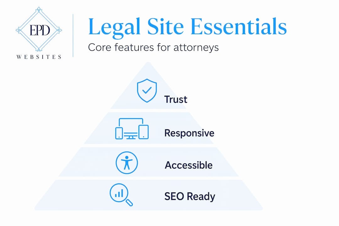
- Features that turn your website into a business driver
- DIY versus professional attorney website design
- My honest take on attorney website design in 2026
- Ready to build a site that actually works for your practice?
- FAQ
Key takeaways
| Point | Details |
|---|---|
| Most attorney sites underperform | Only a third of attorney websites retain visitors due to poor UX and absent pricing information. |
| Mobile-first is non-negotiable | Over half of all legal searches happen on mobile devices, making responsive design a baseline requirement. |
| Content must serve clients, not attorneys | Plain language, transparent pricing, and clear practice area pages reduce bounce and improve lead quality. |
| Automation turns browsers into clients | Online intake forms, scheduling tools, and payment options move leads directly into your pipeline. |
| Professional design pays for itself | Expert-built sites outperform DIY options on SEO, accessibility, and conversion metrics that matter to your bottom line. |
What website design for attorneys actually means
Attorney website design is not about picking a color palette and uploading your headshot. It is the deliberate process of building a digital environment that communicates your expertise, guides a potential client from curiosity to contact, and handles intake tasks without requiring your involvement. Law firm websites must blend offline reputation with online presence, functioning as a natural extension of your firm's expertise and business goals.
Simplicity and intuitive navigation
The most common mistake attorneys make is overloading their navigation. Visitors arrive with a specific problem. They need to find your practice areas, understand your qualifications, and reach you. A menu with eight top-level items and three dropdown layers creates friction. Keep your primary navigation to five items or fewer. Prioritize: Home, Practice Areas, About, Contact, and one supporting page such as FAQ or Testimonials.
Mobile-first and responsive design
More than 50% of legal searches occur on mobile devices. If your site loads slowly on a phone, requires pinching to read text, or buries your phone number below the fold, you are losing clients before they ever speak to you. Mobile-first design means building the mobile experience first, then scaling up to desktop. Not the other way around.
Accessibility compliance
The Web Content Accessibility Guidelines (WCAG) set the standard for making websites usable by people with disabilities. For attorneys, this matters on two levels. First, it widens your potential client base. Second, accessibility failures can expose your firm to legal risk. Proper contrast ratios, alt text on images, and keyboard-navigable menus are not optional extras.

Consistent branding that signals trust
Professional branding and consistent messaging across your website establishes trust before a client ever contacts you. Your logo, typography, color scheme, and photography should all tell the same story. A site that looks assembled from mismatched templates signals carelessness. That is the last impression you want to make on someone deciding whether to trust you with a serious legal matter.
Pro Tip: Use your brand colors consistently across every page header, call-to-action button, and footer. Inconsistency in visual identity creates subconscious doubt in visitors about your firm's attention to detail.
Content strategy and client-focused messaging
Here is where most attorney websites fall apart. Only 30% of potential clients find the information they need to retain services on attorney websites. The fix is not more content. It is the right content, written for the person searching, not for a legal audience.
Writing for your client, not your peers
Avoid Latin phrases, procedural jargon, and acronyms that only practitioners recognize. A person searching for help after a car accident does not know what "comparative negligence" means. They want to know if you handle their type of case, how the process works, and what it will cost. Use plain language that mirrors how your clients search. Prioritizing client journey in design includes using language that reflects client search queries and clearly stating case acceptance criteria.
Pages every attorney website must include
- Home page with a clear headline that states who you serve and what you do
- Practice areas with individual pages for each specialty, not one long list
- Attorney profiles with professional headshots and concise accomplishments
- Contact page with multiple contact methods and a simple form
- FAQ page that addresses the questions clients ask before calling
- Testimonials or case results that demonstrate real outcomes
Attorney profile pages are among the most visited on any law firm website. A grainy photo and a list of bar admissions is not enough. Invest in a professional headshot. Consider a lawyer headshot session with a photographer who specializes in legal professionals. The visual credibility it creates is immediate.
SEO and AI visibility for legal sites
Search engine optimization for attorneys goes beyond keywords. Structuring content for AI visibility means writing clear, authoritative descriptions that generative AI models can easily interpret, offering competitive search advantages as more clients use AI tools to find legal help. Each practice area page should answer the specific questions clients type into search engines. Think: "What does a DUI attorney do in Phoenix?" not just "DUI Attorney."
| Content element | Why it matters |
|---|---|
| Individual practice area pages | Targets specific search queries and improves ranking for niche terms |
| Transparent pricing information | Only 10% of attorney sites show pricing; those that do reduce bounce significantly |
| Client testimonials | Builds social proof and supports trust before first contact |
| FAQ content | Captures long-tail search traffic and answers pre-qualification questions |
| Attorney bio with credentials | Establishes authority and improves time-on-page metrics |
Features that turn your website into a business driver
The best attorney websites go beyond aesthetics to offer functional tools that help clients start the legal process before phone contact. This is the difference between a brochure and a business asset.
Here are the features that create measurable intake improvement:
-
Online intake forms integrated with your CRM. When a visitor fills out a form at 10 PM, that lead should automatically enter your pipeline. Automated intake processes reduce revenue lockup by moving leads directly into the firm's workflow without administrative delay.
-
Appointment scheduling tools. Give clients the ability to book a consultation directly on your site. Calendly, Acuity, or a built-in scheduling widget removes the phone tag that kills conversions.
-
Online payment options. Accepting retainer payments or consultation fees online accelerates collections. Clients expect this convenience in 2026. Firms that require a mailed check create unnecessary friction.
-
Interactive tools and downloadable resources. A personal injury calculator, a divorce timeline guide, or a downloadable checklist for estate planning keeps visitors engaged and positions you as a resource before they become a client.
-
Core Web Vitals performance. Fast page loads and passing Core Web Vitals metrics correlate directly with more calls, forms submitted, and cases signed. Google measures load speed, visual stability, and interactivity. A site that fails these benchmarks ranks lower and loses clients.
Pro Tip: Test your site's Core Web Vitals score using Google's PageSpeed Insights tool. A score below 70 on mobile is costing you search visibility and client conversions right now.
DIY versus professional attorney website design
This is a practical decision, and it deserves an honest look. The right answer depends on your stage of practice and your growth goals.
| Factor | DIY website | Professional design |
|---|---|---|
| Upfront cost | Low | Higher investment |
| SEO optimization | Basic, often incomplete | Technical and strategic |
| Accessibility compliance | Rarely addressed | Built into the process |
| Mobile performance | Template-dependent | Custom-optimized |
| Intake automation | Limited integrations | Full CRM and scheduling setup |
| Time to build | Significant personal time | Handled by specialists |
DIY website solutions are cost-effective but often lack specialized SEO, accessibility, and compliance features that legal professionals need. For a solo attorney just starting out, a well-configured template site can serve as a placeholder. For a firm actively competing for clients in a metro market, it is a liability.
The deeper risk with DIY is not the design itself. It is the strategic gaps. An attorney building their own site on a general-purpose platform is unlikely to know how to structure practice area pages for local SEO, configure schema markup for legal services, or set up intake automation that connects to their case management software. These are the details that separate sites that generate leads from sites that simply exist.
Firms that treat website design and Google Ads as one connected system achieve better measurable business results. A professional designer familiar with the legal industry understands this connection and builds accordingly. You can explore design features for professionals to understand what a purpose-built attorney site includes versus a generic template.
My honest take on attorney website design in 2026
I have watched attorneys spend thousands on photography, office renovations, and conference sponsorships while their website sits on a five-year-old template with a broken contact form. The website is often the last thing they think about and the first thing a potential client sees.
What I have learned from working with professional service providers is that most attorneys underestimate how much their website functions as a conversion tool. They think of it as a credibility marker, something that says "we exist and we are legitimate." But a visitor who cannot find your practice areas within ten seconds is already gone. A visitor who cannot figure out how to reach you on a mobile device will call the next firm on the list.
The attorneys who get this right stop asking "does our site look professional?" and start asking "does our site make it easy for a client in distress to take the next step?" Those are very different questions. The first is about your ego. The second is about your revenue.
I have also seen firms dramatically improve their intake numbers not by redesigning their entire site but by fixing three things: adding a mobile-friendly contact form above the fold, creating individual pages for each practice area, and showing at least a general pricing range. Those three changes alone can move the needle more than a complete visual overhaul.
The attorneys who will win the next five years are the ones who treat their website as infrastructure, not decoration. Build it for the client who is scared, searching at midnight, and needs to know you can help them.
— Kate
Ready to build a site that actually works for your practice?
If this article clarified what website design for attorneys should accomplish, the next step is seeing what a purpose-built legal website actually looks like in practice.

At Epdwebsites, we have been building professional websites for attorneys and other white-collar professionals since 2009. Every site we build is designed around your client's journey, not just your firm's preferences. That means mobile-optimized performance, SEO-ready structure, intake automation, and branding that communicates authority before a client ever picks up the phone.
Explore our attorney web design features to see exactly what goes into a high-performing legal website. If you have questions about the process, our design FAQ covers the most common concerns attorneys bring to us. Your website should be generating leads while you focus on practicing law.
FAQ
What is website design for attorneys?
Website design for attorneys is the process of building a site that communicates legal expertise, guides potential clients toward contact, and automates intake tasks. It goes beyond visual design to include SEO, mobile performance, accessibility, and client-focused content.
How many pages should an attorney website have?
At minimum, an attorney website should include a home page, individual practice area pages, attorney profile pages, a contact page, and an FAQ page. Each practice area deserves its own page for SEO and clarity.
Why does mobile design matter for law firm websites?
Over 50% of legal searches happen on mobile devices, meaning a site that performs poorly on phones will lose clients and rank lower in search results.
Should attorneys show pricing on their website?
Yes. Only 10% of attorney websites display pricing information, yet transparency about fees significantly reduces bounce rates and improves lead quality by pre-qualifying visitors before they contact you.
What is the difference between DIY and professional attorney website design?
DIY platforms offer lower upfront cost but typically lack the legal-specific SEO, accessibility compliance, and intake automation that professional designers build in. For firms competing in active markets, the strategic gaps in DIY sites directly affect client acquisition.