
Your website is often the first clinical impression you make. Before a patient calls, before they read your bio, before they decide to trust you with their mental health, they land on your homepage and feel something. That feeling is why psychiatrists need calming website design, and it goes far beyond color choices or fonts. The visual environment you create online either reduces anxiety or amplifies it. For psychiatrists specifically, the stakes of getting that wrong are higher than for almost any other profession.
Table of Contents
- Key Takeaways
- Why psychiatrists need calming website design
- Coercion-resistant UX and why it matters
- Calming design, trust, and lower bounce rates
- Practical steps to build a calming psychiatry website
- Common design pitfalls that increase patient anxiety
- My take: designing for emotional states, not just logic
- Ready to build a website your patients will trust?
- FAQ
Key Takeaways
| Point | Details |
|---|---|
| Design affects patient emotions | Your website's visual tone triggers real psychological responses before a patient reads a single word. |
| Coercion-free UX builds trust | Avoiding pressure tactics and forced CTAs increases both patient comfort and appointment conversions. |
| Whitespace reduces cognitive load | Strategic use of open space lowers visual fatigue and keeps anxious visitors engaged longer. |
| Calm design cuts bounce rates | Nearly 40% of visitors leave cluttered or confusing sites immediately, before exploring your services. |
| Low-friction engagement converts | Self-assessments and educational FAQs bring patients closer to booking without overwhelming them. |
Why psychiatrists need calming website design
Most professionals think about website design as a branding exercise. Pick colors that look professional, write a short bio, add a contact form, and call it done. For a landscaping company or an accounting firm, that approach is imperfect but survivable. For a psychiatrist, it can actively harm your practice.
The person visiting your website is not in a neutral state. They may be experiencing anxiety, depression, or a mental health crisis. They may have spent weeks working up the courage to look for help. When they land on a cluttered, visually aggressive, or confusing site, their nervous system responds accordingly. The importance of calming web design is rooted in this reality: the interface itself is part of the therapeutic first contact.
Here are the foundational elements that make a psychiatry website genuinely calming:
- Soft, restrained color palettes. Colors like muted sage, warm ivory, slate blue, and soft gray signal safety without being clinical or sterile. High-contrast brutalist designs reduce conversion rates by 22% compared to restrained palettes. That difference is not abstract. It represents real patients who left before reading about your services.
- Generous whitespace. Open space between content blocks is not wasted space. Whitespace improves readability by giving the eye a place to rest and separating ideas without overwhelming the visitor.
- Predictable navigation patterns. When a patient has to hunt for your contact information or services page, cognitive load spikes. Calm websites use standard, expected navigation so visitors always know where they are.
- Avoiding visual competition. Too many fonts, bold colors fighting each other, or animated graphics all demand attention simultaneously. That visual noise mimics the internal experience of anxiety rather than offering relief from it.
Pro Tip: Test your homepage on someone outside your field. If they hesitate, squint, or use the word "busy" to describe it, your layout is already costing you patients.
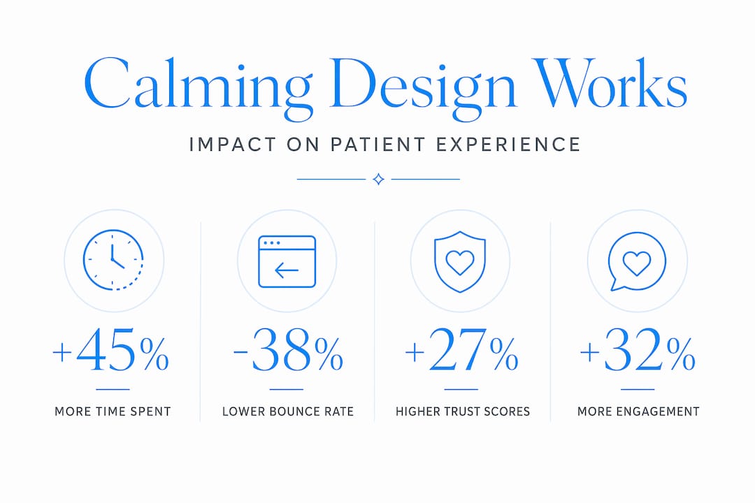
The benefits of soothing websites for mental health practices are measurable. Patients stay longer, read more, and take action when the design environment earns their calm rather than demanding their attention.
Coercion-resistant UX and why it matters
You probably already know that a patient under stress does not make clear-headed decisions. That same principle applies directly to website design for mental health practices. When a visitor lands on your site feeling vulnerable, every design choice either respects their autonomy or pressures them past their comfort level.
Coercion-resistant UX assumes users may already be tired, overwhelmed, or stressed. It builds interfaces that allow people to undo actions, avoid dark patterns, maintain legibility, and preserve a sense of control even under cognitive strain. For a psychiatrist's website, this is not a technical nicety. It is an ethical consideration.
Here is what coercive UX looks like in practice, and what to replace it with:
- Forced booking CTAs. A button that says "Book Now" plastered across every section does not motivate anxious patients. It pressures them. Replace it with softer language like "See if we're a good fit" or "Learn about your options."
- Hidden exits or pop-ups. Trapping visitors with a newsletter pop-up that obscures the page content before they have read a word is a dark pattern. It signals that the practice values email lists over patient comfort.
- Countdown timers or urgency messaging. Phrases like "Only 2 spots left this week" borrow tactics from e-commerce. They do not belong near mental health services.
- No intermediate engagement. Giving patients only one option, a direct booking call, or a contact form, skips the trust-building phase that most mental health visitors need.
Quizzes as secondary CTAs increase engagement and lead generation while letting patients self-select at their own pace. A short self-assessment like "Is this practice right for me?" or an FAQ section gives visitors a low-stakes way to engage before committing.
Pro Tip: Add a "Not sure where to start?" link on your homepage that leads to a brief FAQ or self-assessment. It signals that you understand hesitation and it creates a secondary path for visitors who are not ready to book but are close to it.
How design affects patient experience is not just about visual aesthetics. It is about whether your website makes a stressed person feel safe enough to take the next step.
Calming design, trust, and lower bounce rates
Let's talk about what happens when design gets it wrong. Nearly 40% of visitors exit a website immediately when the design feels outdated or cluttered. For a psychiatry practice, that number represents people who needed help, found your site, and left within seconds because the experience felt wrong.

The stakes multiply when you factor in the mental state of your typical visitor. Nearly 1 in 3 U.S. adults regularly engage in doomscrolling, which means they are arriving at your website already primed for stimulation overload. A calm design does not just look nice. It functions as a neurological contrast to everything else they have been exposed to online that day.
Consider what engagement actually looks like on a well-designed psychiatry site:
| Design Element | Effect on Patient Behavior |
|---|---|
| Open whitespace and clear typography | Longer time on page, lower cognitive fatigue |
| Soft color palette | Reduced immediate bounce, higher page depth |
| Simple, predictable navigation | More pages visited, higher contact form completion |
| Low-pressure CTAs | Higher conversion from visitor to patient inquiry |
Intentional calm design communicates confidence, professionalism, and earns trust through clarity and balance. For mental health practices, that trust signal is not a soft benefit. It is the primary conversion mechanism. A patient who trusts the visual environment is far more likely to trust the practitioner behind it.
Practical steps to build a calming psychiatry website
Knowing the theory matters. Applying it is where most practices struggle. Here is a concrete process for psychiatrists who want to create or overhaul their online presence with calming intent.
- Choose typography and colors deliberately. Serif fonts like Georgia or Lora feel grounded and authoritative without feeling clinical. Stick to two or three colors maximum, and test combinations for contrast ratios that are readable without being jarring.
- Structure content around patient questions, not your services. Instead of leading with "Dr. Smith offers cognitive behavioral therapy," lead with "Wondering if what you're feeling is worth talking about? Here's how we can help." The patient-first framing signals empathy before expertise.
- Add practitioner bios with genuine warmth. A photo taken in natural light, a first-person voice, and a brief mention of your philosophy of care all reduce the cold, institutional feel that drives patients away. Clinical supervision standards in mental health care emphasize the therapeutic relationship above all else. Your bio page is where that relationship begins online.
- Offer a low-stakes engagement option before the booking form. Interactive self-assessments and educational resources boost engagement without requiring immediate commitment. A short symptom quiz or a downloadable "What to expect from your first session" guide works well.
- Use consistent spacing throughout every page. Inconsistent margins or dense paragraphs break the calm experience even when colors and fonts are well-chosen. Spacing is the connective tissue of a calming layout.
Pro Tip: Before your site goes live, view it on a phone in a dimly lit room. That is how many of your patients will first encounter it. If anything feels crowded, hard to read, or visually overwhelming in that context, fix it before launch.
Why aesthetics matter in therapy extends naturally to the digital environment you create. The website is not separate from the care. For many patients, it is the first part of the experience.
Common design pitfalls that increase patient anxiety
Even well-intentioned psychiatry websites make mistakes that undermine everything else. Avoiding these is as important as getting the positive elements right.
- Medicalized language on the homepage. Phrases like "DSM-5 compliant treatment protocols" or "evidence-based modalities" may signal expertise to a colleague but alienate a patient who is already nervous. Write for the person, not the credential.
- Too much information upfront. A homepage that lists every condition you treat, every therapy approach you use, and every insurance you accept is not thorough. It is overwhelming. Filter ruthlessly. Give patients one clear next step.
- Inconsistent visual spacing. Crowded blocks of text next to oversized images signal that no one thought carefully about the reader's experience. Calm websites remove demands on user attention by reducing visual noise and competing elements.
- Pressure CTAs in the wrong places. A "Book Now" button immediately after describing a trauma specialty sends the wrong signal. Patients need to feel heard and understood before they feel ready to act. Timing and placement of CTAs matter as much as the words themselves.
- No acknowledgment of hesitation. Most patients on a psychiatry website are not ready to call. A site that offers no path for the hesitant visitor loses them entirely. Simple additions like "It's okay to take your time" or a resource library keep them in your orbit until they are ready.
My take: designing for emotional states, not just logic
I have seen the difference between a website that patients feel and one they just read. After working with professional service providers for years, I have watched a pattern repeat itself. A psychiatrist with genuine warmth and exceptional clinical skill loses potential patients to a practice with a cleaner, calmer website. Not because the competitor is better. Because their site felt safer to navigate.
What strikes me most is that many practitioners resist calming design because they conflate it with looking less serious. They fear that soft colors or whitespace will undercut their authority. That is exactly backwards. The 81-point Calm Tech framework treats functional calm design as a survival-level priority, not a stylistic preference. Authority comes through clarity, not density.
The ethically uncomfortable truth is this: a website that pressures a psychiatry patient into acting before they are ready does not just lose a conversion. It potentially pushes a vulnerable person away from help they need. That is not a UX failure. It is a clinical one. Calming website design is where the responsibility of your profession and the strategy of your practice should meet. I have found that when psychiatrists understand this, they stop treating their website as a marketing problem and start treating it as a patient care problem. That shift produces better websites every time.
— Kate
Ready to build a website your patients will trust?
If the principles in this article match how you think about patient care, then you deserve a website that reflects that standard. Epdwebsites has spent over 15 years designing professional websites for practitioners who take their online presence as seriously as their clinical one.

From soft color palettes and distraction-free layouts to coercion-free navigation and patient-centered content structure, every design decision is made with your patient's experience in mind. You can explore website features built for professionals or browse the portfolio of completed projects to see what a calm, credible online presence actually looks like. If you have questions before getting started, the FAQ page covers everything from timelines to pricing with the same clarity you will want on your own site.
FAQ
Why does website design matter for psychiatrists specifically?
Patients visiting a psychiatry website are often anxious or vulnerable, meaning the visual environment triggers real emotional responses before they read any content. A calming, low-pressure design directly affects whether that patient stays on the page or leaves.
What colors work best for a mental health website?
Muted tones like sage green, warm ivory, soft gray, and slate blue signal safety without feeling sterile. High-contrast or aggressive color combinations reduce conversions by 22% compared to restrained palettes, which is a critical consideration for mental health practices.
What is coercion-resistant UX and why does it apply to psychiatrists?
Coercion-resistant UX designs interfaces to avoid pressure tactics, forced decisions, and dark patterns, respecting the autonomy of users who may already be stressed. For psychiatry websites, this means replacing hard CTAs with softer engagement options like self-assessments or FAQ sections.
How does calming web design affect bounce rates?
Nearly 40% of visitors leave a site immediately when it feels cluttered or hard to navigate. A calm, well-structured layout keeps anxious patients on the page long enough to build the trust needed to take action.
What is the single most impactful change a psychiatrist can make to their website?
Adding a low-friction secondary engagement option, such as a self-assessment quiz or a "Not sure where to start?" FAQ link, gives hesitant visitors a way to engage without committing to a booking. This one change consistently improves both time on site and inquiry rates for mental health practices.