
Your website is often the first clinical touchpoint a cancer patient encounters, sometimes within hours of receiving a diagnosis. Understanding why oncologists need compassionate website design is not a branding exercise. It is a direct extension of the care you provide, and it shapes whether a frightened patient picks up the phone or quietly closes the tab. Most oncology websites treat design as decoration, a logo, some colors, a contact form. That approach fails the people who need you most.
Table of Contents
- Key Takeaways
- Why compassionate website design matters in oncology
- Core principles of compassionate oncology web design
- Business and clinical benefits of compassionate oncology websites
- Practical steps for improving your oncology website
- Common design pitfalls in oncology websites
- My perspective: what most oncologists get wrong about their website
- Ready to build an oncology website that patients trust?
- FAQ
Key Takeaways
| Point | Details |
|---|---|
| Design shapes first impressions | Patients form a visual opinion of your site in 50 milliseconds, making emotional tone as important as clinical content. |
| Compassion drives consultation bookings | Emotionally accessible websites reduce patient hesitation and increase the likelihood of booking an appointment. |
| Trauma-informed UX reduces cognitive overload | Slowing interaction where it matters most helps overwhelmed patients process information without pressure. |
| Performance affects trust and revenue | A one-second load delay can drop conversions by 20%, directly affecting your patient pipeline. |
| Avoid clinical jargon and coercive design | Clear language and pressure-free navigation preserve patient dignity and build lasting trust. |
Why compassionate website design matters in oncology
Cancer patients do not visit your website in a neutral emotional state. They arrive scared, often sleep-deprived, searching for signals that someone understands what they are going through. Following the 2026 ASCO guidelines, oncology clinicians are now formally encouraged to prioritize effective communication and anticipate patient needs before patients even ask. Your website is the logical starting point for that commitment.
The numbers make this concrete. Research shows that 38% of users disengage when a website's layout feels unattractive or fails to convey care. For an oncology practice, that is not a bounce rate statistic. That is a person who decided, in seconds, that your practice did not feel safe enough to trust with their life.
Here is what compassionate design addresses that aesthetic design alone does not:
- Emotional safety. The site signals immediately whether a patient will be seen as a person or processed as a case.
- Information clarity. Patients under stress cannot parse dense text, excessive jargon, or buried navigation.
- Dignity in the journey. Every click should feel like a calm, supported step forward, not a maze.
- Accessibility for all patients. Older adults, people with cognitive effects from treatment, and caregivers all use your site under varying constraints.
Pro Tip: Ask someone outside your practice to spend 60 seconds on your website's homepage and describe how it made them feel. Their answer will tell you more than any analytics report.
The importance of compassionate design is not a soft, subjective preference. It is a clinical and commercial necessity that supports emotional safety for vulnerable patients while giving them the confidence to book a consultation.
Core principles of compassionate oncology web design
Human-centered design in healthcare means accounting for the emotional, physical, and social state of the person on the other side of the screen. This is more specific than general UX best practices. For oncology, it means designing for someone who may be in shock, in pain, or making the most important decision of their life.

Emotional accessibility is the concept that moves the conversation beyond ADA compliance. It restores humanity to the patient experience, creating digital spaces that offer comfort and a sense of belonging. Translated into web design, this looks like warm but neutral color palettes, photography that shows real human connection rather than stock clinical imagery, and copy written at a reading level that respects cognitive strain.
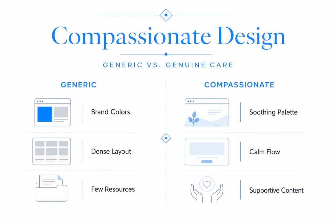
Design elements that reflect genuine care
- Calming color palettes. Blues, greens, and soft neutrals lower anxiety. Avoid aggressive contrast ratios and bright reds unless guiding emergency information.
- Plain language content. Write appointment pages and treatment overviews at a 6th to 8th grade reading level. Patients under stress read at lower levels than their education suggests.
- Predictable navigation. User-centered design reduces friction by simplifying navigation paths and using emotional journey mapping to anticipate where patients need support.
- Visible, non-pressured calls to action. Buttons like "Request a Consultation" should feel like an invitation, not a demand.
- Patient stories. Written or video testimonials from real patients provide hope at the point of hesitation.
| Design element | Generic approach | Compassionate approach |
|---|---|---|
| Color palette | Brand colors only | Calming neutrals with warm accents |
| Navigation labels | Clinical department names | Plain language: "Find a Doctor," "What to Expect" |
| Call to action | "Submit" or "Book Now" | "Talk to Our Team" or "Get Started Today" |
| Patient content | Staff bios and credentials only | Patient stories alongside clinical credentials |
| Mobile experience | Desktop site scaled down | Touch-friendly, thumb-accessible layout |
A trauma-informed interface for oncology assumes users are overwhelmed. It slows interaction where it matters, breaks content into digestible steps, and never forces a patient down a path with no visible exit. This is not about removing urgency. It is about respecting that a patient in crisis still deserves autonomy.
Pro Tip: Design your "What to Expect" page as if a patient is reading it at 2 a.m. the night before their first appointment. That emotional context should shape every sentence.
Business and clinical benefits of compassionate oncology websites
The benefits of user-centered websites extend well beyond patient satisfaction scores. There is a direct financial case to be made, and the data is compelling.
Site performance is a trust signal most oncologists underestimate. 53% of mobile visitors abandon a page if it takes longer than three seconds to load. A one-second delay drops conversions by 20% and satisfaction by 16%. For an oncology practice, "conversion" means a patient scheduling an appointment rather than calling a competitor or delaying care.
Beyond speed, the return on investment from thoughtful design is extraordinary. UX research consistently shows that $1 invested in UX returns $100, with conversion rate improvements of up to 400% when design truly serves the user.
Here is what a compassionate, well-built oncology website actually delivers:
- Higher consultation booking rates. Patients who feel emotionally safe on your site are far more likely to take that first step and call.
- Stronger patient retention. When the digital experience mirrors the clinical experience, trust builds across every touchpoint, not just in the exam room.
- Improved referral rates. Patients who feel genuinely supported often recommend practices to family members and friends facing similar diagnoses.
- Reduced front-desk burden. Clear navigation and accessible FAQs answer common questions before patients call, freeing your staff for higher-value interactions.
Patients assess oncology websites not just for clinical information but for emotional safety, peer hope, and personal connection cues. When your website offers patient stories alongside credentials, it converts hesitation into booked appointments with a consistency that no amount of paid advertising can replicate.
Practical steps for improving your oncology website
Knowing the principles is one thing. Translating them into your actual website is another. Here is a concrete process that works.
- Walk your site as a patient would. Start from a search result, not your bookmarked URL. Notice how long the page takes to load, whether you can find appointment information within three clicks, and whether the language feels warm or clinical.
- Gather feedback from real patients and staff. Ask your patient navigator or social worker what questions patients ask most often. Those questions should be answered prominently on your site, not buried in a PDF.
- Audit your content for reading level and tone. Use a readability tool to check your key pages. Anything above a 9th grade reading level should be simplified for patients under stress.
- Prioritize mobile design. The majority of patients searching for oncologists use their phone. Accessibility improvements in mobile design also improve overall site clarity, speed, and responsiveness in ways that benefit every visitor.
- Add a coercion-resistant approach to your calls to action. Offer calm, reversible choices without urgency tactics. Replace "Act Now" with language that respects where your patient is emotionally.
- Work with design professionals who understand healthcare. Generic web designers can build a functional site. A team with experience in healthcare website navigation understands the patient journey at a level that changes outcomes.
Pro Tip: Map two journeys side by side: the functional journey (how a patient navigates pages) and the emotional journey (how they feel at each step). The gaps between those two maps are where you lose patients.
Common design pitfalls in oncology websites
Knowing what not to do is just as useful as knowing what to do. These mistakes appear consistently across oncology practice websites, and each one erodes patient trust.
- Leading with clinical prestige over patient experience. A homepage dominated by physician credentials and award logos signals that the practice prioritizes status over service. Lead with what patients are there for: reassurance, guidance, and a clear next step.
- Complex navigation under patient stress. Patients form visual opinions of a website in 50 milliseconds. If your menu structure is nested, labeled in department jargon, or requires more than two clicks to reach an appointment request, you are creating barriers at the worst possible moment.
- Ignoring mobile and accessibility standards. More than half of your patients will visit your site on a phone. Pinching to zoom, scrolling sideways, or fighting with tiny tap targets communicates, at a visceral level, that their experience was not considered.
- Urgency and pressure tactics. Pop-ups demanding newsletter sign-ups, countdown timers on consultation offers, and aggressive retargeting language all feel coercive to someone managing a cancer diagnosis. That emotional mismatch drives patients away permanently.
- Static, never-updated content. Outdated treatment information or years-old staff photos signal that the practice is not actively engaged. Patients notice, and they interpret neglect online as a potential reflection of clinical attentiveness.
My perspective: what most oncologists get wrong about their website
I've spent years watching healthcare professionals treat their website as an afterthought, something to check off the professional credibility list and then forget. What I've found, consistently, is that oncologists in particular underestimate just how much emotional weight their site carries.
Here is the uncomfortable truth: your website is not competing with other oncology websites. It is competing with the fear that makes a patient close the laptop and not call anyone. When I look at oncology sites that fail to convert visitors into consultations, the problem is almost never the logo or the color scheme. It is that the site communicates efficiency where patients need warmth, and authority where patients need permission to feel scared.
What I've learned is that the most effective oncology websites treat every design decision as a clinical decision. Font size is an accessibility issue. Page load time is a trust issue. The copy on your "Contact Us" button is an empathy issue. When you approach it that way, the website stops being a marketing tool and starts being part of the care itself.
I've also seen this pay off in ways that surprised the clinicians involved. Practices that invested in genuinely compassionate redesigns reported stronger word-of-mouth referrals, fewer front-desk calls about basic information, and patients who arrived at consultations more prepared and less panicked. The website did clinical work before the appointment even happened. That is the real return on this investment.
— Kate
Ready to build an oncology website that patients trust?
Implementing compassionate website design takes more than good intentions. It takes technical skill, healthcare-specific experience, and an understanding of what emotionally vulnerable patients actually need when they land on your page.

Epdwebsites has worked with medical practices and professional service providers since 2009, building websites that do real work for their clients. If you are an oncologist or healthcare professional ready to close the gap between the care you deliver in person and the experience patients have online, the premium design features at Epdwebsites are built for exactly that. From calming, patient-centered layouts to fast, secure hosting and ongoing support, every element is designed with your patient's first impression in mind. Browse the practice portfolio and see what a website built for trust actually looks like.
FAQ
Why does compassionate design matter specifically for oncology?
Cancer patients visit your website in a heightened emotional state, and 38% disengage when a layout fails to convey care. Compassionate design directly addresses fear, uncertainty, and cognitive overload in ways that generic professional websites do not.
How does website design affect patient trust in oncology?
Patients form a visual opinion of your site in 50 milliseconds, and 94% of first impressions are design-related. A site that feels cold or cluttered signals, immediately, that the practice may not prioritize the patient experience.
What is trauma-informed web design for oncology?
Trauma-informed design assumes users are overwhelmed and structures the interface to reduce cognitive load, offer calm choices, and avoid coercive UX patterns such as pressure tactics, countdown timers, or pop-ups that interrupt a vulnerable user's experience.
What are the business benefits of a compassionate oncology website?
A well-designed oncology website increases consultation bookings, improves patient retention, and reduces front-desk burden. UX investment can return $100 for every $1 spent, with measurable gains in both conversion rates and patient satisfaction.
Where should oncologists start when improving their website?
Start by walking your site as a new patient would, from a search result rather than your bookmarked URL. Identify how long it loads, whether appointment information is easy to find, and whether the tone feels warm or clinical. Then bring in a design team with healthcare experience to address the gaps.