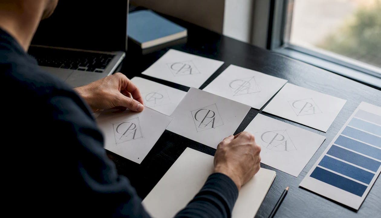
A clean wordmark or monogram with a conservative navy or dark green palette is the right starting point for most CPA firms. Get vector files (.svg and .pdf) plus a monochrome variant before you sign off on anything. Your next step: pick one creation route (DIY template, logo maker, freelancer, or a full-service agency like Epdwebsites), then write a one-paragraph brief that names your specialty, your firm's initials or full name, and the deliverables you expect.
What makes a great CPA logo comes down to three things: it reads clearly at a small printed size typical for engagement letters and remains legible in a small digital format like an email signature. It signals the right level of formality for your client base. The AICPA's professional standards set a high bar for how CPAs present themselves, and your logo is the first visual proof you clear it.
- Choose a wordmark or monogram as your primary mark
- Stick to a conservative palette (navy, dark green, or charcoal) with one refined accent
- Demand vector source files (.ai, .eps, .svg) and a layered PDF at handoff
- Request monochrome and reversed variants for print and embossing
- Test legibility at 1" and 60px before final approval
Key Takeaways
A clean wordmark or monogram with a conservative palette and full vector deliverables is the most reliable foundation for a CPA firm's visual identity.
| Point | Details |
|---|---|
| Choose the right logo type | Wordmark for clarity and solo firms; monogram for partner or legacy practices; emblem for formal institutions. |
| Use a conservative palette | Deep navy, dark green, or charcoal with one refined accent; test in grayscale before committing. |
| Demand vector source files | Request .ai, .eps, .svg, layered PDF, and all variants (monochrome, reversed, favicon) at handoff with written ownership transfer. |
| Test at real-world sizes | Print at 1 inch for letterhead and check at 60 pixels for email signatures before final approval. |
| Epdwebsites for full-service | Epdwebsites integrates custom logo design with website builds, delivering all files and ownership rights in one coordinated package. |
Table of Contents
- What visual styles work best for CPA logo design?
- Which logo type fits your firm's size and use case?
- What colors and fonts convey credibility for CPAs?
- Which symbols help and which ones hurt your CPA logo?
- What files and variants should every CPA firm demand?
- What are your options for getting a CPA logo, and what should you expect?
- How do you test and finalize a CPA logo before launch?
- Why Epdwebsites is a strong choice for CPA logo and branding
- What most firms get wrong about CPA logo design
- Epdwebsites offers CPA logo design bundled with your website
- Useful sources and further reading
What visual styles work best for CPA logo design?
Most accounting firms fall into one of four visual directions, and picking the wrong one for your client base is the most common early mistake.
Conservative/traditional suits tax-focused and audit firms. Think serif typography paired with a shield, column, or balanced geometric frame. These marks communicate stability and institutional credibility, which is exactly what a client handing over their tax returns needs to feel.

Modern/virtual works for cloud-based bookkeeping and virtual CFO practices. Geometric sans-serif type combined with a clean monogram reads as tech-forward without feeling flimsy. Firms targeting younger business owners or startups often land here.

Boutique/advisory fits wealth management and high-net-worth advisory practices. A refined slab serif or elegant serif paired with a monogram signals exclusivity. The palette tends toward charcoal, warm gold, or deep burgundy rather than the standard navy.
Approachable bookkeeping serves small-business and sole-proprietor clients well. Rounded sans-serif type with a warm accent color (soft teal, muted coral) lowers the intimidation factor. This style works for firms that market on personality and accessibility rather than prestige.
A calm, legible palette does more for client trust in tax and audit workflows than any clever icon. When a client opens an engagement letter, they are not looking for creativity — they are looking for confidence.
Pro Tip: Match your visual direction to your highest-value client type, not your personal taste. A boutique advisory firm that uses a rounded, approachable mark will confuse prospects who expect gravitas.
Consistent CPA website branding across engagement letters, client portals, and your site reinforces every trust signal your logo creates.
Which logo type fits your firm's size and use case?
There are four logo types CPAs typically consider, and each has a clear best-fit scenario.
- Wordmark: Your full firm name set in a distinctive typeface. Best for firms with a memorable name or a solo practitioner building personal brand equity. High legibility, easy to scale, minimal production complexity.
- Monogram/lettermark: One to three initials, often stylized. Best for partner firms or legacy practices where the name is long or already well-known. Works beautifully on embossed cards and letterhead.
- Emblem: Type contained within a badge, seal, or shield shape. Best for formal institutions, government-adjacent practices, or firms that want a crest-like authority signal. Harder to reproduce at small sizes.
- Abstract mark: A geometric or conceptual symbol paired with a wordmark. Best for advisory and growth-oriented firms that want a distinctive icon over time. Requires more brand-building investment before the mark stands alone.
Practical selection rules:
- Solo or two-partner firm → monogram or wordmark
- Tax-focused firm needing immediate trust → conservative wordmark with a column or shield accent
- Advisory-first or growth-stage firm → abstract mark plus wordmark lockup
Plan for at least three lockups from the start: horizontal (for website headers and email signatures), stacked (for square social profiles and documents), and icon-only (for favicons and app icons). Name-first marks reduce approval friction across all three because the firm name is always visible, even when the icon is cropped.
Pro Tip: If you are unsure, start with a wordmark. It is the easiest to adapt into a monogram or emblem later, and it never requires clients to "learn" what your symbol means.
What colors and fonts convey credibility for CPAs?
Color does more perceptual work than most firms realize. The palettes that consistently test well for accounting and professional logo for accountants are:
- Deep navy (#1B2A4A or similar): authority, stability, trust. Works across print and digital without shifting.
- Dark green (#1E4D2B or similar): growth, reliability, financial health. Slightly warmer than navy; popular with advisory and wealth-management practices.
- Charcoal (#2E2E2E or similar): modern, neutral, versatile. Pairs well with almost any accent.
- Accent options: Warm gold (#C9A84C) for prestige, soft teal (#4A9E9E) for approachability, or burgundy (#7B2D3E) for boutique positioning. Use the accent on one element only — a rule line, an initial, or a small symbol.
For typography, the choice between serif and sans-serif carries real meaning. Serif fonts (Garamond, Freight Text, Playfair Display) signal tradition and institutional weight. Sans-serif fonts (Proxima Nova, Aktiv Grotesk, Source Sans Pro) read as modern and clean. Many firms use a serif for the firm name and a sans-serif for the tagline or contact details — that pairing works well at both large and small sizes.
Minimum legibility sizes matter for print: no text element in your logo should drop below 6pt on a printed document. For digital, 12px is the practical floor for any type that needs to be readable in a client portal or email footer.
Accessibility contrast is not optional. The 2026 CPA website best-practices guide notes that color consistency and sufficient contrast directly affect how clients perceive professionalism on digital documents. A logo that passes a 4.5:1 contrast ratio against white backgrounds will hold up on printed engagement letters and screen-based portals alike.
Pro Tip: Test your chosen palette in grayscale before committing. If the logo loses its hierarchy in black and white, the color is doing too much structural work.
Which symbols help and which ones hurt your CPA logo?
Symbols are optional, but when they work, they sharpen your specialty signal immediately.
Symbols worth considering:
- Shield or column: compliance, audit, institutional authority
- Checkmark (minimal, geometric): audit, review, accuracy
- Stacked documents or abstract page stack: bookkeeping, tax preparation
- Clean monogram: partner firms, legacy practices
- Abstract upward path or growth arc: advisory, financial planning
Symbols to avoid:
- Calculator: overused to the point of invisibility; adds nothing distinctive
- Dollar sign or currency symbol: reads as transactional rather than professional
- Generic pie chart or bar graph: common in template libraries, rarely distinctive
- Scales of justice: belongs to law firms, not accounting practices
The accountant logo maker guidance from several template platforms reinforces this: visual clichés reduce distinctiveness and cause firm identities to blend together. A symbol only earns its place if it sharpens your specialty for a prospect who has never heard of your firm.
At 60 pixels, a detailed emblem or multi-element symbol loses definition fast. If your mark includes a symbol, test it at favicon size before finalizing. A shield with interior detail often needs a simplified version for small-scale use.
Pro Tip: When in doubt, skip the symbol entirely. A well-set wordmark in the right typeface communicates more authority than a generic icon ever will.
What files and variants should every CPA firm demand?
Getting the wrong deliverables at handoff is a costly mistake. Here is what to request, and when each file type matters:
| File Type | Format | Best Used For |
|---|---|---|
| Vector source | .ai / .eps | Designer edits, future resizing, print vendor handoff |
| Scalable vector | .svg | Website, client portal, email signature |
| Print-ready | Layered .pdf | Letterhead, tax return covers, engagement letters |
| High-res raster | .png (72 dpi) | Presentations, proposals, social media |
| Screen raster | .png (72 dpi) | Web headers, email footers |
| Favicon | .ico / 32×32 .png | Browser tab, bookmarks |
Variants to request at the same time:
- Full-color version (primary use)
- Monochrome black version (for embossing, fax covers, black-and-white print)
- Reversed/white version (for dark backgrounds on your website or printed folders)
- Horizontal lockup and stacked lockup
- Icon-only or monogram-only (for favicon and social profile images)
- Tagline lockup (if your firm uses a tagline)
For embossing and foil-stamped business cards, request single-color vector variants and specify Pantone or spot-color references when handing off to the print vendor.
Usage guide by touchpoint:
- Letterhead and engagement letters: layered PDF, monochrome black variant at minimum 1" wide
- Tax return covers and client folders: full-color PDF or high-res PNG
- Client portal and website header: SVG or optimized PNG
- Email signature: PNG at 200px wide maximum, 72 dpi
- Favicon: .ico or 32×32 PNG, icon-only variant
- Embossed business cards: single-color vector with Pantone reference
Design platforms typically supply color, monochrome, and reversed variants alongside vector and raster exports. Confirm this list before you pay for any deliverable.
What are your options for getting a CPA logo, and what should you expect?
Four routes exist, and the right one depends on your budget, timeline, and how much ownership clarity matters to you.
| Route | Typical Cost | Turnaround | Customization | Ownership/License | Deliverables |
|---|---|---|---|---|---|
| DIY template | $50 or less | Minutes–hours | Low | Varies; check terms | PNG, sometimes SVG |
| AI logo maker | $20 and up | Minutes | Low–medium | Usually royalty-free after purchase | PNG, SVG, PDF |
| Freelancer | $300 and up | a few days | Medium–high | Negotiate in contract | Vector source + exports |
| Full-service agency | $1,500 and up | 1–4 weeks | High | Full transfer at handoff | Complete brand package |
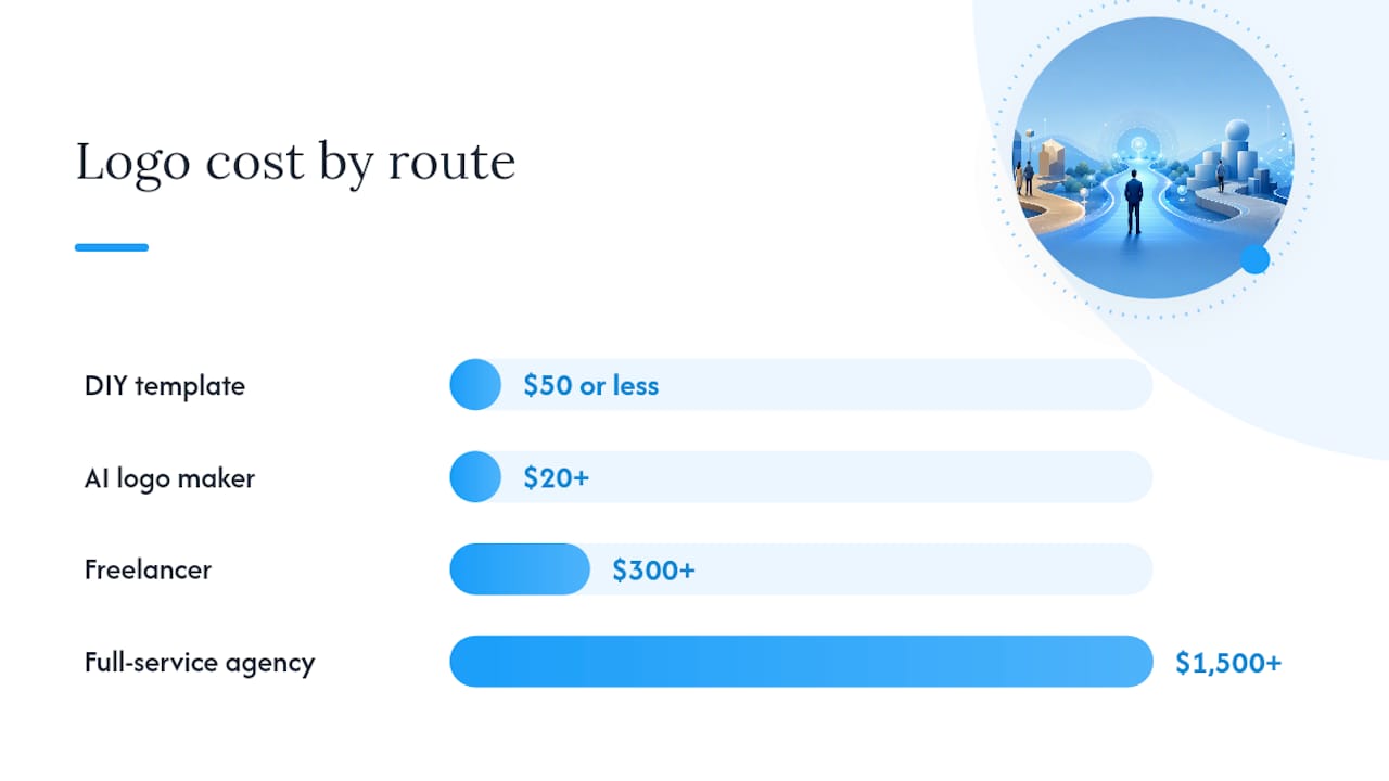
DIY and AI-driven logo creators advertise speed and low cost, and they are a reasonable placeholder for a new firm that needs something on a letterhead by next week. The tradeoff is licensing ambiguity and limited customization. Read the terms carefully: some platforms retain rights to the underlying template even after you pay.
Freelancers offer a middle path. You get a custom mark and, if you negotiate correctly, full vector source files and a written rights transfer. The risk is inconsistency: a freelancer who excels at consumer brands may not understand the visual conventions that matter for tax and audit clients.
A full-service agency that works with professional-service firms brings the highest customization and the clearest ownership transfer. Epdwebsites integrates logo creation with website design and hosting, which means your color hexes, SVG source, and type stack move directly into your site build without a separate handoff conversation.
Pro Tip: Whatever route you choose, get the ownership transfer in writing before final payment. "You own the logo" is not the same as "you own the vector source files and all derivative works."
How do you test and finalize a CPA logo before launch?
Most firms skip the test phase and regret it the first time they see their logo on a printed engagement letter. A lightweight test plan catches the most common failures in under an hour.
- Favicon test: Drop the icon-only variant into a browser tab at 32×32 pixels. If you cannot identify the mark, simplify it.
- Letterhead test: Print the full lockup at 1 inch wide on standard paper. Check that the firm name is legible and no detail is lost.
- Email signature test: Place the horizontal lockup at 200px wide in a test email. Send it to yourself and check it on both desktop and mobile.
- Website hero test: Place the logo at 200px wide on your website header mock. Check contrast against your background color.
- Grayscale test: Convert the logo to grayscale in any image editor. Confirm the hierarchy still reads clearly.
- Embossed mock: If you plan embossed cards, request a single-color vector proof from your print vendor before ordering a full run.
Stakeholder review checklist:
- Partners: Does it reflect the firm's positioning and client expectations?
- Admin staff: Is it easy to place correctly on documents without resizing?
- Sales/business development: Does it hold up on proposals and pitch decks?
Standard revision rounds for a professional logo project run 2–3 rounds. Agree on the number before work begins and define what counts as a revision versus a new direction. Final sign-off should include written confirmation that all source files have been transferred and that the firm holds full ownership.
Testing at real-world sizes — 1 inch for letterhead and 60 pixels for signatures — is a lightweight QA step that catches the most common legibility failures before they reach a client.
Pro Tip: Run the 1" print test before you approve any concept, not after. Detailed artwork that looks sharp on a monitor often falls apart on paper.
Why Epdwebsites is a strong choice for CPA logo and branding
Epdwebsites has worked with CPAs, attorneys, and professional-service firms since 2009, building custom websites and brand identities that hold up across print and digital touchpoints. Logo creation is not a standalone add-on — it integrates directly into the site build, which means your color system, type stack, and SVG source files move into development without a separate handoff.
The process follows a clear sequence: brief, concept presentation, revision rounds (typically 2–3), and final file delivery with full ownership transfer. Clients receive vector source files (.ai, .eps, .svg), a layered PDF, high-res PNGs, and all required variants (monochrome, reversed, favicon) as part of the standard package.
What the Epdwebsites engagement covers:
- Custom logo design tailored to your firm's specialty and client base
- Full vector source files and all variants at handoff
- Written ownership and usage rights transfer
- Integration with website design, hosting, and maintenance
- Coordination of color hexes and type stack across all digital documents
Consistent logo usage on engagement letters and client portals is one of the clearest trust signals a CPA firm can send. When your mark appears the same way every time — same color, same proportions, same placement — clients read it as a sign that the firm runs a tight operation.
The CPA branding guidance published by Epdwebsites explains how firm identity and consistent logo usage across client-facing documents affect client acquisition. For firms that want their logo to work as hard as their website, that coordination matters.
Pro Tip: When coordinating a logo with a site build, bring your primary color hexes, type preferences, and SVG source to the first meeting. It eliminates a full round of back-and-forth during development.
What most firms get wrong about CPA logo design
The conventional wisdom says a CPA logo should be "professional and trustworthy," which is true but nearly useless as design direction. Every firm in the space is aiming for the same two adjectives, which is exactly why so many accounting logos look identical.
The real mistake is designing for the logo itself rather than for its smallest use case. A mark that looks authoritative on a website hero banner can become an unreadable smudge on a printed engagement letter or a 32-pixel favicon. The firms that get this right start with the smallest required size and work up, not the other way around.
There is also a tendency to over-symbol. A calculator, a dollar sign, a handshake — these additions feel like they are adding meaning, but they are actually adding noise. The most distinctive CPA marks tend to be the simplest ones: a well-set wordmark, a clean monogram, or a minimal geometric accent that does not try to explain the entire profession in one icon.
The other thing most guides miss: your logo is a working document tool as much as a brand asset. It will appear on tax return covers, engagement letters, client portal headers, and embossed business cards. Each of those contexts has different technical requirements. Getting the right files at handoff is not a nice-to-have — it is the difference between a logo that works everywhere and one that gets stretched, pixelated, or replaced with a placeholder every time someone needs it in a new format.
Epdwebsites offers CPA logo design bundled with your website
A professional accounting firm deserves a logo that works on a printed engagement letter, a client portal, and a business card without anyone having to resize or recreate it. Epdwebsites delivers exactly that: a custom CPA logo with full vector source files, all variants, and written ownership transfer, built alongside your website so nothing gets lost in translation between design and development.

The package covers custom logo design, website build, hosting, and maintenance — everything coordinated from a single point of contact. Pricing for a combined logo and website project starts at a level that competes with hiring a freelancer for each piece separately, and you get a team that already understands what CPA websites need to win clients. Review the full service and feature details and request a portfolio review or quote to get started.
Useful sources and further reading
A short list of resources that informed this guide and where to go next:
- CPA website branding: Build trust and win Arizona clients — Explains how consistent logo usage on engagement letters and client portals affects client acquisition for CPA firms.
- Ways Websites Attract Accounting Clients: 2026 Guide — Connects logo and branding decisions to client attraction and conversion paths on the website.
- Epdwebsites portfolio — Past projects across professional-service industries; useful for evaluating design quality and sector experience before requesting a quote.
- Epdwebsites service and feature details — Full breakdown of what is included in a website and branding package, including logo deliverables and file handoff.