
The most effective law firm logo design is a simple, typographic mark, a clean wordmark or monogram, built for legibility at every size, not a literal icon crowded with scales and gavels. Prioritize a vector-based wordmark paired with a compact icon variant and locked color specifications. The immediate next step: write a one-page creative brief and commission a designer who specializes in professional services, or budget time to build it yourself using the process below.
TL;DR:
- A law firm logo must be simple, typographic, and highly legible at all sizes, avoiding literal icons like scales and gavels.
- Limit the color palette to two or three colors to ensure consistency, reduce printing costs, and maintain clarity across digital and print mediums.
- Focus on typography with a preference for serif or sans-serif fonts, keeping the design minimal and avoiding overly complex or literal symbols.
- Design or select a logo that performs well at small sizes, including favicon and court document scales, by testing early and starting with icon-only concepts.
- Ensure comprehensive branding by creating a full visual system with consistent typography, colors, and messaging to reinforce professionalism across all touchpoints.
Table of Contents
- Why Law Firm Branding Depends on a Strong Logo
- Key Elements of an Effective Law Firm Logo
- How to Design or Commission a Law Firm Logo
- Law Firm Logo Examples Worth Studying
- Trademarking Basics for a New Law Firm Logo
- Deliverables Checklist: Files, Sizes, and Tests
- Legal and Ethical Considerations in Law Firm Logo Design
- Designing a Logo That Resonates With Your Ideal Clients
- Common Mistakes in Law Firm Logo Design
- Logo Design as Part of a Bigger Branding Strategy
- Working With Designers Who Understand the Legal Industry
- Why a Specialist Often Beats a Generalist for This Project
- Get a Law Firm Logo Built to Work Everywhere
- Sources
Why Law Firm Branding Depends on a Strong Logo
Clients hire attorneys under stress, often during the worst weeks of their lives, and they make snap judgments about competence before they read a single word of copy. A logo is the fastest trust signal a firm has. It shows up before the bio page loads, before the retainer agreement gets sent, before a single phone call happens.
That first impression compounds across every place a prospective client encounters the firm. A logo that looks amateur on a phone screen undercuts a firm's credibility just as much as a typo in a court filing would. Legal branding lives or dies on consistency across touchpoints, and most firms underestimate how many touchpoints exist:
- The website header and favicon
- Business cards and letterhead
- Court filing cover sheets and pleading templates
- Social media avatars, which get cropped into a circle and shrink brutally
- Office signage, building directories, and window decals
- Email signatures, where a logo often renders at 150 pixels wide or smaller
Color and type carry meaning before a client reads a single sentence. Navy and deep blue dominate professional branding because they read as trustworthy and authoritative, a well-documented pattern in color theory research on how people process brand color. That doesn't mean every firm should default to navy. A family law practice trying to feel approachable rather than intimidating might lean toward warmer, softer tones, while a litigation boutique might want the gravity that dark blue or charcoal signals. The point is that color is a decision, not a default, and it should map to how the firm wants to be perceived, not just what looks "lawyerly."
Key Elements of an Effective Law Firm Logo
A logo built for a law firm has to survive contexts most brand designers never think about: a black-and-white fax cover sheet, a courthouse directory sign, a 16-pixel favicon. That constraint should drive every design decision, starting with color.
Color. Stick to two or three colors, a rule reinforced across law firm logo design guides for a practical reason: more colors means more printing costs, more inconsistency across vendors, and more ways for the mark to look muddy when reduced to grayscale for a court document. Navy, charcoal, and burgundy remain common because they signal authority without looking aggressive. A single accent color, gold, teal, or a muted green, can differentiate a firm without sacrificing that gravity.
Typography. Serif fonts still dominate legal branding because they carry historical, institutional associations, think engraved stone, old law books, ceremony. But sans-serif wordmarks have gained ground because they read cleaner on screens and scale down without losing legibility. Whichever direction a firm chooses, limit the identity to one, maybe two, font families. Legibility at small sizes matters more than personality; a beautiful display font that turns to mush on a business card is a liability, not an asset.
Symbols. Here's where most law firm logos go wrong. Scales of justice show up in roughly 86% of legal logo concepts, and gavels appear in about 38%, according to an analysis of law firm logo design patterns. That kind of repetition means a scales-of-justice icon does almost nothing to differentiate one firm from the next in a crowded local market. Modern best practice favors typography-first identities, a distinctive wordmark or monogram, over literal iconography, because type-driven marks scale better and read as more memorable than a stock icon everyone else is also using.
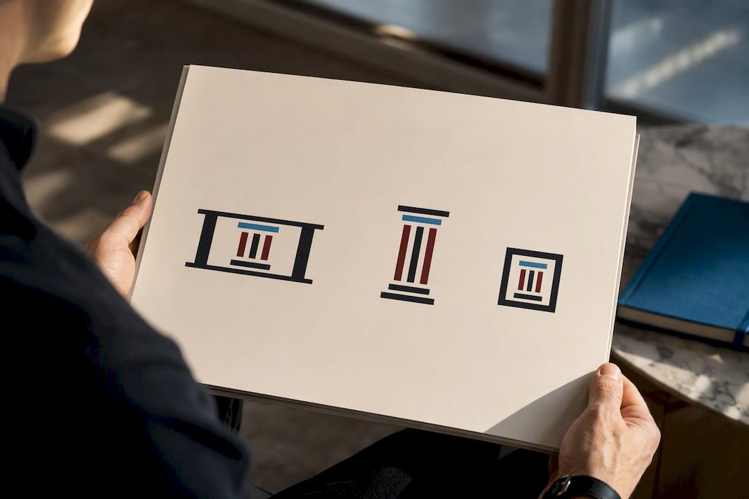
Versioning. Every logo needs a family of variants: a full horizontal wordmark for headers, a stacked version for square social profiles, and a compact icon or monogram for favicons and app tiles. Firms with long partner names, three or four surnames strung together, benefit especially from a tight monogram that can stand alone in small spaces while the full wordmark handles letterhead and signage.
Accessibility. Contrast matters more than most firms realize. A light gray logo on a white website header might look elegant on a designer's monitor and disappear entirely for a client with low vision or on a washed-out phone screen outdoors. Test every color combination against Website color scheme for law firms guidance for contrast ratios that hold up across devices.
Pro Tip: Design the icon-only version first, not last. If a mark still reads clearly at 32 pixels with no wordmark attached, everything larger will take care of itself. Building from the smallest application backward forces simplicity that's much harder to retrofit after the fact.
How to Design or Commission a Law Firm Logo
Most firms either overthink this or underthink it. The process itself isn't complicated, but skipping steps is exactly how firms end up with a logo that looks dated in eighteen months.
Step 1: Write the brief. Before contacting anyone, nail down the basics in writing:
- Practice area and specialty (family law reads differently than corporate litigation)
- Target client demographic and tone (approachable vs. authoritative vs. aggressive)
- Must-have elements (partner initials, founding year, a specific color already in use)
- Forbidden elements (no scales, no gavels, no clip-art style icons)
- Required deliverables (vector files, color variants, favicon, brand guide)
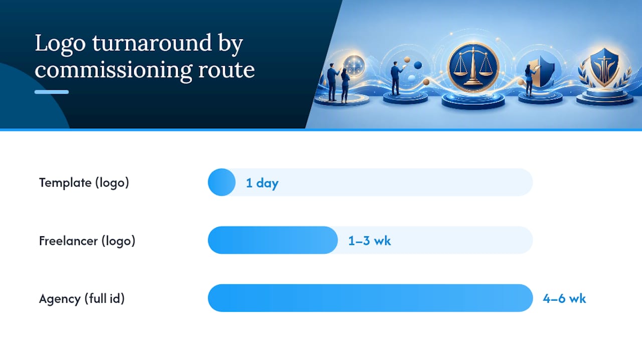
Step 2: Choose a commissioning route. Firms generally pick one of three paths, and each comes with real tradeoffs. Template-based logo makers are fast and cheap but risk producing a mark that isn't unique, since the same templates get reused across thousands of businesses. Freelance designers offer custom work at a moderate cost, though quality and reliability vary widely. Specialist agencies cost more but deliver a full brand system, logo, guidelines, and web-ready files, built to work together, a distinction laid out well in comparisons of law firm logo design approaches.
Step 3: Set milestones. A healthy project moves through concept sketches (three to five directions), a narrowed revision round (one or two concepts refined), and final file delivery. Two to three rounds of revisions is standard; anything beyond that usually signals the brief wasn't specific enough at the start.
Step 4: Budget and timeline. Template tools can turn around a logo in a day for a low cost. Freelancers typically need one to three weeks. Specialist agencies handling a full brand identity, logo plus guidelines plus web integration, often run four to six weeks, reflecting the added coordination between design and development.
Step 5: Vet the designer. Ask direct questions: Have you designed for law firms or other professional services before? Can I see the full file package before final payment? What's included if I need a tweak six months from now? A red flag worth taking seriously: any designer who won't hand over source vector files after final payment. Those files belong to the firm that paid for them.
Law Firm Logo Examples Worth Studying
Curated examples teach faster than abstract rules. Study these approaches for what they demonstrate, not to copy them outright.
- Serif wordmark, no icon — A firm name set in a confident serif typeface, nothing else. Works well for established firms with a distinctive name; projects heritage and confidence without needing a symbol at all.
- Monogram in a circle badge — Two or three initials inside a simple circular frame. Ideal for firms with long partner name strings; the badge format scales beautifully down to a favicon.
- Sans-serif wordmark with a single accent line — Clean, modern type with one geometric line or bracket element. Signals approachability, often used by family law or personal injury firms wanting to feel less intimidating.
- Abstract columns as negative space — Columns suggested through negative space in a monogram rather than drawn literally. Nods to institutional gravity without leaning on a cliché icon.
- Stacked initials with a horizontal underline — Initials stacked vertically with a thin rule beneath. Common among boutique litigation firms wanting a tight, structured feel.
- Single letterform icon — One dominant initial rendered as a bold standalone mark, used as the icon variant alongside a full wordmark. Works particularly well for solo practitioners building a personal brand.
- Shield outline with typographic center — A shield shape used purely as a container for initials, not a literal badge. Splits the difference between symbolic and typographic approaches.
- Two-tone wordmark — The firm's surname in one color, "Law" or "& Associates" in a secondary tone. Creates visual hierarchy without adding a separate icon.
The throughline across every strong example: typography does the heavy lifting, and any symbol present is abstracted rather than literal. That restraint is what keeps a mark from blending into the sea of scales-and-gavels logos flooding local legal directories, an approach backed by curated law firm logo analysis that favors distinctive type over generic iconography.
Trademarking Basics for a New Law Firm Logo
Registering a logo isn't legally required to use it, but skipping this step is a gamble few firms should take, especially one whose entire identity depends on protecting its name. The USPTO explains that federal registration provides stronger nationwide protection and public notice of ownership, both of which matter if a firm ever needs to stop a competitor from using a confusingly similar name or mark.
Before finalizing any design, run a preliminary search using the USPTO's Trademark Electronic Search System (TESS) to check for conflicts with existing marks in the same or adjacent classes. A logo that closely resembles another firm's registered mark, even unintentionally, can trigger a costly rebrand down the line.
A few practical safeguards:
- Search TESS early, ideally before the brief goes to a designer, not after final files are delivered
- Avoid finalizing a name or tagline until the search comes back clean
- Consult a trademark attorney if the search turns up anything close, or if the firm operates under a distinctive coined name worth protecting
- Treat clearance as a launch prerequisite, not an afterthought; rebranding after the fact costs far more than clearing it up front
Deliverables Checklist: Files, Sizes, and Tests
A finished logo isn't one file. It's a package. Every designer should hand over vector source files (AI, EPS, or SVG) so the mark can be resized without quality loss, plus high-resolution PNG files with transparent backgrounds for web use, PDF for print vendors, JPG for basic use, and a dedicated favicon file for browser tabs, a format breakdown consistent with standard law firm logo delivery practices.
Layout variants matter just as much: horizontal, stacked, icon-only, a reversed (light-on-dark) version, and a pure monochrome version for single-color printing or fax transmission.
Test the finished files at real-world sizes before approving anything: a 16-pixel favicon, a 300-pixel email signature, a 1-inch letterhead print, and, if the firm has physical signage, a 6-foot exterior sign. Roughly 86% of legal logo concepts still lean on scales-of-justice imagery, which makes a legibility test doubly important. A generic icon that also fails to scale cleanly is the worst of both problems at once. Run a contrast check on every color pairing to confirm the logo holds up for readers with low vision.
Legal and Ethical Considerations in Law Firm Logo Design
A law firm's logo isn't just a brand asset. It's a piece of professional communication, and most state bar advertising rules extend to visual marketing, not just written copy. Avoid any symbol or phrase that implies a specialization, certification, or outcome the firm can't substantiate, a shield that mimics a government seal, a badge that resembles a judicial emblem, or an icon that could be mistaken for an official certification mark.
Steer clear of imagery that overstates guaranteed outcomes. A gavel paired with a tagline like "Winning Results Guaranteed" edges into misleading territory that several state bar advertising codes explicitly restrict. The safest approach is a mark that communicates professionalism and specialty without making an implicit promise the firm can't back up in writing.
There's also a practical ethics angle: logos that closely mimic a competing local firm's colors, layout, or iconography, even unintentionally, can create client confusion about who they're actually hiring. This matters most in small or mid-size markets where several firms serve the same practice area within a few miles of each other. Running a basic visual audit of local competitors before finalizing a design catches this early, before it becomes a bar complaint or a trademark dispute.
Firms with multiple partners should also think through succession. A logo built entirely around one founding partner's name or initials can become awkward to use once that partner retires or a new one joins. Building flexibility into the identity from the start avoids an expensive, disruptive rebrand years down the line.
Designing a Logo That Resonates With Your Ideal Clients
The biggest mistake in legal branding is designing for other lawyers instead of for clients. A logo that impresses colleagues at a bar association mixer can completely miss the person searching "divorce attorney near me" at 11 p.m., stressed and looking for someone approachable.
Start with a clear picture of who actually walks through the door. A personal injury firm serving working-class clients after an accident needs warmth and plain-spoken confidence, not cold, corporate minimalism. A firm handling high-net-worth estate planning or complex commercial litigation can lean into more formal, understated design, since that audience associates restraint with competence.
Age and channel matter too. A firm whose clients skew older and find them through referrals and print advertising can afford a more traditional serif-and-navy approach. A firm building its pipeline through search and social media needs a mark that holds up at tiny sizes on a phone screen, where ornate detail simply disappears.
One practical exercise: pull up three competitor logos serving the same practice area and demographic, then ask what each one implicitly promises. Approachable? Aggressive? Old-money credibility? Position the new mark deliberately against that field rather than drifting toward whatever feels safe. A logo is a positioning statement before it's a piece of art, and the firms that treat it that way end up with marks that actually convert browsers into consultations.
Common Mistakes in Law Firm Logo Design
The most frequent mistake is choosing a generic scales-of-justice icon because it feels "safe," then wondering why the firm looks indistinguishable from six competitors in the same directory listing. Safe, in this case, means invisible.
Overcomplicating the mark is a close second. Firms sometimes try to cram a scale, a column, a gavel, and a shield into one icon, hoping more symbolism means more meaning. It usually just means the logo turns to mud at small sizes and reads as cluttered everywhere else. One clear visual idea beats four competing ones, a principle borne out repeatedly in legal logo design analysis.
Other recurring problems worth flagging:
- Choosing fonts that look elegant at large sizes but collapse into illegibility on a business card or favicon
- Locking in a color palette without testing it in grayscale, which matters for fax cover sheets and black-and-white court filings
- Skipping the trademark search and discovering a conflict after the website, signage, and letterhead are already printed
- Treating the logo as a one-time purchase instead of part of a broader visual system that needs a style guide to stay consistent
- Ignoring how the mark crops when social platforms force it into a circle, cutting off text or key details
The fix for nearly all of these is the same: test early, test small, and resist the urge to add more elements when the design feels incomplete. Incomplete usually just means restrained, and restrained is what reads as professional.
Logo Design as Part of a Bigger Branding Strategy
A logo is the anchor of a visual identity, not the whole identity. Firms that treat it as a standalone deliverable, commissioned once and forgotten, tend to end up with a mismatched brand: a polished mark sitting on top of a website that uses different fonts, different colors, and a completely different tone.
The stronger approach treats the logo as the first output of a broader brand system: consistent typography across the website and print materials, a locked color palette used everywhere from social graphics to court filing templates, and a tone of voice that matches what the visual identity promises. A firm whose logo signals warmth and approachability but whose website copy reads cold and transactional sends a mixed message that undercuts both.
Marketing efforts inherit this consistency too. Every ad, every social post, every piece of signage either reinforces the identity or chips away at it. A logo redesign is often the right moment to also revisit the website, since a professional, cohesive website does far more to win client trust when it's visually aligned with the mark clients first see in search results or a referral's business card.
Working With Designers Who Understand the Legal Industry
Not every talented designer understands the constraints unique to legal branding: bar advertising rules, the need for grayscale legibility on court documents, or why a firm with four partner surnames needs a monogram strategy a two-person shop doesn't.
Ask any designer or agency directly about experience with professional services, not just general branding work. Request to see how a past logo performed across multiple applications, not just a polished mockup on a colored background. A mark that only looks good in one context, floating on a gradient in a portfolio, hasn't actually been tested. Compare different design delivery models before committing, since agencies, freelancers, and in-house teams each handle revisions and file delivery differently.
Confirm ownership terms before any money changes hands. The firm should own full rights to the final files, including source vectors, once payment is complete. Clarify how many revision rounds are included and what happens if the firm wants changes a year later, after the designer has moved on to other projects. A brand guide or style system delivered alongside the logo keeps future marketing materials consistent, even if a different designer eventually touches them. Firms serious about consistency across every touchpoint should also look at complementary visual elements, like professional photography, that reinforce the same tone the new mark establishes.
Why a Specialist Often Beats a Generalist for This Project
Some providers have worked with professional service firms, attorneys among them, since 2009, and the pattern holds across nearly every project: a logo designed in isolation from the website almost always needs rework once the site build starts. A specialist who handles both sees conflicts early, a color that fails web contrast standards, a mark that doesn't crop cleanly into a favicon, before they become expensive fixes.
What a specialist delivers beyond the logo file itself is alignment: type choices that carry through to the website, color specs that hold up across every touchpoint, and files handed over ready for developers rather than requiring a second round of conversion work. If a firm is preparing a brief, the right question to ask any proposal is simple: does this include web-ready files and brand guidelines, or just a logo?
— Kate
Get a Law Firm Logo Built to Work Everywhere
A logo that only looks good in a portfolio mockup isn't finished, it's half done. Some companies build law firm branding as part of a complete website package, so the mark, the color system, and the site itself are designed together from day one instead of stitched together after the fact. That means no mismatched fonts between your new logo and your homepage, no scrambling for a vector file when a printer asks for one, and no separate vendor relationship to manage on top of your web build.

For firms that already have a logo but need it integrated properly, or firms starting from scratch, Epdwebsites' website design and branding services cover both under one project, with file packages ready for print, web, and signage from delivery day one. The firm's portfolio shows completed work across attorneys, CPAs, and other professional service providers who needed a visual identity that reads as credible from the first click. If you're ready to see what a logo and website built together actually looks like, request a proposal and bring your brief, or use the FAQ page to check pricing and turnaround before you commit.
Sources
- Trademark basics | USPTO
- Logo
- Law Firm Logo Design: What Works and What Doesn't | Legal Practice Marketing
- The Best Law Firm Logo Examples | Clio