
Typography is not a finishing touch. It shapes whether visitors read your content, trust your brand, and take action. Yet the role of typography in professional websites is routinely underestimated, treated as a font selection exercise rather than a foundational UX and branding decision. Attorneys, CPAs, consultants, and medical practices all stake their credibility on first impressions, and your typography is doing that work before anyone reads a single word. This guide cuts through the surface-level advice and gets into the specifics that actually move the needle for professional service websites.
Table of Contents
- Key takeaways
- The role of typography in professional websites: readability and accessibility
- Building typographic hierarchy and brand personality
- Responsive typography: scaling across every device
- Building and testing a professional typography system
- Common typography pitfalls on professional websites
- My take on typography as the foundation of professional trust
- Your typography deserves professional-grade execution
- FAQ
Key takeaways
| Point | Details |
|---|---|
| Typography is a trust signal | Visitors form credibility judgments from type choices before reading your content. |
| Accessibility is non-negotiable | WCAG contrast and size standards directly affect who can read and engage with your site. |
| Hierarchy guides decision-making | Size, weight, and color combinations reduce cognitive load and lead users toward conversions. |
| Responsive type requires CSS strategy | Fluid scaling with tools like "clamp()` preserves readability across every device. |
| System thinking prevents rework | Treating typography as a defined system with roles and testing saves time and inconsistencies. |
The role of typography in professional websites: readability and accessibility
Readability and legibility are not the same concept, and conflating them leads to predictable design failures. Legibility refers to how clearly individual characters are distinguishable from each other. Readability describes how comfortably a reader can process blocks of text. A typeface can be highly legible at display sizes and still be exhausting to read in paragraphs at 16px because its letter spacing or x-height works against extended reading.
For professional websites, both matter equally. Legibility affects navigation labels, calls to action, and headings. Readability shapes how clients consume service descriptions, bios, and case summaries. Get either wrong and visitors abandon the page without consciously knowing why.
Accessibility standards add a measurable framework here. Normal text requires a contrast ratio of at least 4.5:1 against its background under WCAG 2.2, while large text clears the bar at 3:1. If you are targeting AAA compliance, which many healthcare and legal sites should consider, enhanced contrast thresholds require 7:1 for normal text and 4.5:1 for large text. These are not aesthetic preferences. They are the standard your site will be measured against.
Font size thresholds matter just as much. Body text below 16px on desktop creates strain for a significant portion of the professional audience, particularly users over 40 who make up a large share of clients in legal, financial, and medical sectors.
Line length is another overlooked variable. Optimal body text runs between 50 and 75 characters per line, with 66 characters considered the sweet spot. Lines that stretch past 90 characters force readers to work harder to track back to the start of the next line, increasing error rates and fatigue. The fix is using CSS ch units to constrain body text containers by character count rather than pixel widths.
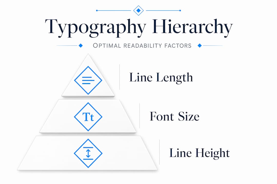
Pro Tip: Set body text line height between 1.4 and 1.6 to give letters enough breathing room. Anything tighter creates a wall of text; anything looser disconnects lines from each other and breaks reading flow.
Building typographic hierarchy and brand personality
Hierarchy in typography is how users navigate a page before reading it. Size tells them what is most important. Weight signals emphasis. Color guides attention flow. When these three tools work together deliberately, you are creating an invisible information architecture that makes your content scannable and your services easier to understand.
The importance of typography in web design becomes obvious the moment you work backward from a conversion goal. Say your goal is to have a prospective client call you. The sequence is: headline grabs attention, subheading clarifies the offer, body text builds confidence, and the call-to-action button closes the loop. Every typographic decision in that chain either supports or undermines that sequence.
Font selection for professional services websites comes with specific constraints. A personal injury law firm has different needs than a boutique consulting practice, but both need typefaces that project authority without feeling cold, and approachability without slipping into casual. Using 2 to 3 typefaces is the standard ceiling, not just for aesthetics but for performance. Loading multiple font families adds HTTP requests and payload weight, increasing the risk of layout shifts and font fallback flashes during page load.
Here are reliable font pairing strategies for professional services websites:
- Serif headline + sans-serif body: Projects authority and readability. Works well for legal and financial sites. Think Playfair Display paired with Inter.
- Sans-serif headline + sans-serif body (different weights): Clean and modern. Works for consultants and tech-adjacent professional services. Nunito paired with Open Sans.
- Single-family with weight variation: Reduces HTTP overhead significantly. A variable font like Source Sans 3 can cover all typographic roles alone with better performance than two separate families.
Below is a quick comparison of pairing strategies by use case:
| Pairing strategy | Best for | Key benefit |
|---|---|---|
| Serif + sans-serif | Legal, financial, medical | Authority with readability |
| Sans-serif + sans-serif | Consultants, agencies | Modern, clean, fast-loading |
| Single variable font | Any professional site | Performance and consistency |
Pro Tip: Before committing to a Google Font pairing, check Wakamaifondue.com to see what weights and styles you are actually loading. Many designers accidentally load 6 font variants when they only use 3.

Responsive typography: scaling across every device
Effective typography for online branding breaks down fast when type does not scale correctly across devices. A heading that reads perfectly at 1280px can become overbearing at 375px or disappear into the page on a tablet. Fluid type scaling solves this by letting font sizes respond proportionally to viewport width rather than jumping at fixed breakpoints.
CSS clamp() is the most practical tool for this. The function takes a minimum value, a preferred fluid value, and a maximum value. A declaration like clamp(1rem, 2.5vw, 1.5rem) means the font size will scale smoothly between 16px and 24px based on screen width, without any breakpoint logic. This creates consistency across the entire size range rather than staccato jumps.
A practical typography workflow should test at the three most common viewport widths: 375px for mobile, 768px for tablet, and 1280px for desktop. Testing at only one breakpoint means you are accepting unknown failures everywhere else.
Here are the steps for building a responsive type scale:
- Start with a base font size of 16px and a modular scale ratio (1.25 or 1.333 work well for professional sites).
- Generate your type scale at all three target viewports using a tool like Utopia.fyi.
- Assign roles to each scale step: body, caption, H3, H2, H1, display.
- Implement each role using
clamp()values from the generated scale. - Test contrast and readability at 200% browser zoom, because contrast and readability shift when scaling behavior interacts with OS font settings.
- Audit all body text containers for line length compliance across breakpoints.
Below are recommended viewport-specific line length targets, based on current UX research:
| Viewport | Recommended characters per line |
|---|---|
| Desktop (1280px+) | 45 to 75 |
| Tablet (768px) | 40 to 65 |
| Mobile (375px) | 30 to 50 |
Failing to control line length on mobile is one of the most common typography mistakes on professional service sites. Designers comp in Figma at desktop size and miss that their 800px-wide body container collapses into a 90-character soup on a phone.
Building and testing a professional typography system
Typography trends for modern websites point toward system-based thinking rather than one-off decisions. Treating your typography as a defined system with consistent rules means fewer revision cycles, cleaner developer handoffs, and a site that holds together visually as content grows.
Here is a practical workflow that web designers and marketers at professional service firms can follow:
- Generate a fluid type scale. Use Utopia.fyi to create a scale with minimum and maximum values for your target viewports. Export the CSS custom property declarations.
- Assign typographic roles. Map scale steps to named roles:
--text-body,--text-heading-2,--text-display. This separates the semantic role from the size value, making future changes one-variable updates. - Verify contrast with real styles. Run your actual text color and background color combinations through the WebAIM Contrast Checker. Do not just check your brand palette. Check the exact hex values your CSS applies.
- Test with real content. Drop an actual service page description into your layout and read it. Dummy text hides readability problems because it has no semantic rhythm.
- Test across viewports and zoom levels. View the page at 375px, 768px, and 1280px. Then zoom each to 200% and verify nothing breaks or becomes illegible.
- Document for handoff. Export a typography spec sheet for developers covering font families, weights, scale values, CSS variables, and contrast ratios.
Pro Tip: Use Google Fonts with font-display: swap in your CSS to eliminate invisible text flashes during load. This one line of code improves both perceived performance and accessibility for professional service site visitors who may have slower connections.
Recommended tools for this workflow include Utopia.fyi for fluid scale generation, WebAIM Contrast Checker for accessibility verification, Wakamaifondue for font inspection, and Google Fonts for performance-conscious font selection. For content-heavy professional sites, including those serving legal or financial clients, thorough testing pays off in lower bounce rates and higher time-on-page.
Common typography pitfalls on professional websites
Knowing the best practices is half the work. The other half is recognizing what is quietly sabotaging the sites you review. Here are the most consistent offenders:
- Loading too many font weights. Excess weights and styles slow down page loads and create visual inconsistency when only some variants render. Load only what you actually use.
- Ignoring contrast outside of body text. Placeholder text, captions, legal disclaimers, and sidebar content often fail contrast checks because designers only test primary content. These areas carry real legal risk on attorney and CPA sites.
- Fixed font sizes in pixels. Pixel-based font sizes override user browser settings for font scaling, breaking accessibility for users who rely on OS-level font size adjustments.
- Skipping mobile line-length checks. Wide body containers that look fine on desktop routinely produce 90-plus character lines on mid-size phones, causing the kind of reading fatigue that kills time-on-page metrics.
- No typographic hierarchy in calls to action. Buttons and CTAs that use the same visual weight as surrounding body text get lost. The impact of fonts on website professionalism compounds at conversion moments.
Pro Tip: Run a quick accessibility audit using Chrome's built-in DevTools accessibility panel before any site launch. It flags contrast failures, missing labels, and font size issues in under two minutes.
My take on typography as the foundation of professional trust
I have reviewed hundreds of professional service websites over the years, and the ones that underperform almost always share one characteristic: they treated typography as decoration rather than structure. A site can have beautiful photography, a sharp logo, and excellent copy. If the typography is inconsistent or hard to read, visitors feel uncomfortable without knowing why. That discomfort reads as a lack of professionalism.
What I have found is that typography builds trust the same way a well-organized office does. It signals that someone thought carefully about your experience before you walked in. For attorneys and consultants, where clients are already skeptical and comparison-shopping, that signal matters enormously. I have seen redesigns where the only change was tightening the type system, and bounce rates dropped noticeably within the first two weeks.
The shift that actually moves results is viewing type as a navigational system rather than a style choice. When teams treat typography systematically, with defined scales, roles, and accessibility checkpoints, they stop relitigating font choices on every new page and start building sites that feel coherent at any size. That coherence is what clients perceive as quality, even when they have no idea what a type scale is.
There is also something counterintuitive worth noting: restraint works better than expressiveness in most professional service contexts. The urge to use a distinctive, personality-forward typeface is understandable, but a CPA's website that uses an unusual display font will create hesitation rather than intrigue. Credibility comes from meeting typographic expectations and then exceeding them in clarity. The personality lives in the spacing, the weight choices, and the hierarchy, not in the typeface itself.
— Kate
Your typography deserves professional-grade execution

When typography is done right, visitors never think about it. They just read, stay longer, and trust faster. Epdwebsites has been building premium websites for attorneys, CPAs, consultants, and medical practices since 2009, and every project starts with getting the typographic foundation right. That means accessible contrast ratios, responsive scaling, and type hierarchies built for conversion, not just aesthetics. If you want to see what a well-executed type system looks like in practice, browse completed client work across professional industries. When you are ready to discuss your own site, explore the full design and hosting services built specifically for white-collar professionals.
FAQ
What is typography's main impact on professional websites?
Typography directly affects readability, user trust, and whether visitors convert to clients. Good typography conveys credibility through scanability and clear hierarchy, which is why it functions as a trust signal before visitors read a word.
How many fonts should a professional website use?
Professional websites should use 2 to 3 typefaces at most. Using more increases page load size, risks visual inconsistency, and reduces the coherent, professional appearance that builds client confidence.
What contrast ratio does body text need to pass accessibility standards?
Under WCAG 2.2, normal text requires a 4.5:1 contrast ratio against its background. Sites targeting AAA compliance, common for legal and medical practices, must meet a 7:1 ratio for normal text.
What is the ideal line length for body text on a professional website?
The optimal range is 50 to 75 characters per line, with 66 characters as a reliable target. Lines outside this range increase reading fatigue and reduce comprehension, particularly on desktop.
Does typography affect website conversion rates?
Yes. Clear typographic hierarchy guides users through content in the sequence your conversion goal requires, from headline to CPA. Inconsistent or hard-to-read type creates friction at each step, reducing the likelihood that visitors take action.