
Website color in healthcare is a visual language that signals trust, healing, and professionalism before a single word is read. Color psychology in healthcare design is the recognized industry term for this practice, and it covers how specific hues shape patient emotions, expectations, and behavior on a medical website. Blue communicates trust and professionalism, green signals health and renewal, and poor color choices can quietly erode confidence in a practice. For healthcare marketers and designers, understanding what website color means in healthcare is not optional. It is the foundation of every credible medical brand online.
What does website color mean in healthcare websites?
Color in healthcare web design carries specific, evidence-based meanings that patients absorb instantly. These meanings are not arbitrary. They are grounded in decades of color psychology research and reinforced by cultural associations patients bring to every digital interaction.
The most common colors and their meanings in healthcare:
- Blue: Blue conveys trust and professionalism and is the dominant color across hospital and clinic websites. It signals stability and competence. Hospitals even associate blue scrubs with clinical trustworthiness, which reinforces the color's power in digital branding.
- Green: Green signals growth, health, and balance. It works especially well for wellness practices, integrative medicine, and mental health providers. Patients read green as a sign of renewal and natural care.
- White: White communicates cleanliness and clarity. It gives a site breathing room and reinforces a sense of order. Overuse, however, can feel cold or sterile.
- Gray: Paired with blue, gray signals professionalism and reliability. Blue and gray palettes actively encourage appointment bookings by projecting clinical authority.
- Earth tones: Warm browns and tans foster warmth and connection. They resonate with patients seeking natural or holistic healing approaches.
- Teal: A blend of blue and green, teal bridges clinical authority with a sense of wellness. It works well for specialty practices that want to feel both modern and approachable.
Each color choice sends a message. A pediatric clinic using warm yellows and soft greens tells parents the space is friendly and safe. A cardiology group using deep navy and white tells patients the practice is serious and precise. The color palette is the first conversation a website has with every visitor.
How does color psychology affect patient perception?
Color psychology directly affects how patients feel when they land on a healthcare website. The effect is subconscious and fast. Patients form a first impression in milliseconds, and color drives most of that reaction.
Cool colors like blue and green reduce stress and promote calm in both physical and digital healthcare environments. That finding matters because a stressed patient who lands on a chaotic or jarring website is less likely to book an appointment or trust the provider. A calming palette lowers the emotional barrier to engagement.

Warm muted tones, such as soft amber or dusty rose, foster optimism and approachability. These work well for practices focused on patient relationships, such as family medicine or counseling. They signal warmth without sacrificing professionalism.
Poor color choices carry real costs. Color inconsistencies subconsciously signal a lack of care to visitors, even when they cannot articulate why. A muddy gradient between two brand colors, or a button color that clashes with the background, registers as disorganization. Patients transfer that perception to the practice itself.
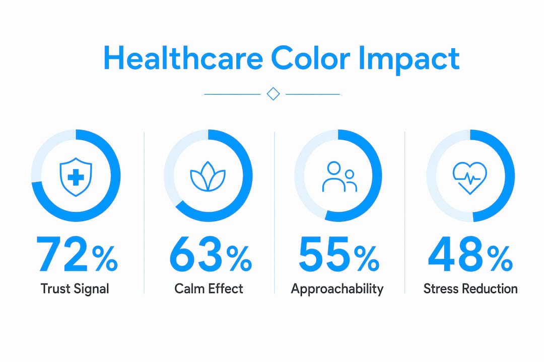
Accessibility is a non-negotiable part of color psychology in healthcare design. Ignoring color contrast creates barriers for older patients and those with visual impairments. Low contrast between text and background does not just fail accessibility standards. It signals to vulnerable patients that the practice did not design with them in mind. That signal damages trust before the patient reads a single sentence.
Here is a practical framework for evaluating color psychology on any healthcare website:
- Check the emotional tone. Does the palette feel calm and professional, or busy and unpredictable? Ask someone outside your team for a gut reaction.
- Test contrast ratios. Use the Web Content Accessibility Guidelines (WCAG) 2.1 AA standard as your minimum. A contrast ratio of 4.5:1 for normal text is the baseline.
- Audit color consistency. Every button, header, and accent should use the same hex values across all pages. Inconsistency reads as carelessness.
- Evaluate specialty alignment. A mental health practice and a surgical center should not use the same palette. Match color meaning to the specific patient experience you are creating.
- Get patient feedback. Run a simple survey or usability test. Ask patients how the site makes them feel before asking if they can find information.
Pro Tip: Test your color palette on a mobile screen in both light and dark environments. Colors shift significantly across devices, and a palette that looks polished on a desktop monitor can appear washed out or harsh on a phone screen.
What are advanced color science strategies for healthcare sites?
Precision in color management separates professional healthcare websites from amateur ones. The industry has moved beyond simply picking a hex code and applying it. Modern color science gives designers quantified control over how colors actually appear to the human eye.
OKLCH is a perceptual color space that allows designers to control perceived lightness and saturation with mathematical precision. Unlike traditional hex codes or RGB values, OKLCH values correspond directly to how the human eye perceives brightness and color intensity. Two colors with identical lightness values in OKLCH will look equally bright to a patient, regardless of their hue. That consistency is critical for healthcare websites, where visual harmony signals professionalism and care.
The practical benefit is significant. A designer using OKLCH can build a full color system where every shade, from primary brand colors to subtle background tints, feels visually balanced. Patients may not know what OKLCH is, but they feel the difference between a site built with perceptual precision and one that was not.
| Color approach | What it controls | Patient impact |
|---|---|---|
| Traditional hex/RGB | Raw color values only | Colors may look inconsistent across screens |
| HSL color space | Hue, saturation, lightness | Better control, but lightness is not perceptually uniform |
| OKLCH color space | Perceptual lightness, chroma, hue | Consistent visual harmony across all devices and hues |
Testing color combinations for harmony is a step many healthcare design projects skip. Designers often apply brand colors directly without checking how they interact. Two individually attractive colors can produce a muddy or visually uncomfortable gradient when placed together. That outcome undermines the professionalism the palette was meant to project.
Accessibility must be built into the color system from the start, not added as a final check. Retrofitting contrast after a design is complete is inefficient and often produces visual compromises. Starting with WCAG 2.1 AA contrast requirements as a design constraint produces better results and a more inclusive patient experience. The accessible design guide for medical sites covers this process in detail.
Pro Tip: Build your healthcare color palette in OKLCH from the start. Define your primary, secondary, and neutral tones using OKLCH values, then convert to hex for production. This approach catches contrast and harmony problems before they reach the live site.
How to apply color meaning practically for healthcare branding
Applying color psychology in healthcare design requires deliberate choices at every stage of a project. The palette must align with the practice's specialty, patient demographics, and brand values. A color that works for a pediatric practice will undermine a surgical center.
Start with a primary color that carries the core brand message. For most medical practices, that means blue or green as the dominant hue. A green and white palette welcomes patients and signals health and calm. A blue and gray palette projects clinical authority and encourages appointment bookings. Choose the primary color based on the emotional experience you want patients to have, not personal preference.
Add one accent color to create visual interest without overstimulation. Teal works as an accent for practices that want to feel both clinical and warm. Soft amber or warm gold works for practices emphasizing patient relationships. The accent color should appear on calls to action, key headings, and interactive elements. It should never compete with the primary color for dominance.
Common pitfalls to avoid:
- Ignoring accessibility from the start. Low contrast text is the most common and most damaging color mistake on healthcare websites. It excludes patients and signals carelessness.
- Using too many colors. A palette with five or more competing hues creates visual noise. Patients feel unsettled, not welcomed.
- Inconsistent color application. Using slightly different shades of blue across pages, because of unmanaged hex values, breaks the sense of a coherent brand.
- Choosing colors based on trends alone. A color that is fashionable in 2026 may feel dated in two years. Ground color choices in psychology and brand values, not trend cycles.
The healthcare website design best practices guide covers how color integrates with layout, typography, and content to create a complete patient experience. Color does not work in isolation. It amplifies every other design decision on the page.
Key Takeaways
Color psychology in healthcare web design is the single most immediate signal of trust, professionalism, and patient care that a medical website sends before any content is read.
| Point | Details |
|---|---|
| Blue signals trust | Blue is the dominant healthcare color because it communicates stability, professionalism, and clinical competence. |
| Cool colors reduce stress | Blue and green palettes lower patient anxiety and increase the likelihood of engagement and appointment bookings. |
| Color inconsistency damages trust | Muddy gradients and mismatched shades subconsciously signal disorganization, reducing patient confidence in the practice. |
| OKLCH improves color precision | Using the OKLCH color space gives designers perceptual control over brightness and harmony across all devices. |
| Accessibility is non-negotiable | WCAG 2.1 AA contrast standards must be built into the color system from the start, not added as an afterthought. |
Why color is the most underestimated tool in healthcare web design
I have worked on professional websites across many industries, and healthcare projects consistently reveal the same blind spot. Practices spend significant time on content, photography, and layout, then treat color as a finishing detail. That sequence is backwards.
Color is the first thing a patient processes. It shapes every subsequent impression, including how they read the copy, how they perceive the photography, and whether they trust the provider enough to book. I have seen well-written, beautifully photographed healthcare sites fail to convert because the color palette felt clinical to the point of coldness, or warm to the point of unprofessionalism.
The practices that get color right share one habit. They treat it as a science, not a preference. They test combinations, check contrast ratios, and align every hue with a specific patient emotion they want to create. They also understand that color transforms a website from a passive information page into a space that actively reassures patients. That shift is not cosmetic. It is the difference between a site that generates appointments and one that generates bounces.
My honest recommendation: before you redesign or refresh a healthcare website, audit the color palette with the same rigor you would apply to the clinical content. Ask what each color communicates. Test it against WCAG standards. Check it on mobile. Then decide if it is doing the work you need it to do.
— Kate
How Epdwebsites builds color-smart healthcare websites
Healthcare professionals who want their website to work as hard as they do need more than a template and a color picker.

Epdwebsites has designed professional websites for medical practices since 2009, applying color psychology, accessibility standards, and precise brand identity work to every project. The team understands that a healthcare website is a patient's first impression of a practice, and color is the first signal that impression sends. You can review the web design features and services to see how Epdwebsites approaches color, branding, and accessibility for healthcare clients. For a direct look at completed projects across medical and professional specialties, the design portfolio shows the range and quality of work delivered.
FAQ
What colors work best for medical websites?
Blue and green are the most effective primary colors for medical websites because they communicate trust, calm, and health. Blue and gray palettes are especially strong for clinical practices, while green and white work well for wellness and integrative medicine providers.
How does color affect patient trust on a healthcare site?
Color shapes patient trust subconsciously and immediately. Cool colors like blue reduce stress and signal professionalism, while color inconsistencies or poor contrast ratios signal disorganization and erode confidence before a patient reads any content.
What is OKLCH and why does it matter for healthcare design?
OKLCH is a perceptual color space that controls how colors actually appear to the human eye by managing lightness, chroma, and hue with precision. It produces visually consistent, harmonious palettes across all devices, which signals professionalism and care to patients.
How important is color accessibility on healthcare websites?
Color accessibility is critical. WCAG 2.1 AA standards require a minimum contrast ratio of 4.5:1 for normal text. Failing this standard excludes older and visually impaired patients and signals that the practice did not design with all patients in mind.
Can the wrong color palette hurt a healthcare practice's online performance?
Yes. Jarring color combinations, low contrast, and inconsistent palettes subconsciously reduce perceived professionalism and trust. Patients who feel unsettled by a site's visual experience are less likely to book an appointment or return to the site.