
Accessible design for medical websites is defined as the practice of building digital healthcare platforms that every user, including people with disabilities and aging adults, can perceive, navigate, understand, and operate without barriers. This standard is not optional. Healthcare organizations must comply with WCAG 2.1 Level AA under ADA Title III, Section 504, and ACA Section 1557. Understanding what accessible design means for medical sites matters because the stakes go beyond legal risk. When a patient cannot complete a prescription refill or book an appointment online, that is a clinical failure, not just a UX problem. Patient trust in healthcare dropped from 73% to 71% in 2026, and a site that excludes users accelerates that erosion.
What legal and technical standards govern accessible medical web design?
Three federal laws define the compliance floor for medical website accessibility. ADA Title III prohibits discrimination in places of public accommodation, which courts have consistently extended to websites. Section 504 creates a civil rights obligation for any organization receiving federal funding, covering most hospitals and clinics. ACA Section 1557 adds a nondiscrimination layer specific to health programs, making digital accessibility a patient equity issue, not just a technical one. You can review how these laws apply to your site in this ACA Section 1557 overview for medical professionals.
The technical standard that satisfies all three laws is WCAG 2.1 Level AA. It contains 50 success criteria organized around four POUR principles:
- Perceivable: Content must be presented in ways users can detect, including alt text for images and captions for video.
- Operable: All functions must work via keyboard alone, with no time traps or seizure-triggering animations.
- Understandable: Language must be clear, error messages must be descriptive, and navigation must be predictable.
- Robust: Code must be clean enough for assistive technologies like JAWS, NVDA, and VoiceOver to interpret correctly.
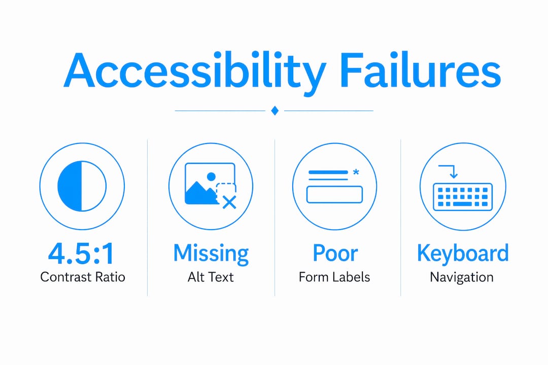
Common compliance failures on medical sites include color contrast ratios below the required 4.5:1 minimum, form fields without visible labels, and interactive elements that are unreachable by keyboard. These are not edge cases. They appear on the majority of healthcare sites audited each year.
Pro Tip: Add automated accessibility scanning tools like axe or Google Lighthouse to your CI/CD pipeline. They catch regressions before deployment, saving far more time than post-launch fixes.
How do accessible design principles address medical website users?
The patient population that relies most on accessible design is not a niche group. Adults 65 and older form the largest demographic using digital health interfaces, and they are also the most likely to have vision loss, motor impairment, or cognitive decline. Designing for this group improves the experience for every user on your site.

Color vision deficiency affects approximately 300 million people worldwide. A medical site that uses red alone to flag a critical drug interaction or an urgent appointment alert will fail those users entirely. The fix is straightforward: pair color with text labels, icons, or patterns so the information survives in grayscale.
Keyboard and assistive technology usability is where most medical sites fall short in ways that directly harm patients. Consider these high-stakes interactions:
- Prescription refill screens that require mouse clicks to activate dropdowns lock out users who rely on keyboard navigation or switch access devices.
- Appointment booking flows with auto-advancing carousels or timed session timeouts cut off users who need more time to read and respond.
- Patient portal logins without clear focus indicators leave screen reader users unable to locate the active field.
Inaccessible prescription refill screens directly harm patient outcomes. That is a clinical care failure, not a design inconvenience.
Cognitive load is the other dimension most designers underestimate. Patients arriving at a medical site are often anxious, in pain, or managing a health crisis. A cluttered layout with competing calls to action, inconsistent navigation, and dense medical jargon raises the cognitive cost of every task. Clear visual hierarchy, predictable page structure, and plain language reduce that burden and keep patients moving toward the care they need.
Pro Tip: Recruit users with disabilities to test your site before launch. A 30-minute session with a screen reader user will surface more real problems than any automated audit.
What are common mistakes in accessible medical website design?
The most damaging accessibility failures on medical sites share one root cause: accessibility treated as a feature to add later rather than a foundation to build from. Post-launch accessibility retrofits are expensive, incomplete, and often miss the structural problems that only a rebuild can fix.
The table below maps the most common mistakes against the correct approach:
| Common Mistake | Best Practice |
|---|---|
| Using color alone to signal critical information | Pair color with text labels, icons, or patterns |
| No keyboard navigation path through forms | Test every interactive element with Tab key only |
| Missing alt text on medical images and charts | Write descriptive alt text that conveys clinical meaning |
| Unlabeled form fields and input errors | Use visible labels and specific error messages |
| Complex navigation with 3+ levels of dropdowns | Use flat navigation with clear, descriptive link text |
| Accessibility audit done only at launch | Run automated scans continuously throughout development |
One mistake deserves extra attention: relying on accessibility overlay widgets as a compliance solution. These third-party scripts claim to fix accessibility issues automatically. They do not. They mask surface problems while leaving structural barriers intact, and they have been challenged in court as insufficient for ADA compliance. Build accessibility into the code from the start. Review the most common design errors that affect aging patients to see how these mistakes play out in practice.
How can healthcare organizations implement accessible design effectively?
Effective implementation follows a clear sequence. Organizations that skip steps early pay for it in retrofits and legal exposure later. Here is the process that works:
-
Start at the architecture stage. Define accessibility requirements in your site brief and vendor contracts before a single wireframe is drawn. Early integration of accessibility in site architecture prevents the costly modifications that come from treating it as an afterthought.
-
Conduct a needs assessment. Audit your current site with tools like axe, Lighthouse, or WAVE to establish a baseline. Document which WCAG 2.1 AA criteria you fail and prioritize fixes by patient impact.
-
Engage the disability community. Proactive engagement with disabled users improves accessibility program outcomes and builds genuine trust. Recruit participants through disability advocacy organizations or patient advisory boards.
-
Build with semantic HTML. Use heading hierarchy correctly (H1 through H3 in logical order), label every form element, and write descriptive alt text for every image that carries clinical meaning.
-
Implement skip links and focus management. Skip navigation links let keyboard users jump directly to main content. Focus management ensures that after a modal closes or a form submits, focus returns to a logical location.
-
Add captions and transcripts. Any video content, including patient education videos and telehealth instructions, requires accurate captions. Auto-generated captions from YouTube or Vimeo are not sufficient for medical content where accuracy is critical.
-
Test with real assistive technology. Automated tools catch roughly 30–40% of accessibility issues. Manual testing with JAWS, NVDA, or VoiceOver catches the rest. Schedule testing at every major development milestone, not just before launch.
The medical practice website launch checklist for 2026 covers the legal accessibility standards your site must meet before going live. Use it alongside your WCAG audit to close compliance gaps before patients encounter them.
Accessible portals improve patient engagement, health equity, and compliance outcomes. That combination makes accessibility one of the highest-return investments a healthcare organization can make in its digital presence.
Key takeaways
Accessible medical website design is a clinical and legal obligation that requires WCAG 2.1 AA compliance, early architectural integration, and real user testing to protect patients and reduce organizational risk.
| Point | Details |
|---|---|
| Legal compliance is mandatory | ADA Title III, Section 504, and ACA Section 1557 all require WCAG 2.1 AA for medical sites. |
| POUR principles are the framework | Every design decision should satisfy Perceivable, Operable, Understandable, and Robust criteria. |
| Aging adults are the primary audience | Adults 65 and older form the largest patient demographic depending on accessible digital health tools. |
| Accessibility must start at architecture | Post-launch retrofits are costly and incomplete; build accessibility into the site structure from day one. |
| Real user testing is non-negotiable | Automated tools catch only 30–40% of issues; manual testing with assistive technology closes the gap. |
Accessibility is a clinical issue, not a design checkbox
I have reviewed enough medical websites to say this plainly: most accessibility problems I see are not technical failures. They are failures of priority. A development team that treats WCAG compliance as a final QA checklist item will always produce a site that technically passes automated scans and practically fails real patients.
The detail that changed how I think about this came from working with a patient who used a switch access device. She could not complete a prescription refill on a major health system's portal because the confirmation button was only reachable by mouse click. The clinical consequence was a missed dose. That is not a UX statistic. That is a patient harmed by a design decision someone made without thinking about her.
Cognitive load on anxious patients is the other issue I see consistently underweighted. Designers optimize for visual appeal and information density. Patients arriving at a medical site are often scared, in pain, or managing a diagnosis they just received. A homepage with six competing calls to action and a rotating hero banner is not welcoming. It is exhausting. Simplicity is not a design preference in healthcare. It is a clinical requirement.
The organizations that get this right share one practice: they engage patients with disabilities in the design process before launch, not after. That single shift changes the quality of every decision that follows. You stop designing for an imagined average user and start designing for the actual range of people who need your site to work.
— Kate
Build an accessible medical website that works for every patient
Medical practices that invest in accessible design acquire patients that competitors turn away and build the kind of digital trust that converts first-time visitors into long-term patients.

Epdwebsites has built professional websites for medical practices since 2009, with a focus on the design standards that protect your practice legally and serve your patients well. From semantic code structure to contrast-compliant color systems, every site we build is designed to meet WCAG 2.1 AA requirements from the first wireframe. Explore our web design and hosting features to see how we approach accessibility for healthcare professionals, or visit our website accessibility services page to discuss your compliance needs directly.
FAQ
What does accessible design mean for medical sites?
Accessible design for medical sites means building digital healthcare platforms that users with disabilities, including those with visual, motor, cognitive, and hearing impairments, can fully use. The standard is WCAG 2.1 Level AA, required under ADA Title III, Section 504, and ACA Section 1557.
Which accessibility standard applies to healthcare websites?
WCAG 2.1 Level AA is the required standard for healthcare websites in the United States. It contains 50 success criteria across four POUR principles and satisfies the requirements of ADA Title III, Section 504, and ACA Section 1557.
What are the most common accessibility failures on medical sites?
The most common failures include insufficient color contrast below the 4.5:1 minimum ratio, missing alt text on medical images, unlabeled form fields, and interactive elements that cannot be reached by keyboard navigation alone.
How does accessible design affect patient outcomes?
Inaccessible medical websites create direct clinical harm. When patients cannot complete prescription refills, book appointments, or access health records online, they miss care. Accessible design removes those barriers and improves health equity across patient populations.
How often should a medical website be tested for accessibility?
Accessibility testing should occur at every major development milestone, not just at launch. Automated tools like axe and Lighthouse should run continuously in the development pipeline, with manual assistive technology testing before each significant release.