
Sidebar content on professional websites is defined as a secondary panel that guides users, surfaces key resources, and drives conversions without competing with the main content. Web designers and digital marketers who understand the role of sidebar content on professional sites gain a direct advantage: a well-built sidebar reduces bounce rates, supports site architecture, and signals credibility to first-time visitors. The sidebar is not decoration. It is a functional tool that, when used correctly, acts as a compact control panel for the entire site experience.
What types of content work best in sidebars on professional sites?
The most effective sidebar content is selective, not exhaustive. Lean, intentional sidebars act like compact control panels that improve user focus and discovery rather than overwhelming visitors with choices. Every element you place in a sidebar should answer one question: does this help the user take a meaningful next step?
The sidebar widgets that consistently perform well on professional service sites include:
- Search box. Search remains one of the most useful sidebar widgets for visitors who arrive with specific questions. This is especially true for law firms, medical practices, and consulting sites with deep content libraries.
- Author or firm bio. A short bio with a professional photo builds immediate trust. For attorneys and CPAs, this widget reinforces personal credibility before the visitor reads a single word of body content.
- Related or popular posts. These keep visitors moving through your content and reduce exit rates on blog-heavy professional sites.
- Single, focused call to action. Focused CTAs improve conversion without distracting from the primary content. One CTA per sidebar, not three.
- Simple category navigation. A short list of practice areas or service categories helps users self-segment and find relevant pages fast.
What does not belong in a professional sidebar: social media counters, tag clouds, excessive advertising banners, and outdated widgets. Social counters and tag clouds reduce site trust and slow load performance. They signal a site that has not been maintained, which is the last impression a law firm or medical practice wants to make.
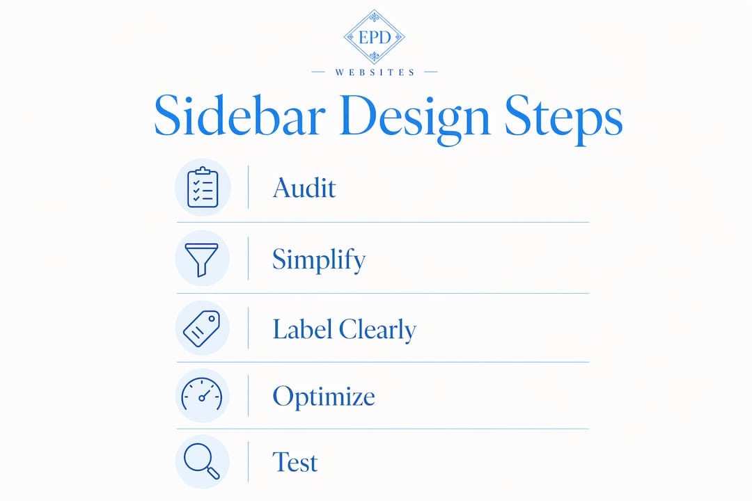
Pro Tip: Audit your sidebar once per quarter. Remove any widget that has not generated a click or conversion in 90 days. A shorter sidebar almost always outperforms a longer one.

How does sidebar design impact user experience and site functionality?
Sidebar design directly shapes how much a visitor trusts your site. A cluttered sidebar signals disorder. A clean one signals professionalism. The sidebar should complement the main content like a light side dish, not a competing buffet. That framing is useful because it reminds you that the sidebar's job is support, not spotlight.
Visual hierarchy matters as much in the sidebar as it does in the main content area. Use clear heading labels for each widget group, consistent font sizing, and enough white space to separate elements visually. Visitors scan sidebars in under two seconds. If the structure is not immediately clear, they ignore it entirely.
Responsive design is non-negotiable for professional sites. On mobile devices, a traditional sidebar stacked below the main content creates a poor reading experience. The better approach is to collapse the sidebar into a hidden or off-canvas state on small screens, surfacing only the most critical element, typically the CTA or search box, as an inline component within the content flow.
Accessibility is a legal and ethical requirement, not a bonus feature. Sidebars should use proper ARIA landmark roles so screen readers can identify and skip the sidebar navigation. Collapsed sidebar icons use tooltips and aria-labels to maintain screen reader accessibility. For professional service providers like healthcare practices and law firms, website accessibility compliance is directly tied to ADA obligations.
Pro Tip: Place your sidebar on the right side of the page for content-heavy professional sites. Eye-tracking research consistently shows that users read the main content column first. A right-side sidebar stays visible without interrupting the reading path.
How should sidebars be technically implemented for professional websites?
Technical implementation determines whether your sidebar enhances or degrades the user experience. The structure matters as much as the content inside it.
-
Use a persistent sidebar pattern for deep-content sites. Persistent sidebar navigation is ideal for authenticated, resource-heavy, or deep-content applications. Law firm resource centers, healthcare patient portals, and consulting knowledge bases all benefit from a sidebar that stays visible as users scroll and navigate.
-
Build collapsible states with animated width transitions. Common sidebar widths range from 300px expanded to approximately 58px collapsed in responsive designs. Animated transitions between states feel polished and reduce cognitive disruption. Abrupt layout shifts feel broken.
-
Save collapse preferences across sessions. Sidebar collapse preferences should be stored in local storage or user session data so returning visitors see the sidebar in the state they left it. This small detail significantly improves the experience for repeat visitors.
-
Implement keyboard navigation and focus management. Sidebar menus must be fully navigable by keyboard. When a collapsible sidebar opens or closes, focus should move predictably. Accessibility best practices for sidebars include aria-labels, proper landmark navigation, and keyboard focus management, especially in collapsible or overlay states.
-
Switch to an off-canvas drawer on mobile. Mobile layouts commonly switch to an overlay drawer pattern for better usability at small viewports. The drawer should open from a clearly labeled hamburger or menu icon and close with both a button and a background tap.
| Implementation feature | Desktop behavior | Mobile behavior |
|---|---|---|
| Sidebar width | 240–300px expanded, 58px collapsed | Hidden by default |
| Navigation pattern | Persistent vertical rail | Off-canvas overlay drawer |
| Collapse state | Saved in session or local storage | Not applicable |
| Accessibility | ARIA landmarks, keyboard focus | Touch targets, focus trap in drawer |
| CTA placement | Sidebar widget, fixed position | Inline within content or sticky footer |
Performance is a real concern. Heavy sidebars loaded with third-party widgets, social feeds, and unoptimized images slow page load times. Slow pages hurt both user experience and search rankings. Keep sidebar assets lightweight and lazy-load any images or embeds that are not immediately visible.
What sidebar content patterns work for professional service websites?
Professional service websites share a common goal: build trust fast and move the visitor toward contact. The sidebar is one of the most reliable tools for doing both. The patterns below apply across law firms, medical practices, real estate agencies, and consulting firms.
For law firms, the sidebar typically carries a short attorney bio with a headshot, a "Schedule a Consultation" CTA, and a list of practice areas. Law firm website layouts consistently use the sidebar to surface the attorney's credentials and a direct contact path. This pattern works because it answers the two questions every prospective client has: "Who am I dealing with?" and "How do I reach them?"
For healthcare and clinic sites, the sidebar serves a slightly different function. Clinic website navigation best practices recommend using the sidebar for appointment booking links, insurance information shortcuts, and location details. Patients arriving on a specific service page want to know if the practice accepts their insurance and how to book. The sidebar delivers those answers without forcing them to hunt through the main navigation.
For consulting and financial services sites, the sidebar works best as a content discovery tool. Related articles, downloadable guides, and a newsletter signup widget keep visitors engaged longer and position the firm as a knowledge authority. Building trust through website design depends heavily on demonstrating expertise, and a sidebar that surfaces relevant resources does exactly that.
Consistent sidebar content also improves SEO by giving search engine crawlers a clear picture of site hierarchy. Changing sidebar content drastically between pages confuses both users and crawlers. Keep the core sidebar structure consistent across all pages, and only swap out contextual elements like related posts based on the current page topic.
The key principle across all professional niches: one sidebar, one purpose per widget, one CTA. Sidebars that try to do everything end up doing nothing well.
Key Takeaways
A well-designed sidebar acts as a purposeful support panel that guides visitors, reinforces trust, and drives conversions without distracting from the main content.
| Point | Details |
|---|---|
| Selective content wins | Include only search, bio, related posts, and one CTA. Remove everything else. |
| Design signals trust | A clean, decluttered sidebar tells visitors the site is maintained and professional. |
| Accessibility is required | Use ARIA landmarks, keyboard navigation, and tooltips to meet ADA standards. |
| Mobile needs a different pattern | Switch to an off-canvas drawer on small screens. Never stack a full sidebar below content. |
| Consistency supports SEO | Keep core sidebar structure the same across pages to help crawlers read site hierarchy. |
What I've learned from sidebars that actually work
The most common sidebar mistake I see on professional service sites is not overloading the sidebar. It is ignoring it entirely. Designers spend weeks on the homepage hero and the service pages, then drop a generic widget area in the sidebar and call it done. That sidebar then sits there for three years, showing a tag cloud from 2021 and a social counter with 47 followers. That is not neutral. It actively damages credibility.
The second mistake is treating the sidebar as a marketing billboard. I have seen law firm sidebars with four different CTAs, two banner ads, and a newsletter popup trigger. Visitors do not convert from sidebars that feel like a highway rest stop. They convert from sidebars that feel like a helpful colleague pointing them in the right direction.
The insight that changed how I approach sidebar design is this: the sidebar should have a single job on each page type. On a blog post, its job is to keep the reader engaged and offer a next step. On a service page, its job is to reduce friction to contact. On a resource page, its job is to surface related material. When you define the job first, the content choices become obvious.
Test your sidebar. Use heat mapping tools to see what visitors actually click. Most designers are surprised to find that the search box outperforms every other sidebar element on content-heavy sites. That data should drive your decisions, not assumptions about what looks good.
— Kate
How Epdwebsites builds sidebars that work for professionals
Professional service websites need sidebars that are clean, accessible, and built to convert. Epdwebsites has designed and hosted professional websites since 2009, working with attorneys, CPAs, real estate agents, and medical practices across Glendale, AZ, and beyond.

Every site Epdwebsites builds includes thoughtful navigation architecture, responsive sidebar design, and accessibility compliance from day one. You get a sidebar that serves your visitors without cluttering your pages or slowing your load times. Explore the web design features Epdwebsites offers for professional service providers, or browse the client portfolio to see how sidebar design works in real professional site builds.
FAQ
What is the role of sidebar content on professional sites?
The sidebar acts as a secondary navigation and conversion panel that guides visitors to key resources, contact options, and related content. Its job is to support the main content without competing with it.
What sidebar widgets should professional service sites avoid?
Avoid social media counters, tag clouds, multiple competing CTAs, and outdated third-party widgets. These elements reduce trust and slow page performance without adding user value.
How should sidebars behave on mobile devices?
On mobile, sidebars should collapse into an off-canvas drawer triggered by a menu icon. Stacking a full sidebar below the main content creates a poor reading experience on small screens.
Does sidebar content affect SEO?
Consistent sidebar structure across pages helps search engine crawlers read site hierarchy clearly. Changing sidebar content dramatically between pages can confuse both users and crawlers.
When should a professional site use a sidebar vs. header navigation?
Use a sidebar when the site has deep content, authenticated areas, or resource libraries that require persistent navigation. Use header navigation for marketing-focused sites with shallow page structures.