
Most professionals assume a polished website means a great website. Clean fonts, a professional color palette, a logo that looks sharp on mobile. That assumption is exactly what makes understanding user experience for professional sites so valuable. UX, the industry term for user experience, goes far beyond how a site looks. IBM defines UX to include ease of use, accessibility, emotional satisfaction, and iterative testing. For attorneys, consultants, CPAs, and medical practices, every one of those elements directly affects whether a visitor becomes a client or clicks away.
Table of Contents
- Key Takeaways
- What is user experience for professional sites
- Core principles of UX design for professionals
- How iterative testing drives better UX outcomes
- Applying UX principles to your professional site
- My honest take on UX and professional websites
- Put better UX to work for your professional site
- FAQ
Key Takeaways
| Point | Details |
|---|---|
| UX is not just visual design | It covers usability, accessibility, performance, and the emotional impact your site creates on visitors. |
| Professional sites need trust signals | Emotional satisfaction and reduced friction directly influence whether a visitor submits an inquiry. |
| Testing beats assumptions | Scenario-based usability testing reveals real user behavior that subjective feedback consistently misses. |
| Speed has a direct cost | A one-second load delay can reduce conversions by 20%, making performance a core UX concern. |
| Iteration drives improvement | UX is not a one-time build. Testing, refining, and retesting prevents new problems from replacing old ones. |
What is user experience for professional sites
User experience, or UX, refers to every aspect of interaction a visitor has with your website, including usability, accessibility, visual design, performance, and emotional impact. It is not a single feature. It is the sum of every moment a person spends on your site, from the second it loads to the moment they close the tab or submit a contact form.
Understanding the user experience definition clearly requires separating three concepts that professionals often confuse:
- User experience (UX): The holistic, end-to-end quality of how a visitor feels and what they can accomplish on your site.
- Usability: A subset of UX focused specifically on whether users can complete tasks efficiently and without error. Can they find your services page? Can they locate your phone number in under ten seconds?
- User interface (UI): The visual layer only. Buttons, typography, spacing, color. UI is what the site looks like. UX is how using it feels.
The user interface vs user experience distinction matters because a site can have a beautiful UI and terrible UX. Imagine a law firm website with elegant design but a contact form buried three clicks deep. The interface looks professional. The experience frustrates.
Emotional impact deserves its own emphasis here. When a prospective client visits a CPA's website, they are not just scanning for services. They are deciding whether they trust the firm. A site that loads slowly, has unclear navigation, or uses confusing language creates low-level stress that most visitors never consciously identify. They just leave.
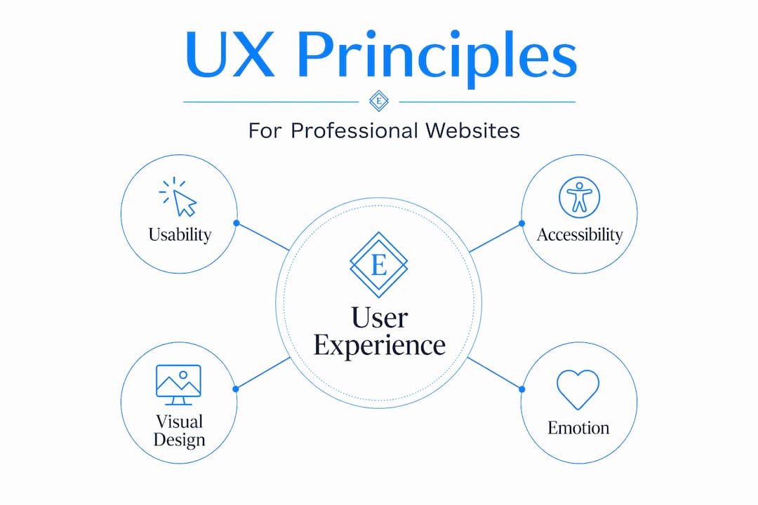
Core principles of UX design for professionals
Applying UX principles to a professional services website means addressing four interdependent layers. Neglect any one of them and the others compensate poorly.
Usability: removing the guesswork
Professional site usability means visitors can find what they need without thinking hard about it. NN/g describes experience design as holistic and human-focused, built to align user needs with business goals through research. In practice, that means clear navigation labels, a logical page hierarchy, and what UX practitioners call "information scent," the subtle cues that tell users they are moving in the right direction.

A well-structured clinic website navigation is a clear example. Patients should be able to identify services, confirm location, and book an appointment in three clicks or fewer. Every additional step is friction, and friction costs you clients.
Accessibility: designing for everyone
Accessibility means your site works for users with visual impairments, motor limitations, or cognitive differences. This is not a secondary concern. An inaccessible site excludes a portion of your potential client base and, in regulated industries, may create legal exposure. Color contrast ratios, keyboard navigability, and descriptive alt text on images are not design flourishes. They are baseline requirements for a professional site that actually works.
Visual design in service of clarity
This is where professionals most often confuse cause and effect. Visual design does not create trust on its own. It supports clarity, hierarchy, and emotional tone. Professional photography contributes meaningfully here because authentic imagery builds credibility faster than stock photos. Typography choices affect whether body copy feels readable or exhausting. Every visual decision should serve comprehension first and aesthetics second.
Emotional satisfaction
This is the layer most often skipped. When a visitor leaves your site, they carry an impression. That impression drives whether they call you, refer you, or forget you. Good UX includes emotional satisfaction alongside functionality, and for professional services, that translates to confidence, reassurance, and ease. A site that confirms expertise quickly and answers obvious questions without forcing visitors to dig creates the right emotional residue.
Pro Tip: Place your most credible trust signal — a specific result, a credential, a client outcome — above the fold on your homepage. Visitors make trust assessments in under five seconds.
How iterative testing drives better UX outcomes
Building a professional website once and assuming it works is the single most common UX mistake. The reality is that UX work is iterative and evidence-based, meaning you test, learn, refine, and retest. Skipping this loop means you are optimizing based on your own assumptions rather than actual visitor behavior.
Here is how a practical iterative UX process works for a professional services site:
- Define realistic scenarios. Write tasks that reflect what real visitors actually try to do. "Find out if this attorney handles employment disputes" is a scenario. "Browse the website" is not.
- Run think-aloud testing. Ask test participants to narrate their thought process while completing tasks. Scenario-based think-aloud testing surfaces the specific moments where users hesitate, misread, or give up. These moments are invisible in analytics data alone.
- Identify friction points, not just failures. A user who eventually finds the contact page but takes four wrong turns has exposed a real problem. Even task completion with hesitation counts as friction worth fixing.
- Redesign and retest. This step is where teams often stop too early. Retesting after changes confirms the fix worked without introducing a new problem elsewhere.
- Track performance metrics alongside behavior. Numbers confirm scale. Behavior explains cause.
On the technical side, three Core Web Vitals metrics directly measure real-user experience quality.
| Metric | What it measures | Why it matters for professional sites |
|---|---|---|
| LCP (Largest Contentful Paint) | How fast the main content loads | Slow LCP signals an unprofessional, sluggish experience |
| INP (Interaction to Next Paint) | How quickly the page responds to clicks | Delays here create the feeling that the site is broken |
| CLS (Cumulative Layout Shift) | How much the page shifts as it loads | Unexpected shifts frustrate users mid-read or mid-click |
Core Web Vitals reflect real user performance in ways that traditional load-time metrics miss. A site that scores poorly on these measures feels slow and unreliable even if the design looks perfect.
The business case is not subtle. A one-second delay in response can reduce conversions by 20% and user satisfaction by 16%. For a professional services firm where each client is worth thousands of dollars, that math demands attention.
Pro Tip: Run a free Core Web Vitals check using Google PageSpeed Insights before investing in a redesign. You may find performance issues that are cheaper to fix than a full overhaul.
Applying UX principles to your professional site
Theory lands differently when you walk through a real example. Consider how a prospective client experiences a law firm website for the first time.
They arrive from a search result. They are looking for specific help, and they are evaluating three or four firms simultaneously. The user journey on professional sites is not a single action. It is a sequence of micro-interactions, each one either building or eroding trust.
Here is a comparison of what effective and ineffective UX looks like on that same firm's site:
| UX Element | Weak implementation | Strong implementation |
|---|---|---|
| Homepage headline | "Welcome to our firm" | Specific statement of who you serve and what you solve |
| Services overview | Single dense paragraph | Scannable list with individual service pages |
| Social proof | No testimonials visible | Client outcomes or quotes above the fold |
| Contact path | Contact page buried in footer nav | Multiple entry points: header button, inline CTAs, sticky bar |
| Mobile experience | Desktop layout forced onto mobile | Fully responsive with tap-friendly buttons |
The most common UX pitfalls that derail professional site inquiries include:
- Using industry jargon that clients do not recognize as their problem
- Burying credentials and proof behind multiple clicks when they should be immediate
- Contact forms with too many required fields, which increases abandonment sharply
- No clear next step after a visitor reads a service page
The goal of improving UX for websites in a professional services context is not perfection on first build. It is a site architecture that guides a high-intent visitor from "Is this firm credible?" to "I want to reach out" with the fewest possible obstacles.
My honest take on UX and professional websites
I've worked with enough professional services websites to say this plainly: the majority of UX problems I see have nothing to do with design. The site looks fine. The problem is that nobody ever watched a real person try to use it.
In my experience, business owners build websites from the inside out. They organize pages the way they think about their own business rather than the way a confused, skeptical first-time visitor moves through information. That gap between internal logic and visitor logic is where most UX failures live.
What I've found actually works is simple but underused: sit with five people who match your ideal client profile and watch them try to complete one task on your site without your help. Do not explain anything. Just watch. Within thirty minutes you will see patterns that no analytics dashboard would ever surface.
The other thing I've learned is that performance and emotion are more connected than most people expect. A site that loads in under two seconds creates a different emotional starting point than one that loads in four. Visitors are not consciously thinking about load time. But they are forming an opinion about your professionalism in those first seconds, and a slow site sets a negative tone that even great content struggles to recover from.
The best investment in professional site design is not a bigger budget for visuals. It is a commitment to testing what you have built against real human behavior, then fixing what you find, and repeating that cycle.
— Kate
Put better UX to work for your professional site
Understanding UX principles is the first step. Applying them to a site that actually converts visitors into clients is where the work gets specific.

At Epdwebsites, we have been building professional websites for attorneys, medical practices, CPAs, consultants, and real estate professionals since 2009. Every site we design is built around the UX principles covered in this article: clear navigation, mobile-first responsiveness, fast load times, and trust signals placed where they actually get seen. You can review our service features and design approach to see how we apply these principles in practice, or browse our client portfolio to see completed work across professional industries. If you are ready to improve how your site performs for real visitors, we offer ongoing site update services to keep your UX sharp as your business evolves.
FAQ
What does user experience mean for a professional website?
User experience for a professional website refers to everything a visitor feels and accomplishes during their time on the site, including how easy it is to navigate, how fast it loads, and whether it builds trust. It goes well beyond visual design to include accessibility, performance, and emotional impact.
How is UX different from UI on a professional site?
UI (user interface) refers to the visual design layer: colors, fonts, and layout. UX (user experience) covers the entire interaction, including usability, emotional response, and whether visitors can achieve their goals. A site can have polished UI and still deliver a poor UX if the structure or performance is weak.
How does website speed affect user experience?
A one-second load delay reduces conversions by 20% and satisfaction by 16%. For professional services sites where each new client has high value, slow performance directly translates to lost revenue.
What is the best way to test UX on a professional site?
Scenario-based usability testing with a think-aloud protocol is the most reliable method. Give real users a specific task to complete and observe without interrupting. Their hesitations and wrong turns reveal friction that analytics alone cannot explain.
How often should a professional website's UX be reviewed?
UX should be reviewed at least once a year and after any significant change to your services, site structure, or audience. Because UX work is iterative by nature, periodic testing and refinement keeps the site aligned with how real visitors actually behave.