
Most attorneys and web designers treat white space as a problem to fix. If there is empty space on a page, the instinct is to fill it with another practice area, a badge, a testimonial, or a stock photo. That instinct costs you clients. Understanding what is white space in legal web design, and more importantly why it works, separates websites that convert visitors into consultations from websites that just exist. This article walks you through the definition, the psychology, the data, and the practical steps to use it well.
Table of Contents
- Key Takeaways
- What is white space in legal web design
- Why white space matters for law firm websites
- Common pitfalls when applying white space
- Best practices for using white space on legal websites
- The data behind white space and legal website performance
- My honest take on white space in law firm design
- See the difference professional spacing makes
- FAQ
Key Takeaways
| Point | Details |
|---|---|
| White space is intentional design | It is the deliberate use of empty area to direct attention, group content, and signal professionalism. |
| It directly boosts comprehension | Effective white space use improves reading comprehension and information retention by up to 20%. |
| Brand perception is tied to spacing | Tight, crowded layouts signal low-quality service, while generous spacing signals a premium, authoritative firm. |
| Mobile spacing is non-negotiable | 73% of mobile users will abandon a site when spacing and design negatively impact their experience. |
| Consistent spacing scales build trust | Using multiples of 4px or 8px across your layout keeps the UI cohesive and professionally credible. |
What is white space in legal web design
White space is every area on a web page that is intentionally left free of content. It is the gap between a headline and a paragraph, the margin on either side of your body text, the breathing room around a call-to-action button. The term "white space" comes from print design, but on a website it has nothing to do with color. Your background could be navy blue, soft gray, or deep charcoal. If there is intentional empty area separating elements, that is white space.
Designers typically split it into two categories. Micro white space refers to the small-scale spacing built into text itself. Line height, the gap between paragraphs, letter spacing, and padding inside a button are all micro white space. Micro white space like line height and paragraph spacing improves readability more directly than font size changes alone. Macro white space is the bigger picture. It is the wide margins on either side of your content column, the generous gap between a hero section and the services section below it, the space that makes a page feel open.
In CSS terms, you control white space through a few key properties:
- Margin: space outside an element, separating it from neighboring content
- Padding: space inside an element, between its border and its content
- Line-height: vertical space between lines of text
- Gap: spacing between flex or grid children
Understanding these tools lets you apply spacing with precision. A page without intentional spacing is visual clutter. It forces the visitor's eye to work harder, raises cognitive load, and creates the subconscious impression that the site (and by extension the firm) is disorganized.
Why white space matters for law firm websites
A legal website carries a specific burden that a restaurant or e-commerce site does not. It has to communicate credibility before a visitor reads a single word of content. Spacing does a significant share of that work.
Research shows that reading comprehension improves by up to 20% when web pages apply white space effectively. For a law firm, that is not just a UX statistic. It means potential clients actually absorb and retain what your attorney bio, your practice area descriptions, and your case results say. A crowded page gets skimmed and closed.
"White space is a strategic decision directing user attention and establishing hierarchy, not just empty area." — Defending the White Space
The brand perception effect is just as significant. Generous white space signals a premium, authoritative brand, while tightly packed layouts create the impression of a bargain or low-quality service. Think about how luxury brands present their products online compared to discount retailers. The spacing is doing the talking before the copy does. For a law firm charging premium hourly rates, a cluttered website sends exactly the wrong message.
There is also a psychological mechanism at work. The human brain processes a screen by trying to group related items and distinguish separate ones. When everything is compressed together, the brain cannot build a clear mental map of the page. It signals stress instead of confidence. White space reduces that cognitive friction. It tells the visitor's brain: "This is organized. You are in good hands."

This is why the most respected law firm websites, especially those serving corporate clients or high-net-worth individuals, consistently use minimalist legal web design principles with generous margins, clean type, and deliberate spacing between sections. The aesthetic in legal websites that converts is calm, not crowded.
Common pitfalls when applying white space
Knowing what white space is and applying it well are two different skills. Most mistakes fall into a small number of patterns.
Too little space is the most common error. It usually happens because someone with authority over the project insists on fitting more content "above the fold." The result is a page that looks like a legal bulletin board. Every element competes with every other element, and nothing wins.
Too much space creates a different problem. Vast empty stretches between short blocks of text can make a page feel unfinished or leave mobile users confused about whether content is loading. Scandinavian design tradition treats white space as structural glue for eye flow, guiding visitors from one element to the next. Space that goes unused without directing attention is just space.
Inconsistent spacing may be the most damaging mistake for credibility. If your section margins jump from 40px to 24px to 60px without a logical reason, the UI looks amateur, even if the visitor cannot identify why. Consistent spacing scales using multiples of 4px or 8px maintain UI cohesion and preserve trust. Pick a base unit and stick to it.
Mobile design adds another layer. Spacing that works beautifully on a 1440px desktop monitor can collapse into awkward voids on a 390px phone screen. Mobile layouts require a minimum 16px lateral padding to maintain professionalism and usability on small screens. Adjust your spacing intentionally for each breakpoint rather than letting the desktop layout scale down automatically.
Pro Tip: When a client or stakeholder pushes you to "fill the empty space," ask them to identify one specific piece of content the current page fails to communicate. If they cannot name one, the space is doing its job.
Here are the most common pitfalls to watch for when building or auditing a legal website:
- Padding on text blocks set to zero, making headings merge visually with body copy
- Line-height set below 1.5 on body text, creating tight, hard-to-read paragraphs
- CTAs crammed next to other elements with no isolation margin
- Section breaks defined only by a background color change rather than vertical spacing
- Mobile padding set to the same pixel value as desktop without adjustment
Best practices for using white space on legal websites
Applying white space well is less about following rigid rules and more about building a deliberate hierarchy. Every element on a legal website competes for attention. White space is how you assign priority.
Here is a practical process to get it right:
- Start with your most important CTA. Give the button or link at least 24px of padding on all sides internally and 40px or more of clear margin separating it from surrounding content. Isolated CTAs get clicked.
- Use proximity to group related content. A practice area heading, a one-paragraph description, and a "Learn More" link should sit closer together than the gap separating them from the next practice area. This is the Law of Proximity in practice.
- Set body text line-height between 1.5 and 1.8. Anything below 1.5 creates a reading tax on your visitor. Anything above 1.8 starts to feel disconnected.
- Widen your content column margins on desktop. A 1200px container on a 1440px viewport should have at least 120px of margin on each side. Wider margins create the confident, authoritative feel that premium law firms require.
- Reduce before you add. If a section feels cluttered, the answer is rarely more content. Removing secondary elements is often more effective than cramming content to fit. Cut a redundant sentence. Move a badge to the footer. Let the primary message breathe.
Pro Tip: Before finalizing a design, zoom your browser to 80% and look at the page from two feet away. If elements blend together or the hierarchy is unclear at a glance, you need more space, not more content.
A good example of spacing in practice: compare a law firm homepage with a tightly packed grid of six practice area boxes, each with an icon and four lines of text, to a version that shows three practice areas with more generous card padding and clear vertical breathing room between sections. The second version consistently performs better on visit-to-lead conversion rates because visitors can read it without effort.
The data behind white space and legal website performance
The skepticism around white space is usually rooted in the feeling that empty space is wasted opportunity. The data says otherwise.
| Metric | Impact of White Space Optimization | Source |
|---|---|---|
| Reading comprehension | Up to 20% improvement | designyourway.net |
| CTA conversion rate | 13% lift with more space around buttons | designyourway.net |
| Visit-to-lead conversion | Up to 400% increase for legal sites | designyourway.net |
| Mobile abandonment | 73% of users leave over poor spacing | loop11.com |
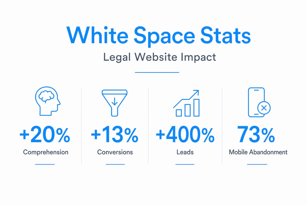
The 13% conversion lift from increased CTA spacing is the figure that tends to change minds in client meetings. It is a concrete, measurable result from a single design adjustment. You do not need to redesign the entire site. Moving content away from your "Schedule a Consultation" button and giving it room to stand alone can move the needle immediately.
The 400% visit-to-lead conversion increase reported for optimized legal websites is a ceiling figure, not an average, but it illustrates the scale of the opportunity when spacing improvements are part of a broader layout overhaul. For attorneys running paid search campaigns, this translates directly into lower cost per lead. Better spacing means better returns on the same ad spend.
And on mobile, the stakes are simply too high to ignore. 73% of mobile users abandon sites where spacing negatively impacts the experience. Since more than half of all web traffic now comes from mobile devices, poor spacing on small screens is not a design preference issue. It is a business problem. You can read more about how attorney website design choices translate directly into client acquisition outcomes.
My honest take on white space in law firm design
I have spent years building and reviewing professional websites, and the white space conversation is one of the most predictable in the business. Every time, someone on the client side points to the empty area around a headline and says, "Can we put something there?" Every time, the answer that serves the firm best is no.
What I have learned is that resistance to white space is rarely about design preference. It is about insecurity. Attorneys who are genuinely confident in their brand are comfortable with a page that says less and says it clearly. Attorneys who are anxious about how they are perceived tend to pile on credentials, badges, and filler copy until the page collapses under its own weight.
The websites I have seen convert the best follow a consistent pattern: they trust the space. They let a strong headline sit alone with room around it. They do not apologize for clean margins. They use minimalist legal web design not because it looks fashionable, but because it works. Visitors read it. They stay longer. They take action.
My advice to any legal professional reviewing their current site: if your designer, or any designer, is telling you that certain space needs to stay empty, listen to them. That restraint is not laziness. It is the whole point.
— Kate
See the difference professional spacing makes
If reading this made you look at your own website differently, that reaction is worth acting on. Epdwebsites has been designing premium websites for attorneys and professional service providers since 2009, and intentional spacing is built into every project from the first wireframe. The difference between a site that looks credible and one that converts visitors into clients often comes down to how thoughtfully the layout breathes.

Browse the website design features Epdwebsites builds for legal professionals, and take a look at completed projects in the design portfolio to see how spacing, hierarchy, and layout work together in practice. If you are ready to talk about what your firm's website should be doing differently, the conversation starts there.
FAQ
What is white space in legal web design?
White space in legal web design is the intentional use of empty space between and around elements on a page. It improves readability, builds credibility, and directs visitor attention toward calls-to-action.
Does white space actually improve conversions on law firm websites?
Yes. Increasing white space around key conversion elements has been shown to lift conversion rates by 13%, and optimized spacing can increase visit-to-lead rates by up to 400% on legal websites.
How does white space affect how visitors perceive a law firm?
Generous white space signals a premium, authoritative brand. Crowded layouts create the perception of a lower-quality or bargain service, which is damaging for law firms charging professional fees.
What spacing rules should I follow for mobile legal websites?
Maintain a minimum of 16px lateral padding on mobile layouts and adjust all spacing at each breakpoint intentionally. Poor mobile spacing drives 73% of users to abandon a website entirely.
What is the difference between micro and macro white space?
Micro white space is the small-scale spacing within text, such as line height and paragraph gaps. Macro white space refers to larger structural spacing like section margins and content column width.