
A law firm website homepage structure is the deliberate arrangement of content and design elements that immediately communicates your firm's expertise, service area, and how clients can reach you. Get it right, and your homepage becomes your most effective intake tool. Get it wrong, and you lose qualified prospects within seconds. Juris Digital identifies contact visibility above the fold as one of the single highest-impact conversion factors on any attorney website. This guide walks you through every structural decision that separates high-performing legal practice homepage layouts from ones that quietly bleed leads.
What are the core elements every law firm homepage must include?
A law firm website homepage structure works when every section answers a specific visitor question before that visitor has to ask it. Smotrów Design frames this as a logical content hierarchy that moves from broad positioning to specific action. Miss one block, and the visitor's mental flow breaks.
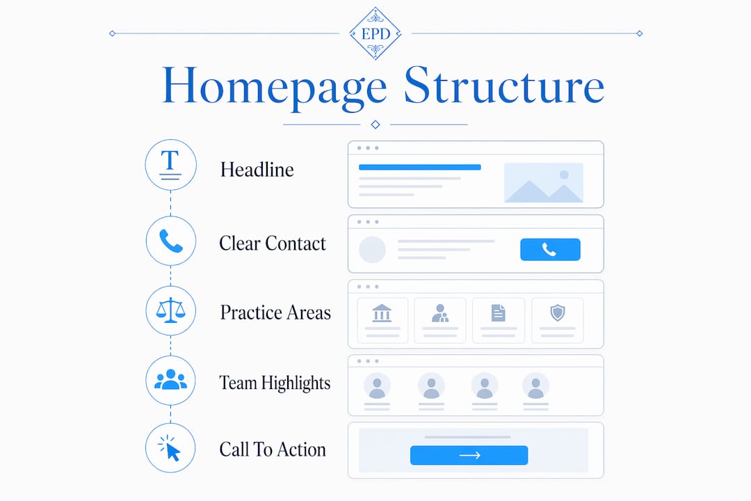
The above-the-fold section
Your above-the-fold area must answer three questions without scrolling: what you do, who you serve, and how to contact you. A headline like "Phoenix Family Law Attorney Serving Maricopa County" outperforms "We Fight for You" every time because it removes ambiguity instantly. Pair that headline with a visible phone number and a primary call-to-action button. Burying contact info is the single fastest way to lose a visitor who has already decided your firm looks credible.

Navigation, practice areas, and team highlights
Sticky navigation with five to seven clearly labeled links keeps visitors oriented without overwhelming them. Below the hero, a brief firm introduction (three to four sentences maximum) should describe your current services and the markets you serve, not your founding story. From there, display your four to six highest-demand practice areas with links to dedicated pages. Over-listing practice areas dilutes focus and pushes visitors toward decision paralysis rather than action.
Attorney highlights come next. A photo, name, title, and two-sentence bio for each key attorney humanizes the firm and builds immediate trust. Follow that with social proof: bar association memberships, peer-reviewed publications, client testimonials, or media mentions. Close the page with a final contact block that gently invites action without pressure.
- Above-the-fold section: headline with practice and geography, phone number, primary CTA button
- Navigation: sticky header, five to seven labeled links, no dropdown overload
- Firm intro: three to four sentences on current services and market focus
- Practice areas: four to six core areas with links to deeper pages
- Attorney highlights: photo, name, title, brief bio
- Trust signals: testimonials, bar memberships, publications, awards
- Final CTA block: contact form or consultation button with low-friction copy
Pro Tip: Replace generic CTA copy like "Contact Us" with intent-specific language such as "Schedule a Free Consultation" or "Explore Our Practice Areas." Smotrów Design reports that context-aware CTAs convert significantly better than generic banners because they match where the visitor is in their decision process.
How should you sequence homepage content to maximize engagement?
The homepage is not a brochure. It is a hub, and fewer than 30% of visitors scroll to the bottom. That means your sequencing decisions directly determine which visitors convert and which ones leave. Every section must answer the question the previous section raised.
Here is the sequence that performs consistently well for attorney website structure:
- Hero section answers: "Is this the right firm for my situation?"
- Firm introduction answers: "What makes this firm different from the ten others I found?"
- Practice areas answers: "Do they handle my specific legal issue?"
- Attorney profiles answers: "Who will actually work on my case?"
- Trust signals answers: "Can I trust this firm with something this important?"
- Final CTA block answers: "How do I take the next step right now?"
Random section placement breaks this flow and forces visitors to work harder than they should. A visitor who has to hunt for your practice areas or scroll past three testimonial carousels before finding a phone number will leave. The homepage as a system concept means each block exists to answer the next logical question, not to fill space or showcase design.
Mobile sequencing deserves separate attention. On mobile, blocks stack vertically, so shorter paragraphs and larger tap targets become non-negotiable. A tap-to-call phone number above the fold on mobile is often the single highest-converting element on the entire page. Keep hero images compressed, CTA buttons at least 44px tall, and navigation menus accessible without covering primary content.
Pro Tip: Test your homepage sequence by reading only the first sentence of each section in order. If those sentences tell a coherent story from "who we are" to "here is how to reach us," your sequence is working. If they feel random or repetitive, restructure before you optimize anything else.
What technical and design practices support a high-performing homepage?
Design and performance are not separate concerns on a law firm website. A visually polished page that loads slowly or breaks on mobile destroys the trust your content was built to create. Google PageSpeed Insights measures three Core Web Vitals that directly affect both rankings and user experience: Largest Contentful Paint (LCP), Interaction to Next Paint (INP), and Cumulative Layout Shift (CLS).
53% of mobile visitors abandon a page that takes longer than three seconds to load. That statistic means a slow hero image is not a minor inconvenience. It is a conversion problem. Compress all hero images, convert them to WebP format, and lazy-load anything below the fold.
| Design Element | Best Practice | Why It Matters |
|---|---|---|
| Hero image | WebP format, under 200KB | Reduces LCP, speeds up first visual load |
| Navigation | Sticky header, max 7 links | Keeps orientation without cognitive overload |
| Phone number | Visible above fold, tap-to-call on mobile | Highest-converting element for mobile visitors |
| Photography | Real attorneys and office, not stock | Builds trust; generic stock photos reduce perceived competence |
| White space | Generous padding between sections | Improves readability and visual hierarchy |
Real photography is not optional for firms that want to project authority. Juris Digital and Epiic Design both flag stock photography as a trust killer. A photo of your actual conference room or your lead attorney at their desk communicates authenticity in a way that a handshake-over-a-gavel image never will. For more on how white space affects legal web design, the principle is straightforward: breathing room between sections reduces cognitive load and makes your content easier to process.
Maintain a clear visual hierarchy by using one dominant headline per section, consistent font sizing, and a color palette that reinforces your brand without competing with your content. Avoid animations that delay content rendering or distract from your primary message.
How to avoid common pitfalls in law firm homepage design
Most homepage failures are not design failures. They are structural failures that no amount of visual polish can fix. Recognizing these patterns early saves significant time and budget.
- Vague taglines: "Experienced. Dedicated. Results-Driven." describes every law firm. A specific positioning headline that names your practice and geography converts better.
- Hidden contact information: Placing your phone number only in the footer guarantees lost leads from visitors who confirmed your credibility and then could not find how to act on it.
- Too many practice areas: Listing 15 practice areas on the homepage signals a generalist firm and overwhelms visitors. Spotlight four to six, link to the rest.
- Slow hero images: Large, uncompressed images push your LCP score above acceptable thresholds and trigger mobile abandonment.
- Stock photography: Courtroom gavels and suited handshakes are immediately recognizable as placeholders. They signal that the firm did not invest in its own presentation.
- Mobile navigation failures: Hamburger menus that expand and cover your hero content push the primary CTA below the fold on small screens.
"The biggest conversion risk on law firm homepages is hiding the contact path, which frustrates visitors who have confirmed your firm is credible and then want to act immediately." — Juris Digital
The pattern behind most of these mistakes is the same: the homepage was designed to impress rather than to guide. Impressing visitors is a byproduct of guiding them well. When your attorney website structure prioritizes the visitor's next question over the firm's desire to showcase credentials, conversion follows naturally.
Key takeaways
A law firm homepage converts when every section answers the visitor's next question in a deliberate sequence, with contact information visible above the fold and practice areas limited to four to six focused options.
| Point | Details |
|---|---|
| Above-the-fold contact visibility | Place your phone number and CTA button where visitors see them without scrolling, on every device. |
| Deliberate content sequencing | Order sections from hero to contact so each block answers the question the previous one raised. |
| Practice area focus | Limit homepage practice areas to four to six; link to dedicated pages for the rest. |
| Mobile performance | Compress hero images to WebP, use tap-to-call links, and keep CTA buttons at least 44px tall. |
| Real photography | Replace stock images with actual attorney and office photos to build immediate credibility. |
What I've learned from building law firm homepages that actually convert
After working with attorneys and professional service firms since 2009, the pattern I see most often is a homepage that was designed by committee. Every partner wanted their specialty featured. The marketing manager wanted the awards carousel. The web designer wanted the full-screen video hero. The result is a page that tries to do everything and guides no one.
The firms with the highest-performing homepages treat the page as a single, linear argument. The headline states who you are and where you practice. The intro explains why that matters to the visitor. The practice areas confirm you handle their issue. The attorney profiles prove a real person will take their call. The trust signals remove the last objection. The contact block removes all friction from the next step.
I have also seen firms spend significant budgets on design and then undermine the entire investment with a phone number buried in the footer. Contact methods buried below the fold often negate otherwise great homepage design. That is an operational checklist item, not a design preference.
The detail most firms overlook is headline specificity. "Trusted Legal Counsel" tells a visitor nothing. "Chicago Employment Attorney for Wrongful Termination Cases" tells them everything in six words. Client-focused headlines that compress your positioning into practice and geography remove ambiguity from the first impression. That specificity is what separates a homepage that ranks and converts from one that simply exists.
— Kate
How Epdwebsites builds law firm homepages that perform
Epdwebsites has designed and hosted professional websites for attorneys and law firms since 2009, with a focus on structure, performance, and client acquisition. Every homepage Epdwebsites builds starts with the same foundation covered in this guide: clear above-the-fold messaging, deliberate content sequencing, and mobile-optimized design that keeps contact information front and center. The professional website features Epdwebsites offers include custom design tailored to your practice area, fast and reliable hosting, and ongoing support so your site stays current as your firm grows. If your current homepage is not guiding visitors toward a consultation, it is time to fix the structure. Epdwebsites makes that process straightforward, affordable, and built to last.
FAQ
What should appear above the fold on a law firm homepage?
Your headline with practice area and geography, a visible phone number, and a primary CTA button must all appear above the fold. Juris Digital identifies this combination as critical to preventing conversion loss from visitors who cannot immediately find how to contact you.
How many practice areas should a law firm list on its homepage?
List four to six of your highest-demand practice areas on the homepage and link each to a dedicated page. Smotrów Design reports that over-listing practice areas overwhelms visitors and reduces the likelihood they will navigate deeper into the site.
Why does page speed matter for a law firm website?
53% of mobile visitors leave a page that loads slower than three seconds, according to GavelGrow. Slow load times directly reduce both your Google rankings and the number of visitors who stay long enough to contact your firm.
Should a law firm use stock photography on its homepage?
No. Juris Digital and Epiic Design both identify generic stock photography as a trust signal failure. Real photos of your attorneys, office, and team communicate authenticity and competence in ways that stock images cannot replicate.
How often should a law firm update its homepage content?
Update your homepage whenever your practice areas, key attorneys, or service geography changes. Epdwebsites recommends reviewing homepage content at least twice per year to confirm that headlines, CTAs, and contact details reflect your current firm positioning.