
Visual hierarchy in web design is the deliberate sequencing of page elements so users notice the most important content first, secondary content second, and supporting details last. Every professional website either guides the eye intentionally or surrenders that control to chance. When hierarchy is weak, attention leaks to the loudest element on the page rather than the most important one. For web designers and developers building sites for attorneys, medical practices, or consultants, that distinction directly affects whether a visitor converts or leaves.
What is visual hierarchy in web design and why does it matter?
Visual hierarchy is the design system that controls the actual order in which a user's eye moves across a page. It operates independently of DOM order or grid placement. A heading placed in the top-left corner of a layout does not automatically receive first attention. What earns first attention is the combination of size, weight, color contrast, spacing, and motion applied to that element.
The importance of visual hierarchy becomes obvious when you compare two landing pages side by side. One has a bold, oversized headline, a clearly separated subheading, and a high-contrast call-to-action button. The other uses similar font sizes throughout, muted colors, and dense paragraphs. On the first page, the eye lands on the primary message by default. On the second, the eye wanders randomly, and the visitor has to work to find the point.
For professional service websites, that wandering is fatal. An attorney's site needs a visitor to immediately understand the practice area and the next step. A medical practice site needs to surface the appointment booking option before anything else. Visual hierarchy in UX design is the mechanism that makes those outcomes predictable rather than accidental.
What are the five primary levers of visual hierarchy?
Understanding visual hierarchy means understanding five distinct tools that designers use in combination. Most pages get two right and three wrong. Using all five on every element simultaneously destroys hierarchy by creating visual noise where everything competes equally for attention.
Size is the most biologically immediate lever. The brain processes scale differences before conscious thought engages. A primary heading should be roughly three times the size of body text, and a subheading should sit at approximately 1.5 times body text size. These three distinct size tiers create a perceptual ranking that requires no learned behavior from the user.

Weight adjusts the visual mass of an element through stroke thickness. Bold text in a paragraph pulls the eye even when the font size matches surrounding text. Used sparingly, weight reinforces size hierarchy. Used everywhere, it cancels itself out.
Space is not passive breathing room. Whitespace acts as a structural ranking mechanism. Isolating a call-to-action button with generous padding signals its priority more effectively than color alone. Grouping related items closer together and separating unrelated items reinforces logical relationships without requiring labels.
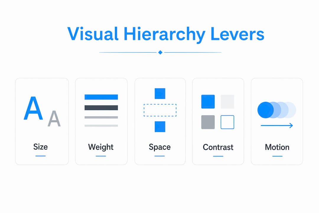
Contrast uses brightness and color saturation to draw focus. A saturated button on a neutral background commands attention. Contrast also carries an accessibility obligation, which the next section covers in detail.
Motion is the highest-impact lever and the most abused one. A single animated element on an otherwise static page captures attention immediately. When every section animates on scroll, motion loses its signal entirely and becomes visual clutter.
- Size: use three distinct tiers per screen, approximately 3x and 1.5x ratios
- Weight: apply bold selectively to reinforce, not replace, size differences
- Space: treat whitespace as a ranking tool, not decoration
- Contrast: use saturation and brightness to mark priority elements
- Motion: reserve animation for one or two finishing moments per page
Pro Tip: Apply the "one dominant element" rule per screen section. If you can identify the single most important element in each viewport, your hierarchy is working. If you cannot, reduce competing signals before adding new ones.
How does accessibility intersect with visual hierarchy?
Accessibility and visual hierarchy are not competing priorities. They reinforce each other, and understanding that relationship makes both stronger. The WCAG 2.x contrast requirements set a minimum 4.5:1 contrast ratio for body text and 3:1 for large text, with enhanced compliance requiring 7:1 for body text. These ratios are not arbitrary. Low contrast undermines hierarchy cues for every user, not just those with visual impairments.
When a designer uses a light gray subheading on a white background to create a subtle secondary tier, that choice often fails the 4.5:1 threshold. The result is a hierarchy signal that sighted users may perceive weakly and users with low vision cannot perceive at all. Fixing the contrast does not flatten the hierarchy. It makes the hierarchy legible to a broader audience.
Inclusive hierarchy design follows a straightforward set of practices:
- Meet WCAG 4.5:1 for all body text and 3:1 for headings above 18pt or 14pt bold
- Use size and weight differences in addition to color, never color alone, to signal hierarchy
- Maintain sufficient spacing between interactive elements so proximity grouping is clear to screen reader users as well as sighted users
- Test pages with browser accessibility tools such as axe DevTools or Lighthouse to catch contrast failures before launch
The website accessibility standards that govern professional service sites in 2026 treat contrast as a baseline, not a bonus. Designers who build hierarchy through contrast, size, and spacing simultaneously satisfy both usability and compliance requirements. That is the most efficient path available.
Visual hierarchy frameworks and examples used in web design
The three-tier size framework is the most reliable starting point for any page layout. Primary headings establish the dominant message. Secondary headings organize supporting sections. Body text delivers detail. The 3x and 1.5x size ratios between these tiers create perceptual separation that users process without effort.
Beyond size, layout reading patterns shape how hierarchy should be structured. Users on content-heavy pages tend to scan in an F-pattern, reading across the top, then down the left side, with diminishing horizontal movement on each pass. Users on marketing or landing pages with visual breaks tend to follow a Z-pattern, moving diagonally across the page. Neither pattern is universal, but both suggest that the top-left region and the first horizontal band carry the highest attention weight on any page.
The table below contrasts strong and weak hierarchy decisions across common design choices:
| Design choice | Strong hierarchy | Weak hierarchy |
|---|---|---|
| Heading size | 3x body text, clearly dominant | Similar size to subheadings, no clear tier |
| CTA button | High contrast, isolated with whitespace | Matches surrounding color palette, crowded |
| Spacing | Related items grouped, unrelated items separated | Uniform padding throughout, no grouping signal |
| Motion | One animated element per section | Every card and section animates on scroll |
| Color contrast | Meets WCAG 4.5:1 for all text | Light gray on white for secondary text |
A common read-path error on professional service websites is placing a testimonial carousel above the primary value proposition. The motion of the carousel pulls attention before the visitor has processed what the firm does. Fixing this requires either moving the carousel below the fold or removing its autoplay behavior so the static headline holds first position.
For legal website design, this kind of read-path discipline is especially important. A visitor arriving from a search for "Glendale DUI attorney" needs to confirm practice area, location, and contact method within the first viewport. Hierarchy makes that confirmation instant.
How to audit and apply visual hierarchy in your web projects
Applying the principles of visual hierarchy requires a repeatable audit process, not just good instincts. Two methods work reliably in practice.
-
The squint test. Squint at the page until it blurs. The element that remains most visually prominent is receiving first attention. If that element is not your primary message or CTA, your hierarchy has a problem that color choices alone will not fix.
-
The three-level check. Scan each screen section and identify the primary, secondary, and tertiary elements. If you cannot name all three within five seconds, the hierarchy is either missing a tier or has too many elements competing at the same level. A clear three-level audit confirms that related items are grouped closer together than unrelated ones.
-
The spacing audit. Review padding and margin values across the page. Uniform spacing is a hierarchy killer. Elements that belong together should share tighter proximity. Elements that are conceptually separate need more space between them. Spacing as a ranking signal is one of the most underused tools in production web design.
-
The motion inventory. List every animated element on the page. If the list exceeds two or three items, remove animations from lower-priority elements first. Motion should finish the hierarchy sequence, not run throughout it.
-
The responsive check. Hierarchy decisions made at desktop breakpoints often collapse on mobile. A 3x heading ratio that works at 1440px may produce a heading that overwhelms a 390px screen. Test size ratios, spacing, and contrast at every major breakpoint before launch.
Pro Tip: After completing a hierarchy audit, ask one person unfamiliar with the project to tell you the first thing they notice on each page. Their answer reveals the actual hierarchy, not the intended one. If their answer differs from your primary message, you have a clear revision target.
For healthcare website design, responsive hierarchy is particularly critical because a significant share of patients access medical practice sites on mobile devices. The appointment booking button must hold its visual priority at every screen size.
Key takeaways
Effective visual hierarchy requires the coordinated use of size, weight, space, contrast, and motion to create a predictable read path that guides users to the primary message before anything else.
| Point | Details |
|---|---|
| Five levers work together | Size, weight, space, contrast, and motion must be combined strategically, not applied to every element. |
| Three size tiers are the baseline | Use roughly 3x and 1.5x ratios between heading, subheading, and body text for clear perceptual ranking. |
| Accessibility reinforces hierarchy | Meeting WCAG 4.5:1 contrast ratios improves hierarchy legibility for all users, not just those with disabilities. |
| Audit with the squint test | The element that remains visible when you squint is receiving first attention. It should be your primary message. |
| Motion is a finishing tool | Reserve animation for one or two elements per page to preserve its attention-capturing power. |
Why hierarchy is harder than it looks
I have reviewed hundreds of professional service websites over the years, and the most common mistake is not a lack of design skill. It is overconfidence in individual elements. A designer spends an hour perfecting a hero image, adds a bold headline, chooses a brand-aligned color for the CTA button, and considers the job done. But hierarchy is not the sum of good individual choices. It emerges from the combined effect of multiple levers working in relation to each other.
The second mistake I see constantly is treating accessibility as a constraint on hierarchy rather than a component of it. Designers resist increasing contrast because they believe it will flatten their carefully constructed tonal palette. In practice, the opposite is true. Higher contrast between hierarchy tiers makes the ranking more visible, not less. The accessibility and hierarchy relationship is one of the clearest examples of two goals that are genuinely aligned.
What I tell every designer I work with: stop optimizing for how the page looks in a static screenshot and start testing how the eye actually moves through it. The squint test takes thirty seconds. The three-level check takes two minutes. Neither requires specialized software. Both will surface hierarchy problems that hours of visual refinement will miss. Hierarchy is a craft that rewards testing over taste.
— Kate
Build a site where hierarchy does the work for you
If you are spending time on visual refinement but your pages still do not convert the way they should, the problem is almost always hierarchy. Epdwebsites has built professional websites for attorneys, CPAs, medical practices, and consultants since 2009, applying exactly the size, spacing, contrast, and motion principles covered in this article to every project.

Every site Epdwebsites delivers is built with a clear read path from the first viewport to the primary call to action. See the design features and approach that make that possible, or browse the client portfolio to see hierarchy principles applied across real professional service websites.
FAQ
What is visual hierarchy in web design?
Visual hierarchy in web design is the deliberate arrangement of page elements so users notice the most important content first, followed by secondary and supporting content in a specific order. It controls the actual eye movement path across a page through size, weight, spacing, contrast, and motion.
Why does visual hierarchy matter for UX design?
Weak hierarchy causes the eye to wander randomly, which means users miss primary messages and calls to action. Strong hierarchy guides attention without conscious effort, improving both usability and conversion rates.
What are the five elements of visual hierarchy?
The five primary levers are size, weight, space, contrast, and motion. Effective hierarchy uses these in combination rather than applying all five to every element, which dilutes the ranking signal.
How do I test visual hierarchy on a web page?
Use the squint test: blur your vision until the page is out of focus and identify which element remains most prominent. Follow that with a three-level check to confirm that primary, secondary, and tertiary elements are clearly distinguishable on every screen section.
How does WCAG affect visual hierarchy decisions?
WCAG 2.x requires a minimum 4.5:1 contrast ratio for body text and 3:1 for large text. Meeting these thresholds strengthens hierarchy by making tier distinctions legible to all users, including those with low vision.