
The fastest way to cut image load time is to serve compressed, correctly sized images in a modern format like WebP or AVIF, delivered through responsive markup and a CDN. That combination hits the three levers that actually matter: format, size, and delivery. Do it right and you get a faster Largest Contentful Paint, less wasted bandwidth, and a page that feels instant instead of sluggish. Everything below is the step-by-step version.
TL;DR:
- Serving optimized images in WebP or AVIF formats through responsive markup and a CDN significantly improves load times and core web vitals.
- Prioritize optimizing hero images first, followed by content-heavy images, and then thumbnails to maximize page speed and user experience.
- Use SVGs for logos, WebP or AVIF for photos, and PNG only for lossless needs, carefully balancing encoding time with file size benefits.
- Implement responsive images with srcset, sizes, and explicit width and height attributes to prevent layout shifts and ensure proper sizing across devices.
- Incorporate lazy loading for below-the-fold images, specify fetch priorities for LCP images, and consider image CDNs for scalable formatting and delivery.
Table of Contents
- Why Website Image Optimization Matters More Than Any Other Speed Fix
- Which Image Format Should You Use: WebP, AVIF, JPEG, PNG, or SVG?
- How Do Srcset, Sizes, and Width/Height Attributes Fix Responsive Images?
- What's the Right Compression Setting: Lossy vs. Lossless
- Lazy Loading, Priority Hints, and CDNs: Getting Delivery Order Right
- Image SEO and Accessibility: Alt Text, Filenames, and Metadata
- Tools and Automation: From Manual Testing to Full Build Pipelines
- How Epdwebsites Handles Image Optimization on Every Site Build
- Manual Tuning vs. Automated Pipelines: What Actually Deserves Your Time
- Get Image Optimization Built Into Your Site From the Start
- Sources
Why Website Image Optimization Matters More Than Any Other Speed Fix
Images and video constitute the majority of bytes downloaded on an average webpage, according to MDN's performance documentation. No other asset type comes close. That's the entire case for prioritizing image work over micro-optimizing your JavaScript bundle: you get more speed for less engineering time.
HTTP Archive's page-weight data backs this up from a different angle, showing images as the single largest contributor to transferred bytes across the web. When a page feels slow, images are usually the reason, not the exception.
Fixing images moves the metrics that Google and your visitors both care about: Largest Contentful Paint, Cumulative Layout Shift, and total page weight all improve when images are handled correctly.
Not every image on a page deserves the same attention. Work through them in this order:
- Hero and above-the-fold images first. These are almost always your LCP element, and a slow hero image tanks your Core Web Vitals score by itself.
- Product photos, portfolio images, and any large content images next. These carry visual weight and often get repeated across category or listing pages.
- Thumbnails, avatars, and background/decorative images last. They're small individually, but they add up fast on image-heavy pages like galleries or blogs.
Get the hero image right and you've fixed the metric that matters most to both users and search rankings. Everything after that is cleanup.
Which Image Format Should You Use: WebP, AVIF, JPEG, PNG, or SVG?
Match the format to the asset, not the other way around. Using JPEG for a logo or PNG for a photograph is the most common mistake webmasters make, and it costs real kilobytes on every page load.
- SVG for logos, icons, and anything built from shapes and paths. It's vector, so it scales to any size with zero quality loss and typically weighs a fraction of a rasterized equivalent.
- WebP as your default for photographic content. It's broadly supported across modern browsers and produces meaningfully smaller files than JPEG at equivalent visual quality, per web.dev's image performance guidance.
- AVIF for your highest-impact hero images when you have the encoding time to spare. AVIF can deliver significantly smaller files than JPEG in some comparisons, though it costs more CPU time to encode and, in some cases, more time to decode on lower-powered devices.
- PNG only when you genuinely need lossless output with transparency, like a screenshot or a UI mockup with sharp edges.
Decode cost is the tradeoff nobody mentions enough. AVIF's superior compression comes with real decoding overhead, particularly on older phones. That's part of why AVIF fits best on a handful of hero images, not your entire site.
The safest rollout uses the <picture> element with format fallback:
<picture>
  <source srcset="hero.avif" type="image/avif">
  <source srcset="hero.webp" type="image/webp">
  <img src="hero.jpg" alt="Downtown office building exterior">
</picture>
The browser picks the first format it supports and falls back to JPEG automatically. Server-side Accept header negotiation accomplishes the same thing without extra markup, which is exactly what image CDNs automate for you.
Pro Tip: *Export SVGs straight from design tools and you'll often ship hidden metadata, editor comments, and bloated path data along with them. Run them through SVGO before deployment.
How Do Srcset, Sizes, and Width/Height Attributes Fix Responsive Images?
A single image file can't be the right size for both a phone screen and a 4K monitor. That's the entire problem responsive images solve, and srcset plus sizes is how you solve it without maintaining separate mobile and desktop templates.
The srcset attribute lists multiple resolution variants of the same image; sizes tells the browser how wide the image will render at different viewport widths. Together, they let the browser calculate exactly which file to download, factoring in both screen width and device pixel ratio, according to MDN's responsive images documentation. A retina display requesting a 400px-wide slot pulls a higher-resolution file than a standard display requesting the same slot, and neither one downloads more than it needs.
Here's a practical implementation:
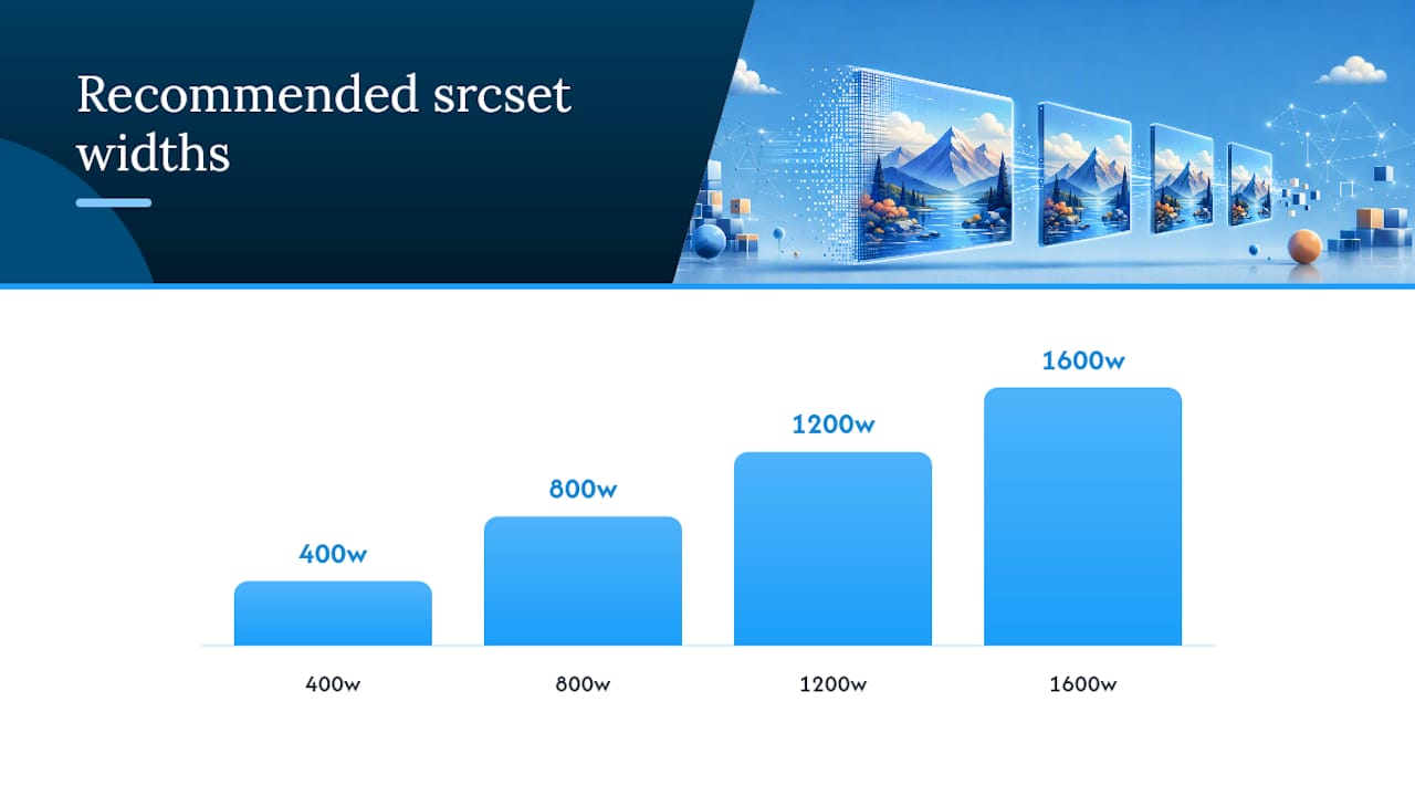
- Generate a limited set of widths, not a size for every possible screen. Something like 400w, 800w, 1200w, and 1600w covers nearly every real-world case. Generating fifty variants sounds thorough, but it fragments your CDN cache and multiplies build time for no real benefit, a tradeoff Web.
- Write the srcset and sizes attributes together:
<img
  src="photo-800w.webp"
  srcset="photo-400w.webp 400w, photo-800w.webp 800w, photo-1200w.webp 1200w, photo-1600w.webp 1600w"
  sizes="(max-width: 600px) 100vw, (max-width: 1200px) 50vw, 800px"
  width="800" height="533"
  alt="Conference room with wood paneling">
- Always declare width and height, or set
aspect-ratioin CSS. The browser reserves the correct box in the layout before the image finishes loading, which is exactly what prevents Cumulative Layout Shift — the jarring jump where text moves because an image just loaded above it.
Skipping width and height is one of the most common reasons a site scores poorly on CLS despite otherwise fast-loading images. The browser has no way to know how tall that image box should be until the file arrives, so it collapses the space to zero and then shoves everything down once the image renders.
Pro Tip: If you're on a CMS like WordPress, most modern themes and image plugins generate the srcset automatically from your uploaded image. Check your rendered HTML in DevTools before building a manual pipeline. You might already have 80% of this solved.
What's the Right Compression Setting: Lossy vs. Lossless
Lossless compression preserves every pixel exactly, which is why it's the right call for logos, icons, and diagrams where a single blurred edge is noticeable. Lossy compression throws away visual information the human eye is less likely to notice, which is why it's the right call for nearly every photograph on your site.
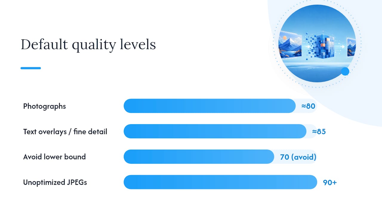
The quality slider is where most people either overcompress into a blurry mess or undercompress and ship bloated files for no visual gain. A workable set of defaults for automated pipelines:
- Photographs: quality around 80. This is the sweet spot practitioners commonly land on when balancing file size against visible fidelity.
- Images with text overlays or fine detail: quality closer to 85. Text edges and gradients show compression artifacts faster than a busy photo does, so they need the extra headroom.
- Avoid dropping below 70 on either category. That's typically where blocking, banding, and visible artifacts start showing up, and the file size savings below that point get smaller while the quality loss gets worse.
On an average e-commerce or professional services site, moving from unoptimized 90+ quality JPEGs down to properly compressed WebP at these settings routinely cuts image payload by half or more without a visible quality difference to the average visitor.
Tools worth having in your workflow:
- Squoosh for manual, visual A/B testing between formats and quality levels before you commit to pipeline defaults.
- Sharp or imagemin for automated, build-time compression in Node-based workflows.
- MozJPEG as a drop-in encoder when you're sticking with JPEG for legacy reasons but want better compression than a standard encoder delivers.
- A dedicated AVIF encoder when a specific hero image justifies the extra encoding time.
Set these as defaults in your build pipeline once and you stop relying on individual contributors to remember quality settings every time they upload a photo.
Lazy Loading, Priority Hints, and CDNs: Getting Delivery Order Right
Compression and format choice only get you half the win. The other half is controlling when and in what order the browser actually requests each image, which is where most sites leave easy performance on the table.
- Use
loading="lazy"on every image below the fold. The browser skips downloading it until the user scrolls near it, which trims your initial page weight substantially on image-heavy pages, per MDN's guidance. - Never apply lazy loading to your hero or LCP image. This is the single most common mistake in image delivery. Lazy-loading the image that's supposed to paint first delays the exact metric you're trying to improve.
- Use
fetchpriority="high"on the LCP element instead, or preload it explicitly in the document head. This tells the browser to fetch that file before lower-priority resources, and web.dev's research shows priority hints can meaningfully improve perceived load time when applied to the right image. - Consider an image CDN if you're managing more than a handful of image sizes or formats. Services in this category negotiate format via
Acceptheaders and resize on the fly from URL parameters, which removes the need to pre-generate every variant at build time.
The tradeoff is real: image CDNs add a runtime dependency and, on some plans, a cost per transformation, while build-time transforms give you full control with no external service in the request path. For a site with a handful of pages and predictable images, build-time transforms via Sharp or a static site generator's image plugin are usually simpler. For a site with constantly changing content, user uploads, or a large catalog, an image CDN saves real engineering hours.
Either way, the ordering rule doesn't change: hero image loads first and loads eagerly, everything else can wait.
Image SEO and Accessibility: Alt Text, Filenames, and Metadata
Image optimization isn't only about speed. It's also how search engines and screen readers understand what's on your page, and getting it wrong costs you both rankings and usability.
- Write alt text that describes the image's function or content in a sentence, not a keyword list. "Attorney reviewing contract at desk" beats "law firm lawyer attorney Phoenix legal services" every time, both for accessibility and for how search engines evaluate the page, a distinction covered well in SERPView's image SEO guide.
- Use descriptive filenames before upload, like
downtown-office-exterior.webpinstead ofIMG_4821.webp. It's a small habit that consistently helps image search visibility. - Add key images to an XML image sitemap if your site relies on visual discovery, like a photography portfolio or a real estate listing page.
- Strip EXIF metadata in production. Camera model, GPS coordinates, and timestamp data add unnecessary weight to every file and can leak more information about the photo's origin than you intend to share, a point Babylovegrowth's visual content checklist also flags.
None of this is complicated, but it's the layer most sites skip once the performance work is done. Skipping it costs rankings and accessibility compliance for close to zero effort saved.
Tools and Automation: From Manual Testing to Full Build Pipelines
Match the tool to the size of the job. A ten-page brochure site doesn't need the same pipeline as a content platform publishing daily.
- Squoosh is the right starting point for manual work: dragging in a file, comparing WebP against AVIF against the original at different quality levels, side by side, before you settle on defaults.
- Sharp and imagemin handle automated, build-time processing in Node environments, generating your full set of responsive widths and target formats every time an image gets added.
- Framework-native image components, like Next.js's built-in image handling or Gatsby's image processing plugins, bake responsive generation and lazy loading into the framework itself, so you're not hand-rolling
srcsetmarkup for every image. - WordPress sites have a choice to make: plugins that generate responsive sizes locally, or offloading the work to an external image CDN or AI-driven image automation service. Plugins are simpler to set up; offloading tends to scale better once your media library grows past a few hundred images and your server starts feeling the load of generating variants on every upload.
There's no universally correct choice here. A five-page consulting site is fine with a plugin. A site publishing new photography weekly benefits from moving that work off the server entirely.
How Epdwebsites Handles Image Optimization on Every Site Build
Since 2009, many websites have been built for professionals whose photography and branding carry real weight in how clients judge credibility. Image handling isn't an afterthought bolted on after launch. It's part of the build.
A standard implementation checklist looks like this: choose WebP as the default format with fallbacks where needed, set quality defaults in the 80 to 85 range depending on content type, generate a practical srcset breakpoint set rather than dozens of redundant sizes, and confirm CDN and caching headers are configured before launch. That's the same framework covered throughout this guide, applied consistently across every project rather than left to guesswork.
If you want to see what that looks like on a finished, professional-grade site, the portfolio shows completed builds across several of these industries.
Manual Tuning vs. Automated Pipelines: What Actually Deserves Your Time
Automated pipelines make sense once you're managing hundreds of images or a high-traffic site where every kilobyte compounds across visitors. Manual tuning still earns its keep on a handful of hero images, where a designer's eye catches an artifact that an automated quality setting misses. The practical test either way: measure your actual LCP, then A/B test hero compression settings against it rather than trusting a quality number in isolation.
— Kate
Get Image Optimization Built Into Your Site From the Start
Retrofitting image optimization onto an existing site means auditing hundreds of files, rebuilding templates, and hoping nothing breaks in the process. Image optimization can be built in from day one, so professional service sites launch already running on compressed, properly sized images with caching and CDN delivery configured correctly the first time.

Site builds typically include format choices, quality defaults, and responsive markup covered in this guide, handled as part of the design and hosting process rather than as a separate line item you have to remember to ask for. If your current site is already live and dragging on load time, that's fixable too through ongoing hosting and performance checks rather than a full rebuild. Take a look at the features page to see what's included, and reach out with your current site for a quick look at where the biggest image wins are hiding.