
Website navigation structure is the organized system of menus and links that lets users move through a website and find content efficiently. It functions as the visible layer of a site's information architecture, translating page hierarchy into something visitors can actually use. Understanding what is website navigation structure explained correctly means recognizing it as both a design decision and a usability tool. Get it right, and visitors stay longer, click deeper, and convert. Get it wrong, and they leave within seconds.
What is website navigation structure, and why does it matter?
Website navigation structure is the roadmap visitors use to explore and discover content across a site. Without it, even a well-designed page becomes a dead end. The structure determines which pages are reachable, how many clicks it takes to get there, and whether users feel oriented or lost.
Navigation also reflects a site's information architecture. Navigation reflects information architecture and serves as its visible layer, meaning the menu a visitor sees is a direct translation of how content is organized underneath. A poorly organized site produces a confusing menu. A well-organized site produces a menu that feels obvious.
Effective navigation directly affects engagement and conversion rates. That connection is not abstract. When visitors cannot find a service page or contact form, they do not call. They leave.

What types of navigation structures work best?
Different navigation patterns serve different site sizes and content types. Choosing the right one depends on how much content you have, who your visitors are, and what actions you want them to take.
Global navigation appears consistently on every page, usually as a top bar or sidebar. Global menus appear across all pages, while local navigation shows context-specific links. Using both together supports sites with diverse content needs.
Mega menus work well for large sites with many categories. They display multiple columns of links in a single dropdown, reducing the number of clicks needed to reach deep content. E-commerce sites and large service directories use them most often.
Breadcrumbs show users exactly where they are within the site hierarchy. A breadcrumb trail like "Home > Services > Tax Consulting" tells a visitor their location at a glance. They are especially useful on sites with three or more levels of depth.
Sticky navigation keeps the menu visible as users scroll down long pages. Sticky headers maintain persistent access to navigation and primary calls to action. The key is keeping the sticky bar slim so it does not crowd the content below it.
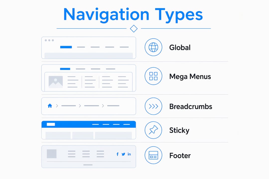
Footer navigation handles secondary links: privacy policies, terms of service, sitemap links, and social profiles. It does not replace the main menu but gives visitors a reliable fallback at the bottom of every page.
| Navigation type | Best use case |
|---|---|
| Top bar (global) | Most sites; primary pages and key CTAs |
| Mega menu | Large catalogs or multi-category services |
| Hamburger menu | Mobile screens; secondary desktop menus |
| Breadcrumbs | Deep hierarchies with 3+ content levels |
| Sticky header | Long-scroll pages; conversion-focused sites |
| Footer nav | Legal pages, sitemaps, secondary links |
Pro Tip: Never rely on a hamburger menu as your only navigation on desktop. Hidden links get fewer clicks than visible ones, so keep your most important pages exposed on larger screens.
How to structure website navigation effectively
The website navigation structure basics come down to clarity, brevity, and consistency. Designers who follow these principles build menus that visitors use without thinking.
Limit primary items to 5–7. Primary header menus should have 5–7 key navigation items to avoid overwhelming visitors. More than seven items forces visitors to scan and choose, which creates friction. Fewer than five may hide important content.
Place the most important items first and last. Studies show that items at the beginning and end of a menu receive the highest user attention. Put your highest-priority pages, such as "Services" and "Contact," in those positions.
Use plain, clear labels. Labels that match user expectations reduce confusion and improve usability. "What We Do" sounds creative but performs worse than "Services." Visitors scan menus fast. Plain words win.
Design for user intent, not internal org charts. Navigation should match how users think, not how a company organizes itself internally. A law firm's internal departments do not map to what a potential client searches for. Build the menu around the visitor's questions, not the firm's structure.
Keep the structure flat. Avoid nesting menus more than two levels deep. Deep hierarchies force extra clicks and disorient visitors. When content grows, expand the top-level categories rather than adding another dropdown layer.
Maintain consistency across every page. Consistent menu position and labels reduce disorientation and encourage exploration. If "About" appears in the third position on the homepage, it should appear in the third position on every other page.
Common mistakes to avoid:
- Using jargon or internal terminology as menu labels
- Hiding key pages inside deep dropdown menus
- Changing navigation layout between desktop and mobile without testing
- Treating the footer as a dumping ground instead of a structured secondary menu
Pro Tip: Run a card-sorting exercise with five real users before finalizing your menu labels. Card sorting reveals the words visitors actually use, which often differ from what the design team assumes.
How does mobile navigation work differently?
Mobile navigation requires a different approach than desktop design. Screen space is limited, touch targets replace mouse clicks, and users often navigate with one thumb. These constraints change every decision.
The hamburger menu is the standard pattern for mobile. It collapses the full menu behind a three-line icon, freeing up screen space for content. Hamburger menus are normal and useful on mobile, but the icon must be clearly visible and placed where thumbs naturally reach, typically the top right corner.
Tap targets need to be large enough to hit accurately. Mobile visitors require large tap targets because thumbs are imprecise. A tap target smaller than 44x44 pixels creates frustration and misclicks. This applies to every menu item, button, and link on the page.
Show the most critical actions without extra taps. If a visitor needs to call your office or book an appointment, that action should be one tap from any page. Burying a phone number three levels deep on mobile costs real business.
Test on actual devices, not just browser emulators. Emulators do not replicate real thumb reach, font rendering, or scroll behavior. Testing on a physical iPhone and an Android device reveals problems that no simulator catches.
For professional service sites, a mobile-first navigation design approach means building the mobile menu first, then expanding it for desktop. This forces prioritization and prevents the common mistake of cramming a desktop menu onto a small screen.
Pro Tip: Add a persistent "Call Now" or "Contact" button to your mobile sticky header. On professional service sites, that single addition measurably increases phone inquiries without cluttering the menu.
How navigation structure impacts engagement and conversions
Navigation is not just a wayfinding tool. It is a conversion mechanism. Well-structured navigation directs users toward contact pages, pricing, and services, which directly supports lead generation and sales. The path a visitor takes through a site is largely determined by what the navigation makes easy to find.
Logical grouping aids content discovery. When related pages sit under the same parent category, visitors explore more of the site. A visitor who lands on a "Business Law" page and sees "Estate Planning" and "Contract Review" in the same dropdown is more likely to browse than one who hits a dead end.
Consistent navigation builds confidence. Visitors who always know where they are and how to get back to the homepage feel in control. That sense of control reduces bounce rates and increases time on site.
Aligning navigation with conversion goals means placing calls to action where attention is highest. A site hierarchy built around SEO and user intent also signals relevance to search engines, which reinforces organic traffic. Navigation and SEO are not separate concerns. They share the same underlying structure.
For professional service providers, attorneys, CPAs, and consultants, the navigation menu is often the first thing a prospective client evaluates. A clean, logical menu signals professionalism before a single word of body copy is read.
Key Takeaways
Website navigation structure is the single most controllable factor in whether a visitor finds what they need or leaves your site.
| Point | Details |
|---|---|
| Limit primary menu items | Keep 5–7 items in the main nav to reduce friction and maintain focus. |
| Place key links first and last | Attention peaks at the start and end of a menu, so position priority pages there. |
| Design for user intent | Build menus around visitor questions, not internal company structure. |
| Prioritize mobile tap targets | Use minimum 44x44-pixel targets and test on real devices, not emulators. |
| Align navigation with conversions | Place contact and service links where attention is highest to support lead generation. |
Navigation design in 2026: what I've learned from building professional sites
The biggest shift I've seen over the past few years is how little attention designers pay to the gap between what a company calls its services and what a client actually searches for. A CPA firm labels its menu "Assurance Services." A potential client types "tax help for small business." Those two things do not connect, and the firm loses the lead before the page even loads.
Simplicity is harder to build than complexity. Adding a dropdown is easy. Deciding what does not belong in the menu requires real discipline. The sites that perform best for professional service providers, the attorneys and consultants I've worked with through Epdwebsites, are the ones with the fewest menu items and the clearest labels. Every extra item is a decision you're forcing the visitor to make.
Mobile is now the dominant mode for first visits, even on professional service sites. Visitors check a law firm's website on their phone during a commute or a lunch break. If the mobile menu is clunky or the contact button is buried, that visit ends without a call. The visual hierarchy of your navigation on mobile deserves as much attention as the desktop layout, arguably more.
The practitioners who get this right test their navigation with real users, not assumptions. A five-minute card-sorting session or a quick usability test with a colleague reveals more than hours of internal debate. Build, test, adjust, repeat.
— Kate
How Epdwebsites builds navigation that works for professionals
Professional service providers need websites that make the right first impression and guide visitors toward a call or inquiry without friction.

Epdwebsites has designed and hosted websites for attorneys, CPAs, real estate agents, and medical practices since 2009. Every site includes a navigation structure built around the client's visitors, not internal org charts. The premium web design features Epdwebsites delivers include clear global menus, mobile-optimized layouts, and sticky headers that keep contact options visible on every page. If your current site's navigation is costing you leads, that is a fixable problem. Epdwebsites builds sites that convert visitors into clients.
FAQ
What is website navigation structure?
Website navigation structure is the organized system of menus and links that guides visitors through a website and makes content discoverable. It serves as the visible layer of a site's information architecture.
How many items should a navigation menu have?
Primary header menus should contain 5–7 items. More than seven forces visitors to scan and choose, which creates friction and increases the chance they leave without clicking.
What is site hierarchy in web design?
Site hierarchy is the parent-child relationship between pages on a website. A clear hierarchy groups related pages under logical categories, reducing the number of clicks needed to reach any piece of content.
Why does mobile navigation need special attention?
Mobile screens are small and touch targets replace mouse clicks, so menus must be simple, large, and easy to tap. Testing on real devices, not browser emulators, is the only reliable way to catch usability problems.
How does navigation structure affect conversions?
Well-structured navigation places contact pages, service descriptions, and calls to action where visitor attention is highest. That placement directly supports lead generation by reducing the steps between a visitor's arrival and their decision to reach out.