
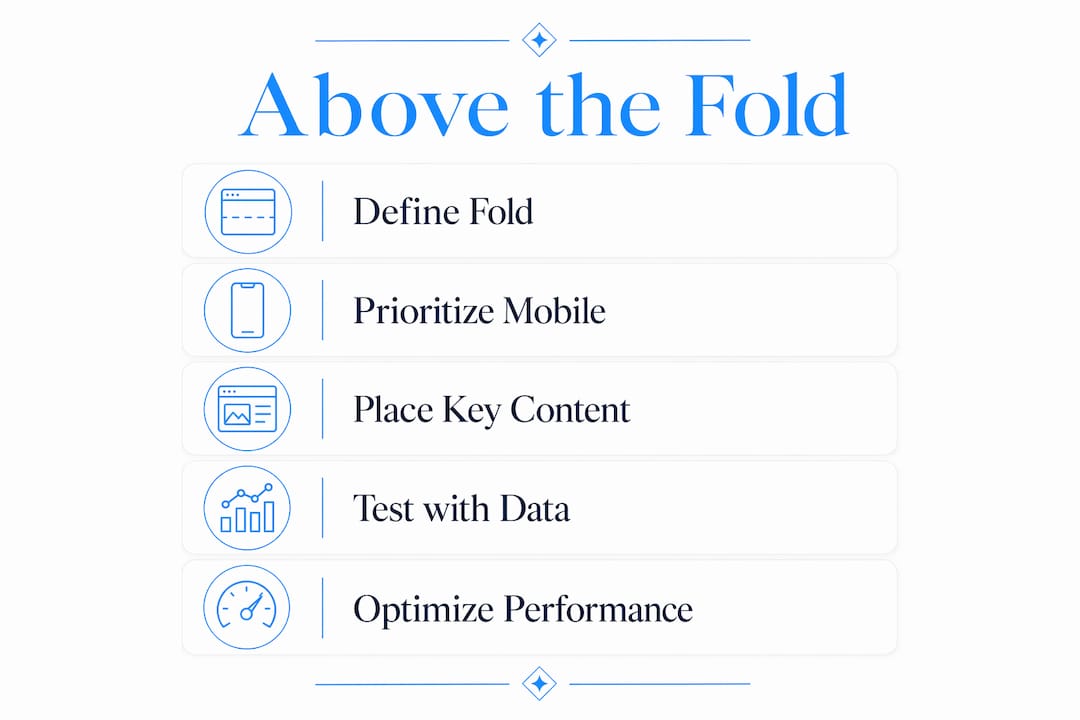
Above the fold is the portion of a web page visible in the browser window without scrolling. Put it to work immediately: use that space to state your value clearly and give visitors one compelling reason to keep going. The catch is that the fold is not a fixed line. It shifts based on device, screen resolution, and browser chrome, so a desktop visitor and a mobile visitor see different amounts of your page before they ever touch the scroll bar.
Table of Contents
- What does "above the fold" mean on a website?
- Why the fold still matters for attention and conversions
- How do you actually measure where the fold is?
- Mobile and responsive design change everything about the fold
- What should you place above the fold?
- How to test your above-the-fold design with real data
- How above-the-fold choices affect SEO and page performance
- Two hero wireframe examples and a pre-launch checklist
- Epdwebsites' recommended approach for professional-service sites
- Key Takeaways
- The fold is where trust is won or lost
- Your hero area, built right from the start
What does "above the fold" mean on a website?
The phrase comes straight from print journalism. Newspapers are folded in half for display, so editors placed the most important stories in the top half — literally above the physical fold — to catch a buyer's eye at the newsstand. When web designers started thinking about screen real estate in the 1990s, the metaphor transferred naturally to the browser window.
On the web, the fold is wherever the visible area of the page ends before a user scrolls. Everything a visitor sees on first load is above the fold; everything requiring a scroll is below it. Nielsen Norman Group defines it as the portion of a website immediately visible to a visitor without any scrolling or interaction.
That framing matters. Designers who treat the fold as a fixed 600-pixel line miss the point. The real question is: what does your specific audience see when they land, and does that view give them enough reason to stay?

Why the fold still matters for attention and conversions
Yes, the fold still matters. Significantly. NN/g research shows that users treat content above and below the fold very differently, with attention dropping steeply once content falls out of the initial viewport.
~84% difference: Nielsen Norman Group's usability research estimates a mid-point difference of roughly 84% in how users engage with content above versus below the fold.
That gap is not uniform across every page type. On landing pages, paid-traffic destinations, and hero-driven homepages, the fold is critical — visitors are making a fast judgment about whether to stay. On long-form articles or resource pages, the fold matters less because users who arrive with reading intent will scroll. The principle holds: the fold is where first impressions are made, and first impressions drive the decision to continue.
Ad viewability follows the same pattern. Industry data consistently shows that viewable impressions drop substantially for ads placed below the fold, which has direct revenue implications for publishers and advertisers alike.
How do you actually measure where the fold is?
There is no single fold. The fold varies by device, screen resolution, and browser chrome, so measuring it for your actual audience is the only approach that produces useful data.
Here is a practical sequence to map the fold for any high-traffic page:
- Pull your device report from Google Analytics 4. Check the breakdown of sessions by device category (mobile, tablet, desktop) and screen resolution. This tells you which viewport sizes matter most for your audience.
- Identify your top three viewport heights. Common desktop heights cluster around 768px and 900px; mobile heights often fall in the 667px–844px range, but your data may differ.
- Subtract browser chrome. A typical desktop browser toolbar and tab bar consume roughly 80–120px. On mobile, add the status bar and any sticky navigation your site uses.
- Resize your browser manually to those dimensions and screenshot what is visible. Tools like Chrome DevTools' device emulation make this faster.
- Prototype hero variants at those breakpoints before committing to a design or running a test.
Pro Tip: Set up a scroll-depth report in Google Analytics 4 using the built-in scroll event (fires at 90% scroll depth by default). Adjust the threshold to 25% and 50% to see where visitors stop engaging — that data often reveals a fold problem faster than any heuristic.
Mobile and responsive design change everything about the fold
Prioritize mobile breakpoints. Most professional-service websites now see the majority of their traffic arrive on phones, and a hero that looks clean on a 1440px desktop monitor can bury the headline entirely on a 390px iPhone screen.

A few concrete do's and don'ts for mobile hero sections:
Do write a concise value statement that fits in two lines at 16px on a 390px screen. If your headline wraps to four lines, it pushes the CTA below the fold before the visitor reads a word.
Don't use an oversized hero image that fills the entire viewport. A full-bleed photo with text overlay sounds elegant in a design brief; on a phone, it often means the CTA is invisible until the user scrolls.
Do place your primary call-to-action button within thumb reach. The lower-center zone of a phone screen is the most accessible tap target — not the upper corners.
Sticky headers deserve special attention. A 70px sticky nav on mobile eats 70px of your already-limited viewport. On a 667px screen, that leaves 597px of usable space before the fold. Factor that into every hero design decision. CSS safe-area insets (env(safe-area-inset-*)) handle notches and home-indicator bars on modern iPhones, but they need to be explicitly coded — they do not apply automatically.
Pro Tip: Add a subtle visual cue below your hero content — a partial image peeking up from below, a small downward arrow, or a short line of microcopy like "See how we work" — to signal that more content exists. Users scroll more when they can see there is something worth scrolling to.
What should you place above the fold?
Clarity wins. Every element competing for space in the hero area costs the visitor cognitive effort. The goal is to communicate one clear promise and invite one action.
Here is a prioritized checklist for hero areas, ordered by impact:
- Headline (required, first). One sentence that states what you do and who you serve. Specific beats clever: "Estate planning for Arizona families" outperforms "Your future, secured."
- Subhead or value line (required). One sentence expanding on the headline — the outcome you deliver or the differentiator that matters. Keep it under 20 words.
- Primary CTA (required). One button, one action. "Schedule a free consultation" or "Get a quote" — not three buttons with equal visual weight.
- Hero image or background (contextual). Supports the message; does not replace it. Avoid stock photos that look generic. A photo of your actual office or team works harder than a handshake image.
- Trust cue (high value). A bar of client logos, a credential badge, a short social-proof line ("Trusted by 200+ Arizona businesses"), or a recognizable certification. One trust signal is enough. Building trust through design starts the moment a visitor lands.
Secondary CTAs — "Learn more," "See our work" — belong below the fold or in the navigation. Placing two CTAs of equal weight above the fold splits attention and typically reduces clicks on both.
Pro Tip: Reduce visual complexity by limiting your above-the-fold palette to two colors and one typeface weight for body text. Then use a contrasting color exclusively for the CTA button. Visitors' eyes go to contrast — make sure that contrast points at the action you want them to take.
How to test your above-the-fold design with real data
Assume nothing. A hero that feels right in a design review may underperform in the wild, and the only way to know is to test it.
A basic A/B test structure for the hero area:
Hypothesis: Changing the headline from a generic statement to a specific outcome claim will increase consultation form submissions. Variant: One change at a time — headline text, CTA copy, or hero image, never all three simultaneously. Sample size: Run the test until you reach statistical significance; most experiment platforms flag this automatically. Primary metric: Conversion rate (form submission, phone click, or CTA click). Secondary metrics: Scroll depth, time to first interaction, bounce rate.
For tooling, each platform has a distinct strength. Optimizely handles enterprise-grade A/B and multivariate experiments with strong statistical controls. AB Tasty is a strong mid-market option with visual editing that does not require a developer for every test. Hotjar provides heatmaps and session replay — you can literally watch where visitors click, tap, and stop scrolling. Google Analytics 4 ties behavioral data (scroll depth, engagement time) to acquisition channels, so you can see whether paid traffic behaves differently from organic.
KPIs to watch on every hero test: scroll depth past the fold, time to first interaction, CTA click rate, and viewable impressions for any above-the-fold ad units. These four metrics together tell you whether your hero is hooking visitors or losing them.
How above-the-fold choices affect SEO and page performance
Above-the-fold content influences how search engines perceive page relevance and how fast the page feels to real users. Placing too many ads or render-blocking resources above the fold can hurt both ad viewability and search visibility.
Key performance and SEO considerations:
- Largest Contentful Paint (LCP): Google's Core Web Vitals measure how quickly the largest visible element loads. A heavy hero image that loads slowly tanks LCP and can suppress rankings. Preload key hero images using
<link rel="preload">and serve them in WebP or AVIF format. - Cumulative Layout Shift (CLS): Elements that shift after load — fonts swapping, images popping in — create a jarring experience and hurt your CLS score. Reserve space for images with explicit width and height attributes.
- Lazy loading: Apply
loading="lazy"to images below the fold, not above it. Lazy-loading your hero image delays LCP and is one of the most common performance mistakes on professional-service sites. - Ad density: Google's page experience guidelines penalize pages where above-the-fold content is dominated by ads. Keep promotional units below the hero or use them sparingly.
- Render-blocking scripts: Any JavaScript or CSS that must execute before the page paints delays the visible content. Move non-critical scripts to load after the fold renders. An AI visibility boost add-on can help surface performance gaps that affect search rankings.
Two hero wireframe examples and a pre-launch checklist
Consulting firm homepage
Above the fold: firm name in the top-left nav, a one-line headline ("Business strategy for mid-market manufacturers"), a 15-word subhead, a single "Book a discovery call" button, and a row of three client logos below the button. The hero image is a muted background — not a full-bleed photo — so text contrast stays high. On mobile, the logo row drops below the fold intentionally; the headline, subhead, and CTA remain visible.
Lead-gen landing page
Above the fold: no navigation (removes exit paths), a benefit-led headline ("Cut your tax bill before April 15"), a subhead with one specific proof point, a short form (name + email + phone), and a green submit button. Trust is handled by a single line: "4.9 stars across 180 Google reviews." Nothing else competes for attention.
Before launching any hero redesign, confirm these items:
- Headline is visible without scrolling on a 390px-wide mobile screen at default font size.
- CTA button has sufficient color contrast (WCAG AA minimum, 4.5:1 ratio) — check website accessibility standards.
- Hero image is preloaded and served in a modern format (WebP or AVIF).
- No layout shift occurs between first paint and full load (CLS below 0.1).
- A/B test is configured before launch, not after.
- Scroll-depth tracking is active in Google Analytics 4.
Epdwebsites' recommended approach for professional-service sites
For attorneys, CPAs, consultants, and medical practices, the above-the-fold area has one job: establish authority fast and make the next step obvious. A professional firm should carefully present unique selling points above the fold to maximize trust. Visitors arriving at a professional-service site are evaluating trust before they evaluate services. The law firm homepage structure principles apply broadly: lead with who you serve, state the outcome you deliver, and give one clear action.
A practical checklist for professional-service hero areas:
- Lead contact information (phone number or "Schedule now" button) visible in the top-right corner or sticky header on desktop.
- Credentials or bar admission stated in the subhead or a badge below the headline — not buried in an "About" page.
- A one-line service summary that answers "What do you do?" in plain language.
- One primary CTA tied to the highest-value conversion action (consultation, quote, or intake form).
Sample headline templates you can adapt:
- "Arizona estate planning attorney — protecting families since [year]."
- "CPA services for small business owners in [city] — tax prep, bookkeeping, and planning."
- "Consulting for [industry] companies that need results, not reports."
Semrush's guidance reinforces this: above-the-fold content for professional sites should communicate who you serve, the outcome you drive, and the single action to take next. Epdwebsites applies this framework across its professional-service portfolio — the hero area is always the first conversation in the design process, not an afterthought.
Pro Tip: Client logos and case-study signposts build credibility without cluttering the hero. Place them in a thin bar immediately below the fold — visible the moment a visitor scrolls one finger-width — rather than crowding them into the hero itself. A partial view of that bar above the fold acts as a scroll invitation.
Key Takeaways
The fold is a psychological boundary, not a pixel line — optimize for your visitors' actual viewports, prioritize mobile, and test before assuming your hero works.
| Point | Details |
|---|---|
| Define the fold correctly | The fold is the visible area before scrolling; it varies by device, screen size, and browser chrome. |
| Attention drops sharply | Nielsen Norman Group estimates roughly an 84% difference in user engagement above versus below the fold. |
| Measure for your audience | Use Google Analytics 4 device reports to find your top viewport heights, then prototype at those breakpoints. |
| Mobile comes first | Design the hero for a 390px mobile screen first; desktop is the enhancement, not the baseline. |
| Test before assuming | Run A/B tests with Optimizely or AB Tasty and use Hotjar heatmaps to validate hero decisions with real data. |
| Epdwebsites approach | Epdwebsites builds professional-service hero areas around authority signals, a clear value proposition, and a single CTA — starting from the first design conversation. |
The fold is where trust is won or lost
Most articles about above-the-fold design focus on what to put there. The more useful question is why visitors leave before they scroll — and the answer is almost always that the hero failed to make a promise worth keeping.
Professional-service websites face a specific version of this problem. An attorney or CPA's homepage is not selling a product with a photo and a price. It is asking a stranger to trust them with something consequential. That means the above-the-fold area needs to do more than look polished. It needs to answer three questions in about three seconds: Who are you? Who do you help? What should I do next? When those answers are missing or buried, visitors leave — not because they are not interested, but because the page did not give them enough to stay.
The fold is also where performance decisions become visible. A slow-loading hero image, a layout shift that moves the CTA after the page renders, a sticky header that eats 80px of mobile viewport — these are not design details. They are conversion problems. The sites that perform best treat the hero as a system: copy, design, performance, and testing working together, not in sequence.
Your hero area, built right from the start
Epdwebsites has designed professional-service websites since 2009, and the hero area is always where the real work begins. A polished homepage that buries the value proposition or hides the CTA below the fold on mobile is not a finished website — it is a missed opportunity on every visit.

For attorneys, CPAs, consultants, and medical practices, Epdwebsites offers a focused website audit that evaluates your above-the-fold content against the criteria in this guide: headline clarity, CTA placement, mobile viewport performance, and Core Web Vitals. The turnaround is fast, the recommendations are specific to your practice area, and the next step is straightforward. Request your site audit or review the full range of design and hosting features to see what a professionally built hero area looks like in practice.