
A mobile-friendly website loads correctly and works fully on smartphones and tablets without requiring the user to zoom in or scroll sideways. According to Google's criteria, a page qualifies as mobile-friendly when it uses readable text without zooming, sizes content to the screen, places links far enough apart to tap accurately, and avoids software unsupported on mobile devices, like Flash. That last point trips up more sites than you'd expect. Flash is effectively dead on mobile, yet older sites still rely on it.
Here is what Google's Googlebot specifically looks for when labeling a page mobile-friendly:
- Text is readable without zooming
- Content fits the screen width with no horizontal scrolling required
- Links and buttons are spaced far enough apart for accurate tapping
- No Flash or other software unsupported on mobile devices
- The viewport is configured correctly so content scales to the device.
What are the key characteristics of a mobile-friendly website?
Responsive design is the defining characteristic Google recommends most. It serves the same HTML on one URL and uses CSS media queries to adjust the layout based on screen size. No redirects, no separate mobile subdomain, no user-agent guessing. The page simply reflows.
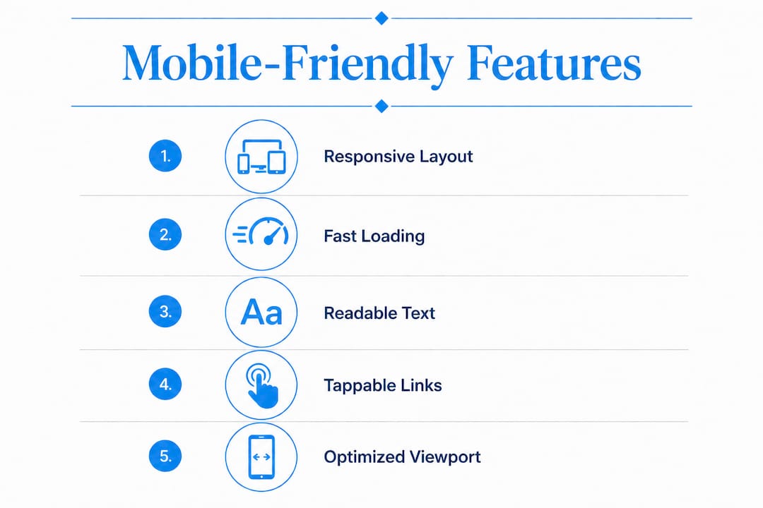
Beyond responsiveness, several other features separate a well-built mobile site from one that just barely passes a test:
- Readable font sizes: Body text should be large enough to read without pinching the screen, commonly set at a size that is comfortable for typical mobile reading.
- Tap targets: Buttons and links need adequate spacing. Fingers are not cursors. Closely packed links cause accidental taps and frustration.
- No horizontal scrolling: Fixed-width layouts that exceed the viewport force users to scroll sideways, which Google treats as a usability failure.
- Fast loading: Compressed images, minimal render-blocking scripts, and efficient code all contribute to speed on cellular connections.
- Simplified navigation: Hamburger menus and collapsible sections work far better on small screens than sprawling desktop nav bars.
- Viewport meta tag: This single line of HTML tells the browser how to scale the page. Without it, most mobile browsers render the desktop version at full width and shrink it, making text tiny.
- No non-mobile plugins: Pop-ups, Flash animations, and certain JavaScript-heavy widgets either break or create terrible experiences on mobile.
A common pitfall is the fixed-width layout, where a designer hard-codes a page width of 1200 pixels. On a phone, that layout does not collapse. The user sees a shrunken desktop page and has to zoom and scroll to read anything. Media queries in CSS solve this by applying different layout rules at different screen widths.
Pro Tip: Use Chrome DevTools' device emulation mode to preview your site at common phone resolutions before testing on a real device. It catches obvious layout breaks in seconds.

Why mobile-friendliness matters for user experience and SEO
The numbers from Google Ads are direct: visitors are 5 times more likely to leave a site that is not mobile-friendly. That is not a marginal difference. A potential client who hits a site that requires zooming and sideways scrolling does not wait around. They go back to the search results and tap the next link.
Stat to know: Nearly half of mobile users abandon a page if it takes more than 3 seconds to load. On a slow cellular connection, a bloated desktop site hits that threshold fast.
The SEO angle is just as direct. Google switched to mobile-first indexing, which means it uses the mobile version of your site to determine rankings, not the desktop version. If your mobile site has less content than your desktop site, your rankings reflect the thinner version. Google's 2015 mobile-friendly update formalized this by boosting mobile-optimized pages in mobile search results globally. Non-optimized pages saw ranking drops.
The business impact compounds quickly. Poor mobile experiences reduce time on site, increase bounce rates, and cut conversions. For a law firm or medical practice, a prospective client who cannot read your services page on their phone is a lost lead. The user experience on professional sites directly shapes whether visitors trust the brand enough to make contact.

How to check and improve your site's mobile performance
Google provides two free tools that cover different scopes. The Mobile-Friendly Test analyzes a single URL and returns a pass or fail with specific issues listed. Google Search Console's Mobile Usability report covers your entire site, flagging pages with recurring problems like viewport misconfiguration or small tap targets.
Common issues found in these tests, and their fixes:
| Issue | What causes it | Fix |
|---|---|---|
| Viewport not configured | Missing or incorrect viewport meta tag | Add <meta name="viewport" content="width=device-width, initial-scale=1"> |
| Text too small to read | Font size below readable threshold on mobile | Set body font to at least 16px; avoid absolute pixel sizes |
| Clickable elements too close | Links and buttons with insufficient spacing | Add padding around tap targets; minimum 48x48px recommended |
| Horizontal scrolling | Fixed-width layout wider than viewport | Use percentage-based or fluid widths; apply CSS media queries |
| Slow page load | Uncompressed images, render-blocking scripts | Compress images, defer non-critical JavaScript, use browser caching |
Practical steps to improve mobile performance:
- Test individual pages with Google's Mobile-Friendly Test and address every flagged issue
- Check Google Search Console weekly for new mobile usability errors
- Replace fixed-width layouts with fluid grids or a responsive framework
- Compress all images before uploading; use modern formats like WebP where supported
- Simplify your navigation to work with a thumb, not a mouse
- Use readable fonts at appropriate sizes without requiring the user to zoom
- Remove or replace any Flash-based elements or plugins that do not render on mobile
- Test on actual phones, not just desktop browser simulations, since real devices reveal issues emulators miss
For complex structural changes, working with a professional web developer saves time and avoids breaking other parts of the site. Many mobile usability failures are rooted in improper viewport configuration, which looks simple but affects every page when misconfigured.
Expert insights on mobile-friendly design for professional services
Professional service websites carry a different burden than e-commerce sites. An attorney's site or a medical practice's site must project credibility before a visitor reads a single word. A layout that breaks on a phone undermines that credibility instantly. The benefits of a professional medical website extend well beyond aesthetics: mobile-friendly design directly affects whether patients and clients trust the practice enough to book an appointment or make a call.
Epdwebsites has designed mobile-friendly sites for attorneys, CPAs, real estate agents, consultants, and medical practices since 2009. That experience surfaces patterns that generic guides miss. Here are the practices that consistently produce results for professional service clients:
- Match mobile and desktop content exactly. Google's mobile-first indexing ranks based on the mobile version. If your mobile site hides your credentials, service descriptions, or contact information, your rankings and your credibility both suffer.
- Prioritize contact accessibility. Phone numbers and contact forms should be visible without scrolling on mobile. A tap-to-call button is not optional for professional services.
- Meet accessibility standards. Mobile-friendly design and accessibility overlap significantly. Sufficient color contrast, readable font sizes, and logical tab order benefit both mobile users and visitors using assistive technology.
- Avoid common design mistakes. Many professional sites fail on mobile because of oversized hero images, auto-playing videos, or navigation menus that collapse incorrectly. These common design mistakes are fixable but require deliberate attention during the build phase.
- Keep the mobile experience fast. Professional clients searching for an attorney or CPA on their phone are often in a hurry. A site that loads in under two seconds on a cellular connection keeps them engaged. One that takes five seconds loses them.
Google's mobile-first indexing requirement that mobile and desktop content match is especially relevant for professional sites that use separate mobile URLs or dynamic serving. With responsive design, content parity is automatic. With other configurations, it requires active maintenance.
How Epdwebsites builds mobile-friendly professional websites

Epdwebsites builds every client site with mobile performance as a core requirement, not an afterthought. The professional-grade website features include responsive layouts tested across devices, fast-loading pages, and designs that reflect the credibility your clients expect when they find you on their phone.
If your current site fails Google's Mobile-Friendly Test or you are starting from scratch, Epdwebsites offers personalized guidance and quick turnaround for professionals in Glendale, AZ, and beyond. Reach out to discuss what a properly built mobile site can do for your practice or firm.
Key Takeaways
A mobile-friendly website requires readable text, proper viewport configuration, tappable links, and fast loading to satisfy both users and Google's mobile-first indexing.
| Point | Details |
|---|---|
| Google's core criteria | Readable text, no horizontal scrolling, tappable links, and no Flash define mobile-friendliness. |
| Responsive design is the standard | Serving the same HTML with CSS media queries is Google's recommended and easiest configuration. |
| 5x abandonment risk | Visitors are 5 times more likely to leave a site that is not mobile-friendly. |
| Mobile-first indexing | Google ranks based on the mobile version of your site, so thin mobile content hurts rankings. |
| Check with Google's tools | The Mobile-Friendly Test and Search Console's Mobile Usability report identify specific issues to fix. |